6 Research Ready Websites
July 24, 2014

CONSUME CREATIVELY
This content is available in:
This content is available in:
TEXT
A Case Study of Non-Profit Research Organization Websites
Take a look at these 6 non-profit research organization websites and learn how each of them incorporated some must-have design elements.
1. SRI International
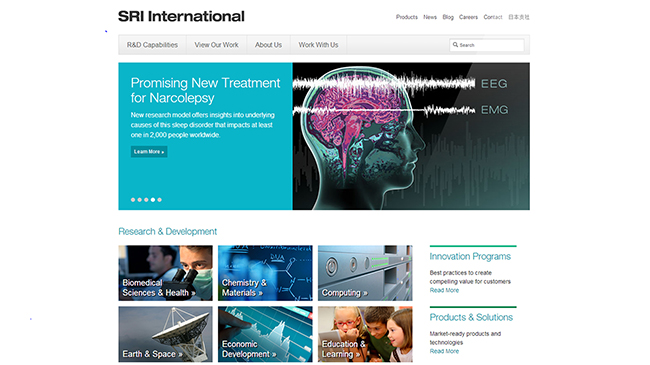
Screenshot of the SRI International website.
The 10 things we love about this website are:
- The home page image gallery. The gallery grabs visitor’s attention by displaying interesting photographs.
- Text is used in the gallery slides. Using actual text on each slide of the gallery instead of just images allows search engines, like Google, to find and index the content and makes the information searchable on the website.
- Links in the home page slider. The buttons and heading text in the gallery slides are linked to blog posts, giving the reader a simple way to access the whole article.
- The categorized research image grid. Just below the image gallery there is a block of photographs that help communicate how the company has categorized their research. This visually pleasing element on the home page also provides quick and easy access to their research.
- Legible fonts. When designing the site, they used easy-to-read fonts that enhance communication.
- Simple navigation. The navigation is really clean and not complicated for such an involved site.
- Great sidebar content. All of the pages on this website have secondary information housed in the sidebar, providing the reader with a further reading option that keeps them engaged on the site.
- Inclusion of news and featured projects sections. On some of the pages there are “News” and “Featured Projects” sub-sections that engage visitors and keep them on the site to read more.
- Social media icons. The site also has social media icons in the footer that allow for easy sharing of information across a range of social media websites. The icons are also color matched to reinforce the organizations brand identity.
- Newsletter signup. The small, uncluttered footer also features a newsletter signup. The signup has only one field where visitors are asked to enter their email address, making the process fast and easy.
2. Donald Danforth Plant Science Center
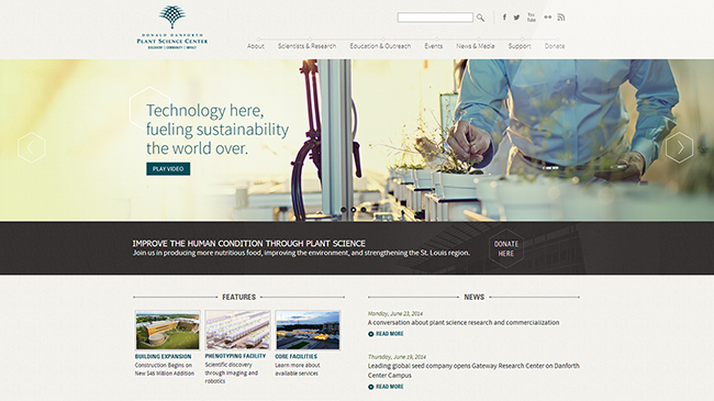
Screenshot of Donald Danforth Plant Science Center website.
This site meets our design standards because:
- It displays professional photography. The large image sliders on the homepage of this site contain beautiful, professional photographs that you’ll see used throughout the site as header images on each page.
- It’s easy to navigate. The breadcrumb navigation keeps the reader informed of their location of the site at all times. The fast response of the menu animations when the visitor hovers over a menu item is also nice. This gives a visual cue as to where the user is pointing the mouse.
- It uses the sidebar to feature important items. The left sidebar of the pages in this site provide readers with access to further readings either through expandable navigation or by clicking on one of the featured articles or videos.
- It features branded social media icons. The branded social media icons in the footer of this site add a nice touch to the design.
- It uses a professional style sans serif font. This makes it easy on the reader’s eyes, especially when reading large amounts of text.
- It has a call-to-action button. Although quite subtle, there is a “Donate Here” call-to-action button on the homepage of this site. Many non-profit organizations include these types of buttons on their website, but this site displayed it very tastefully. The button grabs your attention, but not in an alarming way.
3. American Diabetes Association
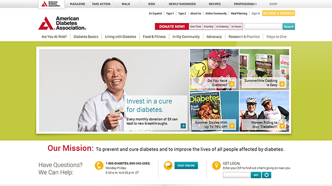
Screenshot of American Diabetes Association website.
This website is research ready because it includes:
- Large, contemporary sized fonts that make the site really easy to read.
- A creative homepage gallery. Unlike a regular homepage slider, this gallery exhibits unique transitions between articles by requiring the visitor to click on the plus icons in the lower right corner of the smaller boxes. Upon clicking on the “+” symbol on a small box, the boxes animate and rearrange to show the article you clicked on as the big image. Then, when you click on the arrow on the big version, you are transferred to the full article.
- Unique sub-navigation. Upon clicking on a main menu item, a unique behavior is enacted to display sub-navigation. The layout makes it really easy to find what you’re looking for without the navigation jumping all over the place.
- Large, professional and friendly images grab the visitor’s attention and makes the site appear upscale.
- A newsletter signup and social media icons. These two features allow for quick information gathering and assist with easy social sharing of content.
- A Blog! It’s a great place to share research updates and teach readers about new discoveries.
- Call-to-Action buttons. A large red “Donate Now” button and a large yellow “Become A Member” button are easily recognized at the top of the pages.
- An easy-to-read layout. A large width main column with generous padding on the left and right, as well as generous padding between paragraphs, eases readability.
- Additional articles for further reading. Visitors stay engaged after scrolling down to the bottom of the website pages where they’re met with a listing of additional articles to read.
- Secondary footer navigation. The large footer provides an additional option for navigating the site.
4. National Multiple Sclerosis Society
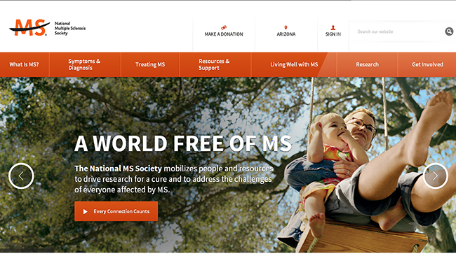
Screenshot of National Multiple Sclerosis Society website.
A few great elements of this site include:
- The HUGE image slider. And I mean really HUGE! Visitors to this site are greeted with a big image slider showcasing large, friendly images with call-to-action buttons on top to grab the readers attention.
- A bold color palette. The orange and blue buttons and text against the white background draws the visitor’s eye to key click-points in the site.
- Big, bold navigation. A visitor will always know their exact position within the site.
- White space. Spreading the page elements out in an open grid helps with communicating a lot of information without the user feeling overwhelmed.
- An abundance of call-to-action buttons. A large number of call-to-action buttons are used throughout the site, but their consistent, simple look keep the website looking clean.
- The “Discover More” section. At the bottom of each page there are additional articles listed to keep the visitor engaged and to promote further learning.
- Color-matched social media icons. At the bottom of the page, there are branded social media icons that keep information about the organization flowing on other platforms.
- The “Stay Informed” button. This button takes visitors to a page where they can create an account to receive mailings and other communications from the non-profit organization.
- The “Make A Donation” button. As a very important call-to-action, this button is persistently visible to readers in the header of the website
- It’s responsive! This site can collapse and transform to display optimally on any device, including desktop computers, tablets and mobile phones.
5. American Cancer Society
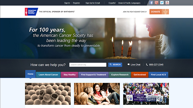
Screenshot of American Cancer Society website.
We believe this site is well-designed because:
- It uses large imagery and statistics to grab attention.
- It includes a large “Donate” call-to-action button in the upper right corner of every page.
- The navigation is easy to understand. The color coding of each section makes it easy to know exactly where you are within the site at any time.
- Three blog posts are promoted on the homepage. Just under the navigation bar are three images accompanied by preview text that link visitors to the full blog post articles.
- Blog posts are categorized. The blog is separated into categories which makes it really easy to navigate and find articles related to topics of interest.
- Secondary navigation is available in the large footer.
- Social sharing icons are displayed on every page. Above the donate CTA are icons for Facebook, Google +, Twitter and YouTube, which help the social reach of the organizations message.
6. Shriners Hospital for Children
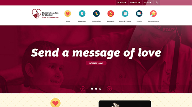
Screenshot of Shriners Hospital for Children website.
This website caught our attention because:
- It’s clean and organized. A generous use of white space makes it really easy to read and comprehend the information.
- It uses fun, animated icons in the navigation bar.
- It features large, emotion grabbing images in the homepage slider. The colorful images accompanied by bold text and call-to-action buttons in the slider compels visitors to donate or send a loving message to one of the children.
- The large, fun fonts are aesthetically pleasing. The use of large, fun, sans serif fonts for titles throughout the site engage visitors and make the content easy to read.
- Tons of professional photos coat the website and pull on the visitors emotions.
- Social media icons visible in the footer make it easy for visitors to share content.
- It has an email newsletter signup section in the footer. Signing up is super simple by only requiring visitors to enter their email address.
- There is a unique patient portal feature. This allows patients to log in to the site and safely and securely view their healthcare records.
- Visitors can watch videos. In the research section of the site, a YouTube video is embedded on the page, filling the entire screen.
- Success stories can easily be found. The site is designed to make it really easy to navigate to the success stories through the research and patient care sections of the site.
Who Manifested This Madness?

This fabulous human, that's who.
Monica Maye Pitts
Monica is the creative force and founder of MayeCreate. She has a Bachelor of Science in Agriculture with an emphasis in Economics, Education and Plant Science from the University of Missouri. Monica possesses a rare combination of design savvy and technological know-how. Her clients know this quite well. Her passion for making friends and helping businesses grow gives her the skills she needs to make sure that each client, or friend, gets the attention and service he or she deserves.

