
A Look Inside the Project: Soul Connections
December 9, 2014

CONSUME CREATIVELY
This content is available in:
This content is available in:
TEXT
Many of our clients come to us for multiple types of marketing needs, and sometimes one project well-done leads into more projects!
The Missouri Conference of United Methodist Churches is the association of Methodist churches in Missouri. One of the agendas of this conference is to create programs for the Methodist church laity and clergy to come together to deepen the Methodist community.
The Missouri Conference came to us, back in 2011, in need of a website for one of these programs: The Call. We were happy to oblige and created a website perfectly supporting the needs of the program, showcasing their events, stories and experiences. Along with the purposeful website we designed several postcards sharing information about The Call events. We also created The Call logo, as well as logos for other programs associated with The Missouri Conference.
Soul Connections
Every spring The Missouri Conference has a special seminar.In the spring of 2014, Soul Connections, a program bringing United Methodist Church laity and clergy together to strengthen the Methodist community and share spiritual experiences, was launched.
Prior to the seminar, Soul Connections needed various marketing materials in preparation of their introduction. Having pleased The Missouri Conference with all of the aforementioned services, who should they turn to? MayeCreate, of course!
Lovely Logo

Soul Connections is a spiritual program; the creative sparks we received from the client involved a labyrinth, or a path typically walked to instill a sense of peaceful spiritual contemplation. The gentle swirls of the logo illustrate this “inward focus” concept. Soothing blues correlate to the meaning of the labyrinth, with a deeper blue in the center representing our inner selves.
The Designer’s Two Cents: Tyler
The Soul Connections logo was a pretty simple process. The client had a pretty good idea about what they wanted before even walking in the door! They were basically like, “We like this icon, give it these colors and put our name by it.” Boom. Done.
While the process was simple, choosing the right font was an interesting step. We had to find the right amount of “swoopy” to relate to the icon, with the right amount of professional readability, which can sometimes be a slippery slope. If you have too much swirl you’re making a wedding invite, but if you get too professional you just have a serif font that looks boring. I think this font works because it looks like a serif font even though it really isn’t! It has just the right amount of curves making it feel more relaxed but maintains clear legibility like that of a sans-serif font.
Gate Fold Brochure
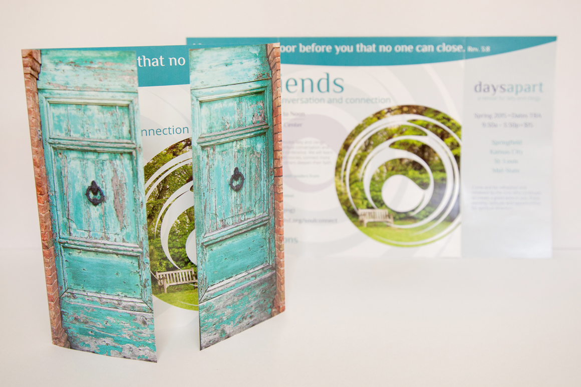
Click to view larger version.
In keeping with the “inward focus” idea comes the Soul Connections brochure. Often the Soul Connections events incorporate a lot of quiet time, in a natural setting; the events are often held at retreat centers with a nature element. Upon opening the doors of the brochure, you’re greeted with a place of stillness, within the labyrinth illustration.
This brochure is an educational tool providing information to Missouri United Methodist laity and clergy about opportunities to join together and build their community.
The Designer’s Two Cents: Sadie
When Jeremy came to me with this brochure, I felt challenged, having never designed a gate-fold brochure before. The client had a clear picture of what they wanted the outside of the brochure to look like, which always helps. I’m a photographer, so images are sort of my thing, and I enjoyed searching for JUST the right doors. When I found the perfect entryway, BOOM. It matched the logo’s colors and everything without requiring any adjustments! My favorite part, though, is the image swoopy-thing on the inside! (Yes, that’s it’s technical term.) That was just one of those things that pop up in your mind and you say, “Yeah!!!”
6″ Bannerstand
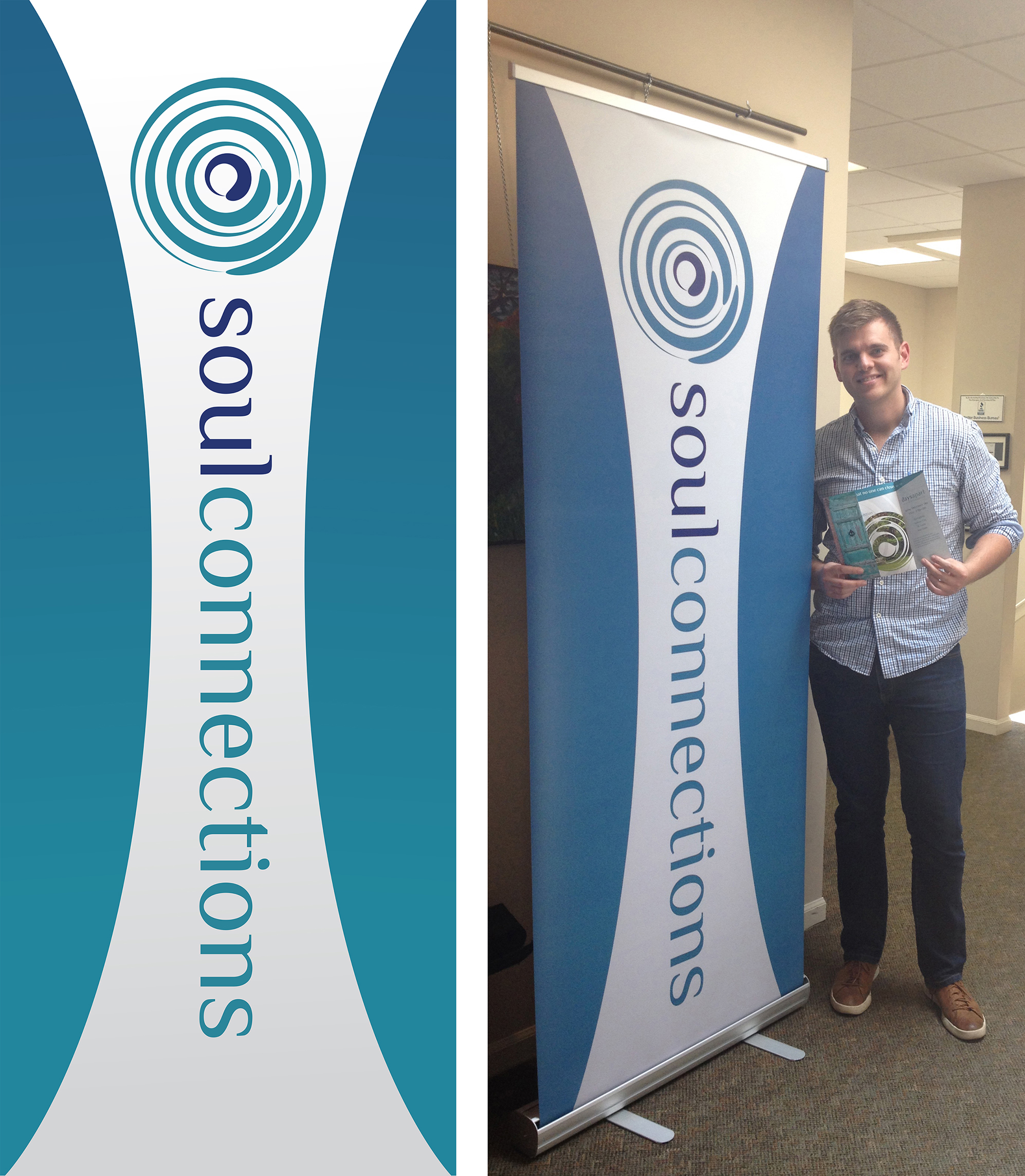
Jeremy with the Soul Connections banner. (Click to view larger version.)
To compliment their brochure, meant to sit atop their table at the Soul Connections booth, is the Soul Connections banner. Designed to be eye-catching and present, the minimalist design draws visitors over with it’s swooping graphics and clear illustration of to whom you were going to be talking with.
The Designer’s Two Cents: Tyler
Functional Website
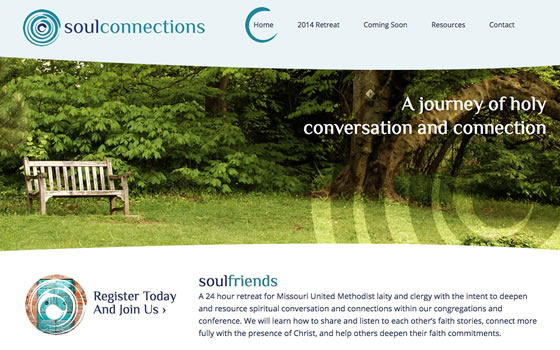
Keeping with the branding created over the course of the Soul Connections marketing materials, the website utilizes the logo graphic, fonts and colors. The cool blues used throughout the site keep with the overall intention of Soul Connections: peace and serenity, “inward looking”. The site’s main purpose is to inform Missouri United Methodist laity and clergy of upcoming retreat events. With it’s clean design, visitors of the site can navigate through the pages and find the information they’re looking for with ease.
The Designers’ Four Cents: Tyler (Initial Design, Programming) and Sadie (Design of Interior Pages)
The End Result
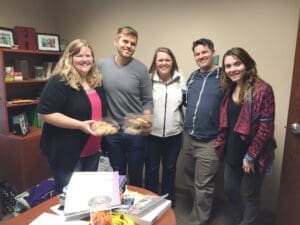
MayeCreate cookie delivery!
The hopeful end result of any project is a happy customer, and with all these services provided we accomplished just that!
The Project Manager’s Two Cents: Jeremy
Every time we get a chance to work with the folks at the Missouri Annual Conference is a treat. They have great energy and passion in what they do, inspiring the branding and marketing we put together for their programs.
And what better way to celebrate a job well done than with cookies!
[hs_action id=”10390″]
Who Manifested This Madness?

This fabulous human, that's who.
Monica Maye Pitts
Monica is the creative force and founder of MayeCreate. She has a Bachelor of Science in Agriculture with an emphasis in Economics, Education and Plant Science from the University of Missouri. Monica possesses a rare combination of design savvy and technological know-how. Her clients know this quite well. Her passion for making friends and helping businesses grow gives her the skills she needs to make sure that each client, or friend, gets the attention and service he or she deserves.