Best Engineering Website Design
July 26, 2016
CONSUME CREATIVELY
This content is available in:
This content is available in:
TEXT
The engineering websites in this blog have made the list for the best designed because of their modern design, flashy photographs and functionality. Each of these websites have a few characteristics that make them stand out from one another. Check out which engineering companies have the best designed websites:
Shafer, Kline & Warren (SKW)
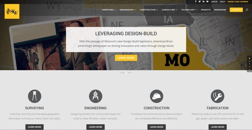
Opening videos and photographs, detailed service information and animation modernize this site.
What Makes This Engineering Website Stand Out
- A video incorporated slideshow draws visitors into the website. What I mean by this is: three videos are tied into a rotating slideshow, each video plays for a certain amount of time before switching to the next one. And if you want to view the entire video, simply click on it. SKW’s video slideshow is a form of marketing because it displays blueprints, drones in the field and company pictures, all of which are interesting, yet informative.
- Their expertise is separated by individual pages along with additional pages for all of their capabilities. It is more work to create such detailed pages, but it will benefit you in the long run. People want information handy, which is where the Internet comes into play; people are less likely to call for details. Plus Google rewards websites offering valuable unique content with better placement.
- Large, horizontal photos greet visitors on every page of the website. This is definitely eye catching and visually appealing. Furthermore, it creates a consistency between the pages, tieing the whole website together.
- Animation can be found throughout, adding a flare of design, either by hovering over different sections or scrolling down the pages. It gives that modern touch to your website, which is attractive to viewers because it is fun and it might hold their attention a little longer.
- An informative and helpful careers page entices potential employees to explore SKW further. SKW went above and beyond on their careers page, providing information from employee benefits to internship opportunities. Showcasing current employees with their progress in the company sets an example for the kind of employees they are looking to hire.
- Each project is designed in a case study format. What I mean by this is: each project is displayed in a three-step process. SKW starts with the project’s challenge, provides the solution, then shows the outcome. Potential customers will find this outstanding because it literally gives them an example of what their challenge may be with a solution and an outcome.
Wish List
Even though the careers page gets an overall ‘A’ grade, the layout of the employees is not ideal. Its an oddly formed gallery with a mystery to what is clickable. In addition, the names of the employees are almost invisible because of the font size.
St. Louis Bridge Construction Company
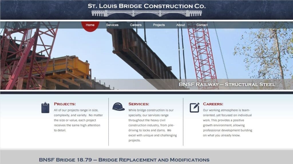
A featured video, well organized projects and services and a special milestone timeline make this site striking.
What Makes This Engineering Website Stand Out
- A featured project and video directs the viewer’s attention further down the page, encouraging them to click on it and explore the rest of the projects. The St. Louis Bridge Construction Co. utilized an opening video as a marketing device. Videos appeal to the younger generation especially, however, people of any age enjoy videos.
- Clear and to the point services page provides a brief description of each service before taking you to the projects associated with said service. The layout of the services page does not require the viewers to read every service description. Instead, they can go straight to the one that interested them and click on it for a drop down to appear.
- The projects page is well organized with two prominent sections: current projects and all projects. By dividing their projects in this manner, visitors can distinguish which projects they would like to browse. There are not too many engineering websites that display their current work.
- A milestone timeline is exhibited on the about page. This is a unique feature for the St. Louis Bridge Construction Co. compared to many engineering websites. The timeline shows all of the company’s milestones throughout the years, beginning with its foundation to what is next for the company. People find timelines appealing, no matter what it is of because of their natural design and rarity. Furthermore, pictures from the past run down the timeline matching with the milestones.
- Recent awards are displayed on the sidebar of the about page, adding interest and credibility. Engineering and construction awards demonstrate a company’s dependability, work ethic and trustworthiness through its achievements. This, in turn, can impress visitors and make customers feel confident in their hiring decision.
Cook, Flatt & Strobel (CFS) Engineers, P.A.
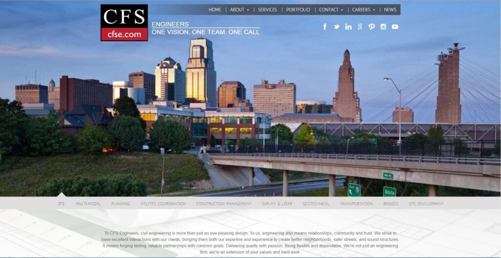
Fixed backgrounds, unique slideshow and project information make this site a winner.
What Makes This Engineering Website Stand Out
- A fixed background throughout the website ties it all together, creating a consistency between the pages. Consistency is key in web design because it pulls all of the pages into one cohesive website. When pages are designed completely different from one another, then the website looks unfinished and unprofessional.
- The company’s capabilities are a part of the introductory slideshow on the homepage, each picture ties to a particular service. This is a unique spin on the traditional opening slideshow and it provides information to the viewers immediately. Visitors do not have to search for CFS’ list of capabilities and can determine if CFS performs residential or commercial services.
- With seven locations, website visitors can contact each one directly either by online form or traditional ways. Viewers are pleased with this type of easy contacting because it means less time and confusion on their end.
- A detailed portfolio page is offered with buttons connecting the projects with the type of service associated with it. Each project has service buttons taking you to said service page, where there are similar projects to be found. Furthermore, each project gives a nice description along with the location and share this links, which is a fantastic advertising method.
Wish List
Even though CFS had great attributes on their portfolio page, their formating for the photos was inconsistent. Every featured project should have similar photos, specifically in size and shape, to create a cohesive portfolio.
PDFs should always open up in another tab, not in the same tab because it will take you away from the site. This goes for any and all websites! CFS offers job opportunities, but the applications load in the same tab as the website. If visitors accidentally clicked here and wanted to leave, they will be inclined to “x” out of the tab, assuming they would go back to the website. However, that is not the case and now they have to type the web address back in to continue exploring the site.
OOCI, Inc.
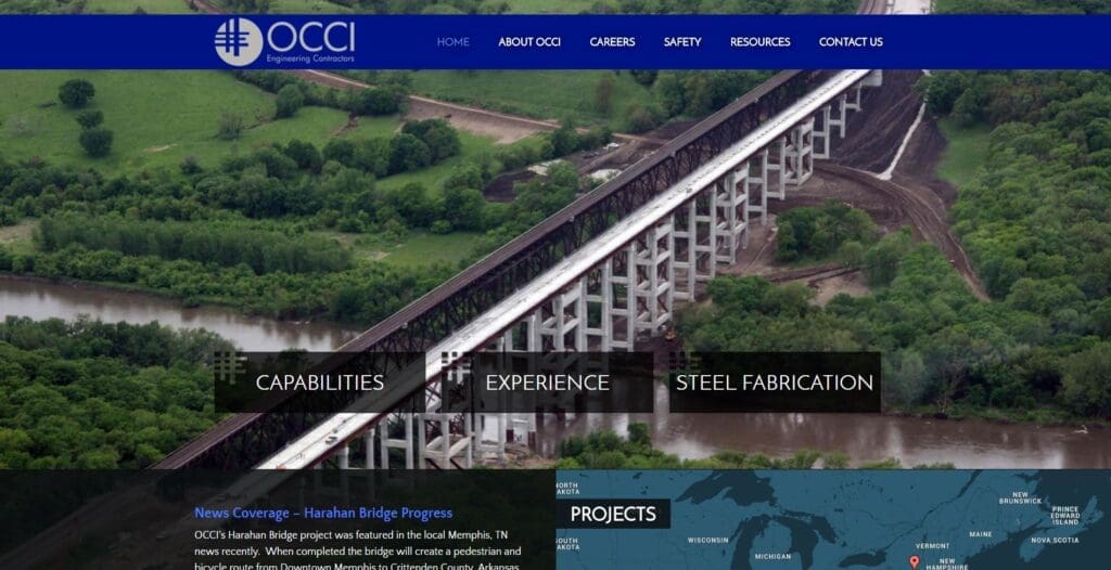
A map of completed projects and local TV recognition draw visitors in immediately.
What Makes This Engineering Website Stand Out
- A map of locations with completed projects greets the visitors on the homepage. This is a fantastic way to display their expertise right off the bat. It is interesting to view all of the places that OCCI has worked, and it shows that they are an expert in their field and work on projects throughout the country.
- Important recognition can also be seen on the homepage, showing off their skills and abilities. OCCI’s Harahan Bridge project was featured in the local Memphis, Tennessee, news recently. Exciting news such as this appeal to viewers immediately, making them feel more comfortable that OCCI is the right choice for them. Great work OCCI for keeping your website up-to-date, accolades are an honor but no one will know about them if you don’t announce it.
- Their “expertise” page is divided by their capabilities on a sidebar navigation system. Visitors can easily explore completed projects without scrolling through them all, which, as mentioned before, saves them time and energy. Viewers are less likely to scroll through the entire list of projects in search for a particular one.
- Black tinted boxes underneath bodies of text really make this site have flare. Various fixed background pictures lie underneath the tinted boxes, which are behind bodies of text. This design element can accomplish the design appeal engineers seek, if done correctly.
- Segmented email lists make it easy to talk to people about what they want to hear. Under the resource page, OCCI offers an email list for equipment resale and rental, subcontractor and vendors, and current employees. Visitors will find this tool a relief and will be more inclined to sign up for the email. Most companies that provide an email list, usually do not have different segments like OCCI does, it’s normally an all in one package (all emails get sent to the email list).
SCI Engineering, Inc.
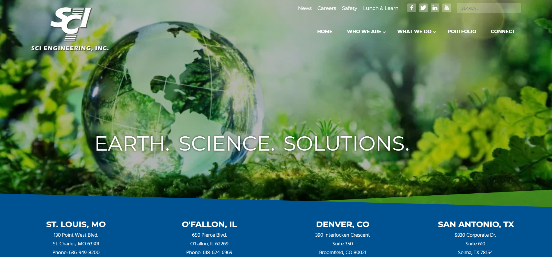
Clean, clear design with lots of white space and an interactive portfolio gallery make this site flashy.
What Makes This Engineering Website Stand Out
- A clean and clear design really makes this website attractive. A lot of white space gives the website room to breathe, which can be relaxing to visitors. An open website draws viewers in compared to a “closed” feeling one and white space has a lot to do with that.
- Sharp, original photographs add a pleasing touch to the overall look and design. Every page lights up with such high quality photographs. Professional photography can make your company seem professional. And when I say professional photography, I don’t necessarily mean hiring someone; you can take your own photos to show off your company’s work.
- An interactive gallery is displayed on the “portfolio” page; this type of design is unique to engineering websites. Most of the time there is nothing fancy about the portfolios in galleries. Usually, each project must be clicked on in order to view the information. However, SCI included animation with their portfolio gallery. When hovering over each project a location is shown, bringing a nice taste of motion into the page. Moreover, every project consists of a large introductory image with consistently formatted content and consistency is king!
- Testimonials are displayed on every in-house service and market page right above the footer, showing off their satisfied customers. This, in turn, can boost visitor confidence in the company’s engineering abilities.
Wish List
Large bodies of text are overwhelming to visitors and make it unattractive and difficult to read. Furthermore, the text is too small and thin. This can be fixed by simply breaking up the content into smaller paragraphs, adding subheads and either changing the font, or making it larger. Viewers are turned off with high quantities of text that are a challenge to read and may be turned away from your website.
When viewing any of the In-House Services or Markets, a footer with “Visit Our Featured Projects” points towards a list of the markets and in-house services. It would make sense for the featured projects to be viewable when you clicked on one of the in-house services or markets. But this is not the case; instead, you must click on “Visit Our Featured Projects.” Visitors may find this confusing and frustrating because it says one thing and points to a list, but it does something entirely different.
Does your website need a few of the characteristics that the above possess?
If so, stick around this next week to find out what your engineering website must have and which trends are recurring in the industry. Come back to read our next two blogs covering these topics.
Who Manifested This Madness?

This fabulous human, that's who.
Monica Maye Pitts
Monica is the creative force and founder of MayeCreate. She has a Bachelor of Science in Agriculture with an emphasis in Economics, Education and Plant Science from the University of Missouri. Monica possesses a rare combination of design savvy and technological know-how. Her clients know this quite well. Her passion for making friends and helping businesses grow gives her the skills she needs to make sure that each client, or friend, gets the attention and service he or she deserves.