Don’t do it! 8 Logo No-Nos
November 1, 2014
CONSUME CREATIVELY
This content is available in:
This content is available in:
TEXT
Logo design is a tricky beast. There are lots of elements to consider like icons, colors, words and overall shape of the logo. To help prevent a logo disaster, we’ve put together 8 logo design no-nos to guide you in a more positive design direction.
1. Don’t Use Microsoft Word
Microsoft Word is good for one thing: words. It’s excellent for writing papers, rough copies of blog posts or emails, outlines for speeches, etc. And if you’re super proficient, perhaps an E-Book. However, when it comes to anything design-wise, especially something representing your business, please don’t use Word. There are other options!
If you don’t have the money to purchase an Adobe product, consider subscribing to the Adobe Creative Cloud. There are several different plans; you could sign up for a single app, at $19.99/mo, for a couple months and design yourself an awesome logo and then cancel your subscription. Adobe Illustrator is the best program for logo design, however InDesign can also get the job done.
Another possibility is hiring a pro (*cough, cough* MayeCreate) to get the job done.
2. Don’t Over-Design

The MayeCreate logo is clean and straight-forward. Who are we? MayeCreate. What do we do? Design.
With unlimited options, I understand it’s hard not to go berserk and design the heck out of something. The best logos are often simple, clean and easy to read and understand. You don’t need sparkles, feathers or frills. Here in the office, Tyler often reminds us to KISS: Keep It Simple, Silly. The best logos are often simplistic, sleek and easily translate what a company provides.
Keep this small list of don’ts at hand in case you see yourself veering off into design crazytown:
- Don’t use an exorbitant amount of shadows, gradients or glowing text/objects. These effects do not translate well when the logo is used in a smaller format like a business card.
- Don’t bevel or emboss everything; flat design is in.
- Don’t cram everything together. Logos do tend to be thought of as small designs, but leaving space between items is like a breath of fresh air.
3. Don’t Design Emotionally
This may seem like a strange don’t because why wouldn’t you want to be emotionally attached to your design?! Keep these thoughts in mind when you feel yourself attempting to become one with your design:
- We’re emotional creatures, it’s impossible to not put ANY emotion into your design, but remember it could be for someone other than yourself; there will be critiques. If you find yourself super attached you could get your feelings hurt.
- As designers, we have to remember the art is for someone else. You have to remain unattached, to an extent, so the work can live for the client’s personal taste.
- You may try and cram too many things into your design. You may THINK you want fireworks, that fireworks accurately depict your business, but may not realize there are more simple graphic ways to illustrate fireworks.
4. Don’t Stop After One Idea
Good designs take time, especially in the beginning stages. Our guy that designs logos, Tyler, will typically spend 30 minutes to an hour simply sketching ideas before even touching Illustrator. How many ideas does he come up with in that time? Maybe 20. How many of those ideas are successful? Probably two.
[ezcol_1half]

Sketches for logos look crazy! But it’s a must to come to the final creation. (Click to see a larger version.)
[/ezcol_1half] [ezcol_1half_end]

The final outcome of the MayeCreate designed Game-Garb logo.
[/ezcol_1half_end]
Let your creative juices flow; allow yourself time to look for inspiration and sketch out a million ideas before honing in on one or two to actually create digitally. Your design will thank you.
5. Don’t Use Stale, Overused Fonts
Are you using any of the following fonts in your logo design?

Well….don’t. These fonts, Comic Sans and Papyrus especially, have come to earn a bad reputation in the design world. With thousands of fonts out on the market, why resort to ones that are, like, so 20 years ago? Venture out into the font abyss and find other fonts that strike your fancy.
Keep these thoughts in mind when searching for the perfect font for your design:
- Don’t use fonts that are hard to read. Take a look at Brush Script and Curlz up there; imagine how that would look used on a business card. Not so clear, right? Your logo will be used in various ways in a number of sizes, keep it clean and simple.
- Don’t get caught with funky characters. Some fonts have oddly styled letters and you wouldn’t want to run into that halfway through designing because you failed to see your font has a weird “g”.
6. Don’t Use Photos
Like I’ve mentioned already, your logo will be utilized in different ways at different sizes. Photographs are created by pixels, or tiny squares of color, with a set size. While they can get smaller, they can not get larger. When a photograph file is stretched it gets pixelated and, well, gross.
Use vector graphics instead of photos. A vector, or Illustrator graphic, is created by tiny scalable objects defined by mathematical equations, rather than pixels, which you can freely expand and collapse with no detriment to the appearance.
[ezcol_1half]

Adorable photo, right? But what if you need to use it for a larger project?

When stretched, JPGs get blurry at best. More often they become pixelated and distorted…NOT what you want in a logo.
[/ezcol_1half] [ezcol_1half_end]

Now, vectors on the other hand can appear great small…

And large! Because vectors are calculated mathematically, and not by pixels, you can make that light bulb wall-sized and it will look perfect every time.
[/ezcol_1half_end]
If creating your own vectors is not your thing, check out these great websites to find what you’re looking for: ThinkStock or VectorStock. Once you’ve downloaded the file, pull it into Illustrator to adjust until you’ve perfected your design.
7. Don’t Use Clipart
What comes to mind when I say “clipart”? Colorful line drawings of flowers, bunnies or clowns? Thought so. Let’s keep the clipart for elementary school walls, okay? A logo is meant to represent a business in a classy, professional way. It’s best to start from scratch.
8. Don’t Design by a Committee
It takes time to figure out if you like a design or not; asking someone’s opinion could possibly help. However, it’s probably best to just ask a couple people, not an entire room. Everyone has their own opinion and before you know it, three people will be hollering over the other two and eventually someone will start crying. Stick with asking a couple people whom you know are unbiased and will give honest, constructive criticism.
What’s next?
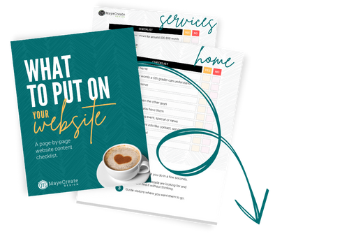
Now that you’ve learned what not to do in logo design, find out what you should do!
[hs_action id=”10595″]
Who Manifested This Madness?

This fabulous human, that's who.
Monica Maye Pitts
Monica is the creative force and founder of MayeCreate. She has a Bachelor of Science in Agriculture with an emphasis in Economics, Education and Plant Science from the University of Missouri. Monica possesses a rare combination of design savvy and technological know-how. Her clients know this quite well. Her passion for making friends and helping businesses grow gives her the skills she needs to make sure that each client, or friend, gets the attention and service he or she deserves.