Is your business card being thrown away?
January 27, 2015

CONSUME CREATIVELY
This content is available in:
This content is available in:
TEXT
Business cards. You gotta have one, right? It’s the perfect takeaway or handout to share your business with the world. But what about the design… How can you make yours special? How can you stand out from the stack that inevitably collects on everyone’s desk? I’ve compiled a couple dos and don’ts and ways to make your business card stay on the top of that stack.
10 Dos and Don’ts of Business Card Design
Don’t:
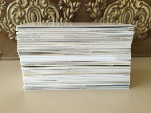
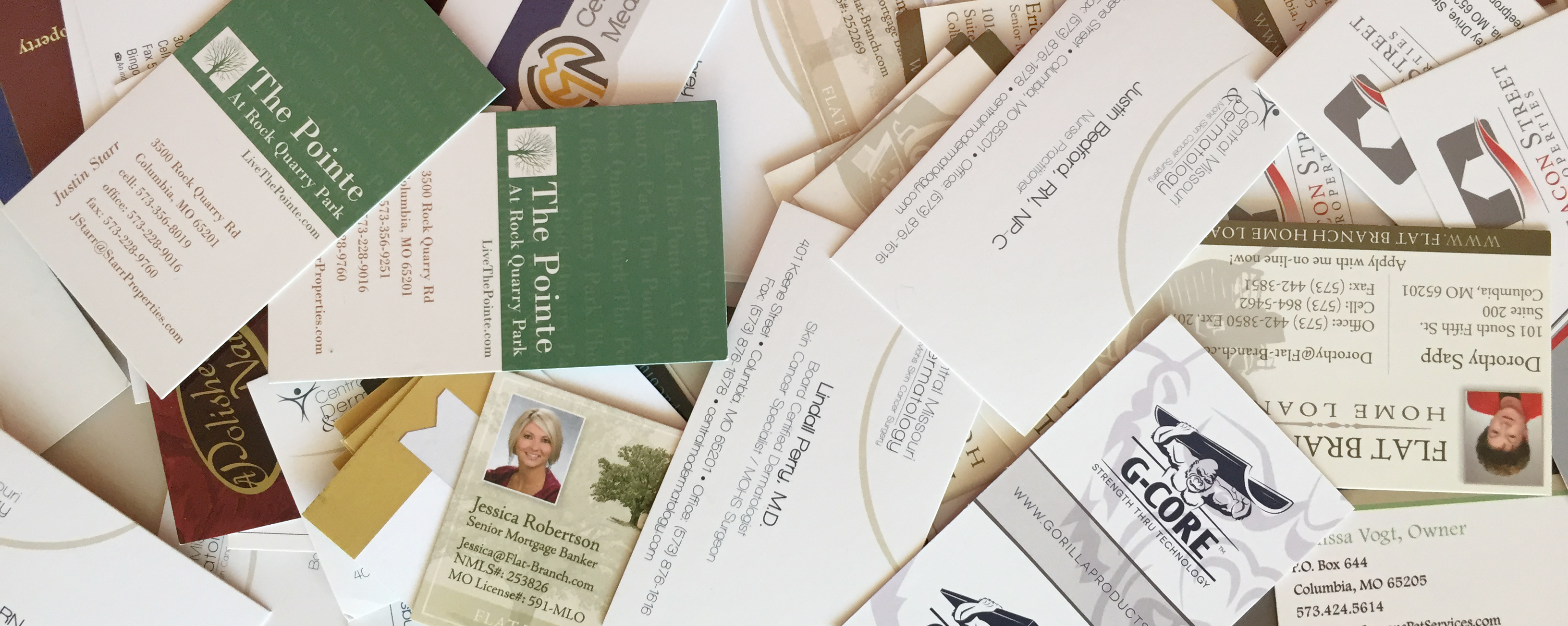
Don’t let your business card end up in a pile of cards on someone’s desk.
Clutter It Up
The most successful business cards are the simple ones. A business card is not a brochure, it doesn’t need to list out and explain your services; it doesn’t need to feature photos of all the projects you’ve completed. One picture? Sure! Twenty? No.
Provide 239,579 Pieces of Information
We’re on Facebook, Twitter, Google+, LinkedIn and Pinterest… But that doesn’t mean we need to include all those URLs on our business cards. Those can all be reached from your website (and hopefully yours works the same way!). Leave these things off your business card. If people are going to investigate or contact you digitally, they’ll use your email address and your website.
Forget Important Information
Considering the above suggestion, for the love of Pete, don’t fail to include all the pertinent information:
- Name
- Job Title
- Phone
- Fax (This is optional, really. Who uses fax anymore?!)
- Address
- Website URL
- Business Logo
- Slogan (If you have one…)
Do:
Clearly Illustrate Your Business and Industry
If you’ve not had a conversation with someone before handing them your card, the card itself is going to be the conversation starter. Make sure to make that boom! first impression; make sure the viewer knows who you are and what you do before even moving on to the contact information.
Font: Use an Easily Readable Font and Size
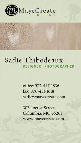
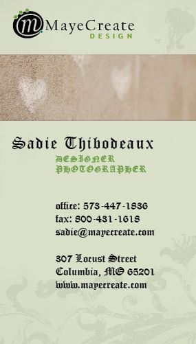
You want people to read your card, right? Pick fonts that are “simple” and easy to read as the majority of content on most business cards range from font sizes 6pt to 10pt.
The example on the left shows my regular business card. The sample on the right illustrates a poor font choice. Old English is not legible. Don’t use it. Just don’t.
Pick a Paper Weight That’s Substantial
Make it Unique
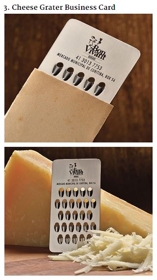
This business card is so cool!! (Found at Bored Panda)
You want your business image to stand out, to get noticed. It’s okay to be different, but don’t go overboard. Ponder these possibilities when crafting yourself a new business card:
Different Material
What about printing your business card on a thin metal sheet?! If you’re a yoga business, how about creating a business card on a thin foam mimicking a yoga mat. Think outside the box about what sort of material your card could be, but make sure it’s related to your brand.
Special Sizing
I’m personally a fan of square business cards, like half the size of a normal card. Technically, cards can be trimmed in any sort of way you want, but remember where they’re going to be kept: mostly in wallets. Remember to keep the initial size the standard 3.5″x2″ and get smaller from there. (But not too small!)
Writing Space
When working on business cards, I’m often told to keep a big space on the back of the card in case either the client, or the client’s customer, wants to write notes or important information. This would be a creative design feature for any businesses that schedule appointments with customers. Write that info on the back!
Utilize for a Different Use
The point of a business card is to drive customers to your business. Why not use one side of the card as a coupon? Or to share upcoming events and specials? Just remember not to make the text any smaller than 6 pt, and that sometimes less is more. Just give people the gist and let them visit your website for more information.
Get noticed…
but in a good way. Make your card special and reflective of you and your business. I see racks of business cards all the time; don’t you want your card to catch my eye?
For more inspiration check out the resources below. And if you’re ready to get a design rolling, we can help you with that!
Who Manifested This Madness?

This fabulous human, that's who.
Monica Maye Pitts
Monica is the creative force and founder of MayeCreate. She has a Bachelor of Science in Agriculture with an emphasis in Economics, Education and Plant Science from the University of Missouri. Monica possesses a rare combination of design savvy and technological know-how. Her clients know this quite well. Her passion for making friends and helping businesses grow gives her the skills she needs to make sure that each client, or friend, gets the attention and service he or she deserves.

")