Color Theory – What Your Colors Really Say About Your Brand
July 12, 2024

CONSUME CREATIVELY
This content is available in:
AUDIO
TEXT
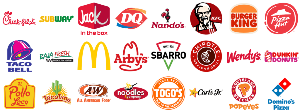
Have you ever stopped to think about why red dominates fast food chain brands while banks gravitate towards green?
It’s because colors impact everything from our mood to our appetite. And those branding pros know color is just one more tool in their marketing tool box. Between 62% and 90% of a product’s first impressions are determined by its colors.
Most of the time when people choose the brand colors for their business or organization, they just go with colors they like. And there’s certainly an honest quality in making decisions based on your gut reactions. At its base level color theory for brands is really a study of just that – people’s reaction to color.
Your brand colors can leave a positive impression on your audience and come together harmoniously in a design or be hard to read, awkward, and loud.
So, if you’ve ever wondered why your logo’s color matters or what they mean, you’re in the right place. I teamed up with my co-art director at MayeCreate, Tyler, to plan this long anticipated and totally dorky chat about color theory for brands.
Stay tuned for our next episode too! We’re reminiscing about the misadventures of client directed color palettes, good logo colors, and the tools we use to bring it all together.
What is color theory for brands?
Color theory is the study of how colors work together, affect your emotions, and how you perceive things.
Color theory basics for brands.
We all KNOW our colors…but it can be difficult to talk about color without the terminology to express what you see and feel.
Having conversations with clients about color can be a pretty lively experience. Some express their color opinions with clarity. Some resort to more creative tactics bringing in swatches of fabric, tennis shoes, and paint samples to explain what they’re looking for.
Web colors are especially tricky because every screen is different.
I tried to explain why an artist would choose a complimentary color for an object to my 9 year old while working on her art project. The concept was lost on her. She just couldn’t understand WHY anyone would not want everything to match!

Aveleen’s purple dragon eye has an analogous color scheme of purples and a bit of pink. (More on color schemes in our best color combinations blog post.) She poo pooed my idea of making the dragon’s eye a complimentary yellow to make it pop. But she got the job done in her own fashion picking a lighter value of pink to contrast with the darker colors of the surrounding scales.
But…I’m getting a little ahead of myself here…using all these terms without defining them first. So let’s start with some elementary art terms here. Everyone knows ROYGBIV, the colors of the rainbow. Here are few other terms we use on the regular:
Hue
Hue is what color is, they’re the words we learn as kids to define colors. Red, yellow, blue and so forth. Hue is technically the wavelength of the light that’s reflecting back off particles.
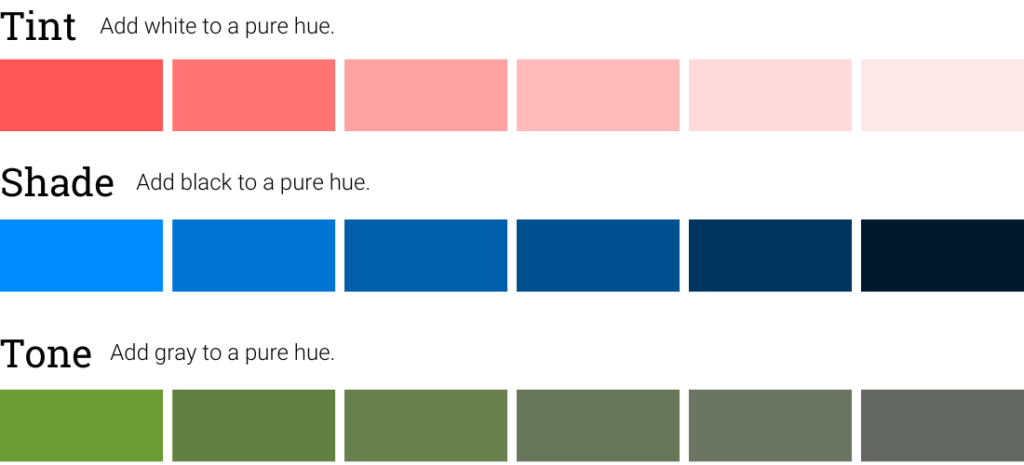
Value
A value indicates the lightness or darkness of a color. It’s determined by how much white or black the color has in it. A super light orange or light blue have white added in. They’re considered a tint and are lighter in value.
Tint = Add white to a pure hue.
Shades = Add black to a pure hue.
Tones = Add gray to a pure hue.
Chroma
A note on accent colors & making things “pop”.
I talk more about picking color schemes and accent colors in our Good Logo Colors & Best Combinations blog post, but here’s the short story on accent colors. You don’t have to add neon colors, outline letters, add a starburst or even a huge heavy shadow to make something ‘pop’. The poppage can be obtained by simply choosing a color that contrasts with the others in your color scheme…or, heaven forbid, adding space around the object you want to stand out in your design to set it apart and make it easy to see.
Choosing your colors.
If you aren’t married to any set of colors yet, it may be best to first define what you DON’T want. Because that gives us designers room to play. So first define any colors you’re offended by or just feel wrong. Then consider what you want your colors to say about your brand to build a short list of options.
Color theory is more of an art than a science.
As mentioned earlier, color theory is the study of how things work together and how colors make a psychological impact on human emotions and behavior. 85% of purchase choices made by shoppers are influenced by colors.
But remember, color theory for brands is just a theory. Studies on how colors affect humans are all over the place. Culture, age, AND gender impact how people feel about colors.
Take paint colors for example. I read about wall colors ad nauseam before having my first baby. I wanted the nursery to be the perfect hue. We didn’t know our baby’s gender yet, though, and I didn’t want to saddle a little boy with a pink room for the foreseeable future. And no one has time to paint after the new baby arrives, so naturally we gravitated to a green or yellow color palette.
Carleton Wagner says yellow stimulates the anxiety center of your brain. Conversely, Leatrice Eiseman found in her research that most people associate yellow with sunshine, warmth, and cheer. And last but not least, according to the American Psychological Association, yellow can strain your eyes which can cause babies to be fussy so…alas the walls to Ellis’ room were painted green.
So ultimately your gut reaction to a color is as important as your audience’s. Despite the varied perceptions of colors, you DO want to choose colors for your brand. Colors make your brand 80% more recognizable, according to Colorcom.
Chroma is color intensity or purity. A hue with high chroma has no additives. No black, white, or gray added to it. Adding those colors to another hue reduces its chroma. Neon colors are great examples of high chroma colors.
What your colors say about your brand.
Blue
Positive Associations
Negative Associations
Blue is a popular brand color for law firms, accountants, tech companies, and nonprofits. The feeling blue evokes is largely dependent on the hue. Navy will feel more conservative, but tech brands tend to embrace a brighter chroma royal or cyan blue.
People love blue – 57% of men and 35% of women rank it as their favorite color. And 33% of top brands use it in their logos.
The flipside of blue.
While people love blue, we also use it metaphorically to denote sadness or melancholy, like “feeling blue.” We also use it to explain something unexpected like “out of the blue.” Which feels pretty contradictory to the positive adjectives people used to describe it like “trust” and “serenity.”
Because blue isn’t commonly found in natural foods, it has been found to suppress appetites. Probably why most fast food restaurants don’t sport blue logos.
Green
Positive Associations
Negative Associations
You see green a lot for brands like health foods and anything outdoorsy, from landscaping companies to farm equipment dealerships.
In medieval Europe, green was associated with wealth and status. It holds some of those connotations still today and is a very popular bank brand color.
Green is a fan favorite, ranking in the top three favorite colors for both men and women.
It can be a very effective secondary color in your color scheme because, depending on the intensity and hue, it can blend in and feel almost neutral.
Like blue, we tend to use Green metaphorically in the English language. When we refer to a person or business as “green” we mean they’re new or fresh. We also use it to convey jealousy, like, “green with envy.”
Yellow
Positive Associations
Negative Associations
You’ll find tons of yellow logos in the paving industry, roadside destinations like gas stations, fast food restaurants and popular retail chains.
In general, use yellow in moderation.
When designing brand materials like brochures or websites, yellow, like red, is amazing when used in moderation. It draws attention in both rural and urban settings; pops right out of designs and landscapes alike. In design, yellow works well when balanced with cooler colors and neutrals because too much yellow can get loud fast!
In some Eastern cultures, yellow is associated with royalty and spirituality. It is believed that yellow stimulates mental activity and creativity as well as appetite.
Yellow indicates danger and a need for caution.
On the flip side, in nature, yellow can indicate danger – poisonous animals are often black and yellow for example. And we use it in signs and traffic lights to indicate changes in road conditions and encourage motorists to slow down.
Some research suggests yellow stimulates the anxiety center of your brain and in the English language we use “yellow” to express cowardly behavior and lack of ethics.
Orange
Positive Associations
Negative Associations
Orange is FUN!
In the United States, orange is often associated with Halloween celebrations where it symbolizes autumn, harvest, and the supernatural. In the Netherlands, orange is associated with the Dutch royal family and national pride.
Despite all those positive connotations, orange gets a real bad rap.
It’s one of the least popular colors regardless of gender, culture, and age. 29% of people claim orange is their least favorite color. And 26% of people associate orange with low prices, which might be why we see it promoting clearance prices and markdowns in retail stores.
Orange is still a very popular color for call to action buttons.
That’s because orange is the complementary color pairing for blue, everyone’s favorite. When paired together, orange nearly jumps off the page drawing attention to itself surrounded by the color hue of blue.
Orange is tough to get ADA Compliant. It almost only passes compliance as a background color when topped with flat black text. And light orange doesn’t often pass on white either.
Red
Positive Associations
Negative Associations
They say the color red raises blood pressure and stimulates the pulse rate and appetite. It’s an extremely popular color for fast food restaurants, law firms, and construction company brands.
Red is an amazing accent color – it’s certainly an attention grabber! One popular study proved red call to action buttons tend to convert higher than green. But gigantic sections of red feel pretty intense. Almost like the information is yelling at you. That’s not to say you can’t – Crisis Line Text does a great job of balancing red with white and pink to make their red dominant color scheme work.
Red can be a tricky color for ADA Compliant Design.
It CAN be done, but the contrast needs to be just right to ensure the content is legible. It’s best when used on a white background. It doesn’t often pass compliance on darker backgrounds.
Plus, if red’s your color, your design also needs to function without it. Color blindness affects 1 in 12 men. Individuals with red/green color blindness may experience difficulty distinguishing colors that contain elements of red or green. For example, they can mistake blue for purple because they don’t perceive the red component of purple.
Normal Vision
Protanopia (Red Color Blindness)
Photo Source: https://www.colourblindawareness.org/colour-blindness/
Purple
Positive Associations
Negative Associations
We see more food brands in the purple line up coupled with tech, churches and nonprofits as well. But overall we don’t see it as often as blue, green or red.
Historically purple has been associated with royalty. But different cultures perceive purple differently. The Romans wore it even though it was more expensive than gold and Queen Elizabeth I declared only the royal family could wear it! In Japan, the color purple signifies wealth and position. While in Thailand and Brazil, purple is a color of mourning.
The experienced designer in me feels obligated to warn you about a few challenges with purple…
While it’s lovely, it can print unpredictably.
Sometimes dark blueish purple can end up looking navy while a reddish purple can feel like maroon or even brown. If those are your colors, just talk to your printer and potentially do a test run to make sure you get the color you’re looking for.
Which makes sense because the MayeCreate designers assure me from their years in art school that purple is one of the most PIA colors to mix. They buy red, blue, yellow, white, black and mix them to create most of their hues but opt for a tube of pre-mixed quinacridone violet to round it out because it’s so hard to get purple right consistently. Probably because purple is the hardest color for the eye to distinguish.
Go forth and pick some awesome colors!
While color theory for brands provides some pretty cool insights into the psychological impact of colors and their influence on consumer behavior, choosing the right colors for your brand is best accomplished by finding balance between theory and intuition.
Consider factors like cultural associations, age, and gender preferences, alongside your own gut reactions to colors. And with that information at hand you can craft a color palette that effectively communicates your brand’s identity and resonates with your target audience.
For more tips on picking a color palette check out our blog post/podcast combo exploring good logo colors & best combinations. Or by all means, call us! We can help you pick, design is what we do after all!
Sources:
Who Manifested This Madness?

This fabulous human, that's who.
Monica Maye Pitts
Monica is the creative force and founder of MayeCreate. She has a Bachelor of Science in Agriculture with an emphasis in Economics, Education and Plant Science from the University of Missouri. Monica possesses a rare combination of design savvy and technological know-how. Her clients know this quite well. Her passion for making friends and helping businesses grow gives her the skills she needs to make sure that each client, or friend, gets the attention and service he or she deserves.