
Color Chronicles: Exploring Good Logo Colors & Best Combinations
July 12, 2024

CONSUME CREATIVELY
This content is available in:
AUDIO
TEXT
Choosing the colors for your brand is a cross between art, psychology and science. So unfortunately there aren’t hard and fast rules to follow. There’s not a rule about how many colors make a good logo. There’s not even a list of best color combinations for logos or brands. There are, however, lots of things to consider before putting the final stamp of approval on your logo colors.
While your brand is more than just your colors, using consistent colors makes your brand 80% more recognizable. Colors play a large role in your audience’s perception of your brand, but they don’t stand alone. You can showcase your brand personality through icons, imagery, fonts, words and more.
The right logo and brand color combination will:
- Reflect your brand personality
- Provide reliable design options
- Allow you to set yourself apart from the competition
Before we explore the big 3, let’s start with the basics – brand color palette types and uses as well as popular color schemes.
Good Logo Color Considerations to Pick the Best Combinations
The best logo color combinations are balanced. Most palettes include both primary and secondary colors with some contrast between colors. Combining light and dark or bright and reserved colors enhances legibility and creates depth and dimension in your design. And ensures it is flexible enough to display well in all mediums.
Color combinations or branding color palettes fall into two categories:
1. Your logo, small and simple printed materials
High chroma color hues are welcome and well suited for logos, signs and business cards. These items usually have a fairly simple color palette of a main color supported by a neutral color like black or gray and just maybe an accent color. Because these elements are simple in nature, you should usually keep them to three colors to avoid overly busy designs and keep the content feeling organized and cohesive.
2. Digital and more complex printed materials
For more complex designs with many elements, your colors will keep your design feeling consistent and coordinated. A balanced palette is especially important for these materials. Designing with lots of information without making it feel overwhelming is far easier to achieve with a good mix of neutrals, brights, light and dark options.
So how do you know which color combination is best for your logo?
Off to art school we go!
Many balanced color palettes fall into three popular color schemes:
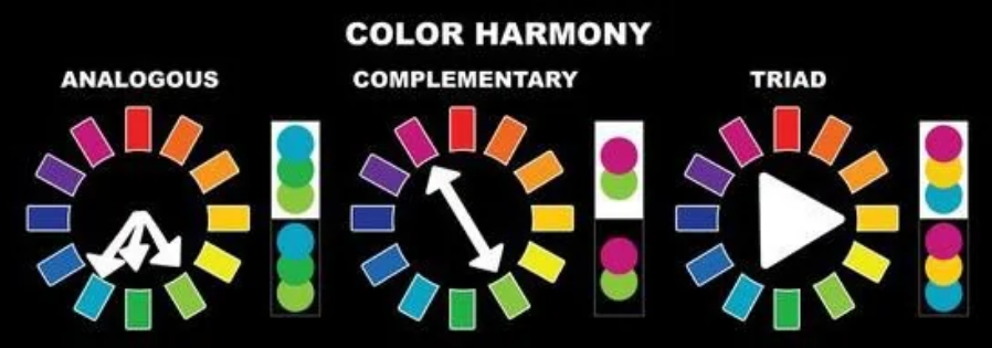
Complementary Colors
Most people know complementary colors live on the opposite side of the color wheel. For example, orange and blue are complementary colors. Using complementary colors allows one color to sit back and relax while the other pops. Usually a designer uses the relaxed color, like blue in our example, for most of the colored elements and drops in orange when they want to draw attention to an element.
So whenever clients come to us, and say, “I want this button to pop.” Most of the time we roll with a complementary color, because that’s going to jump off the page the most. But you don’t have to choose a complementary color to add emphasis. Some colors naturally jump off the page more than others. Warm colors like red, yellow, and orange tend to stand out more than cooler colors like blue, green or violet.
Analogous Colors
Analogous colors are colors next to each other on the color wheel. For example red, orange and yellow are analogous colors. Using analogous colors with neutrals in a color scheme gives you a more varied color palette to pick from while still creating a harmonious feel.
Triadic Colors
Triadic colors, like red, blue and yellow, make a perfect triangle around the color wheel. A triadic color scheme creates a vibrant palette with contrast and variation.
Neutral Colors
The most common neutral colors are black, brown, white and gray. But you can use tints, shades or tones in your color palette as neutrals as well. The neutral colors in your palette are usually used for subtle background colors and the text on your marketing materials.
Tint = Add white to a pure hue.
Shades = Add black to a pure hue.
Tones = Add gray to a pure hue.
I like a palette with a dark, medium and light neutral to add variety and options for organizing complex content in print and web designs.
Learn more about colors including how they influence people’s feelings and behaviors in our color theory for brands blog post/podcast combo.
Now onto the considerations to choose the best logo color combination for your business or organization.
1. Reflect your brand personality
How do you want your brand to feel?
How it feels is about more than just the colors. It can also be conveyed in the text casing, font and icon choices. But colors play a major role. If you’re not sure which colors you want specifically, keep reading, there’s a how-to exercise coming!
First, let’s review a few color palettes to spark your creative juices!
Monochromatic
In most cases, a monochromatic color palette feels more conservative.
Cool colors also give off a cool considerate vibe.
Bright & Varied
While brighter colors like orange and yellow tend to feel more fun. Even purple can feel fun depending on the hue. More color variation and brighter colors feel youthful and energetic. But be careful not to overwhelm.
Muted & Soft
Softer, less saturated colors feel more feminine. These types of palettes produce a homey, comfortable feeling.
Earth & Jewel Tones
Earth tones can feel fresh and balanced because we see them in nature all the time. Mixing earth tones with warm or jewel tones can add interest and variance in your designs.
Consider your audience.
As you consider how you want your brand colors to make people feel, also take into account the potential preferences of your audience. Color preference of your audience can depend on many factors like culture, age and gender.
Cultures perceive color differently.
For example, in Japan, the color purple signifies wealth and position. While in Thailand and Brazil, purple is a color of mourning. More on colors and cultural perceptions in our Color Theory for Brands blog post/podcast combo.
Color preferences can adjust with age.
Recent studies of adults suggest a preference for blue, the universal favorite color among both men (57%) and women (35%), increases with age while red decreases slightly.
Men and women prefer different colors.
Men tend to choose more powerful colors, maybe that’s why so many construction company logos are red and black. But men say their top three favorites are blue, green and black. Their least favorites are brown, orange and purple.
Women, on the other hand, opt for blue, purple and green as their favs. Their least favorites are reported to be gray, brown and orange.
2. Provide Reliable Design Options
A good logo color combination isn’t a design liability.
Before choosing your color palette, you need to figure out what you’re going to do with the darn thing. Your logo and brand colors will be used across various platforms and mediums, so you need to pick colors that work well in different situations.
Signage
Do you want a sign that stands out from the road?
You want your sign to grab attention. Brighter colors like red and yellow pop in both an urban and rural setting.
Do you want signage that people can read?
You’ll want bolder lines in your logo and potentially a white background for your signage. Thin lines and light text on a dark background are more difficult to read at a distance.
Do you want a sign that holds its color for decades?
Signs fade. And some colors fade faster than others. Red and purple (because it’s composed of red and blue), for example, have a shorter shelf life when exposed to sunlight. So if you’re making an investment in an expensive sign, just know darker and mild earth tones tend to hold their pigments longer.
Apparel
If you plan on monogramming hats and polos and your core color is yellow or a neon pink, just consider how everyone is going to look sporting those colors. Aaaand that’s all.
Digital
Digital advertising offers limitless colors at no additional cost. Though, in most cases, you’ll be showcasing more than just a logo in digital mediums. This makes it especially important to develop a brand color palette complete with neutrals, main and accent colors.
Because light shines through colors in a digital medium, choosing super bright colors for your main colors can make the design feel loud, and if that’s what you want then by all means fill your screen with orange, yellow and red! But if not, consider choosing a cooler color like blue, green or purple as your main color and save the warm or higher chroma colors like neons for your accent colors.
Neon colors don’t exist in 5 color process printing. Neither do sliver, gold or other metallic colors. If you want to use them as part of your logo colors, know you’ll be paying for a special ink to bring them to life. And that might be totally worth it to you!
Some colors, while lovely, can print unpredictably.
Sometimes dark blueish purple can end up looking navy while a reddish purple can feel like maroon or even brown. If those are your colors, just talk to your printer and potentially do a test run to make sure you get the color you’re looking for.
Similar to digital, choosing a balanced color palette for your brand will allow you to create materials that are easy to read, feel professional and organized, while still remaining true to your brand.
ADA Compliance
8% of men and .05% of women are color blind in some way.
If your audience is predominantly male, make sure you have plenty of contrast in your color palette and check to make sure your logo is legible even for those who are color blind.
We use WCAG Color contrast checker, a Google Chrome extension, to check the color contrast between foreground and background of our designs. It can simulate color blindness and evaluate the contrast for the simulations so you can see how your design looks for colorblind users. You can also input other colors or sample colors from a document to test for more optimal combinations.
3. Allow you to set yourself apart from the competition
Some industries are almost color locked. Construction and many trade contractors are red and black while banks tend to favor green.
Break from the pack!
Take a look at your industry and consider a color combination that will set you apart without making you look like a joke, of course – you want to be memorable in a good way. They’ll be visiting all the websites of your competitors while doing their research. A memorable logo color combination is a good way to leave an impression and increase their likelihood of remembering you.
How to define the best logo colors and combinations for your brand.
Your colors reflect you so the first step is defining what you want to represent. If you’re not sure, start by defining your core values (you can use the worksheet in our free Marketing Plan Workbook to get your started). Then associate those values with colors or find photos that inspire the feeling of your core values and use a system like Canva to pull out a sample color pallet.
Watch the process step by step using Canva.
Watch the video to see just how you can use Canva’s built in features to speed up the process of choosing the best logo colors and good color combinations for your brand’s color palette.
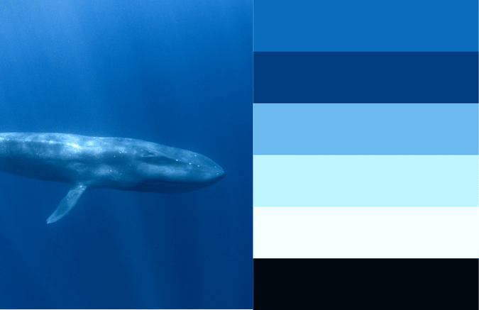
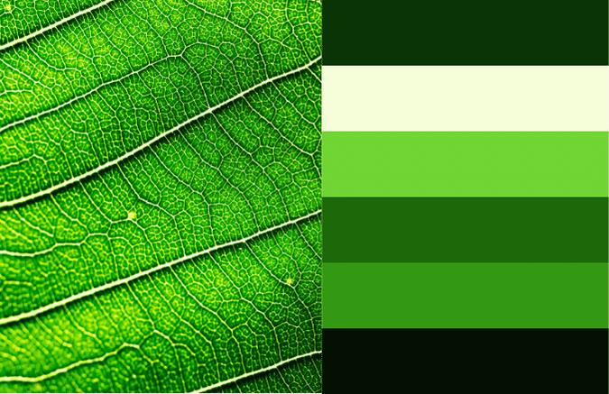
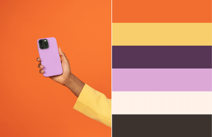
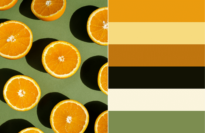
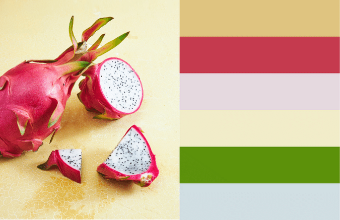
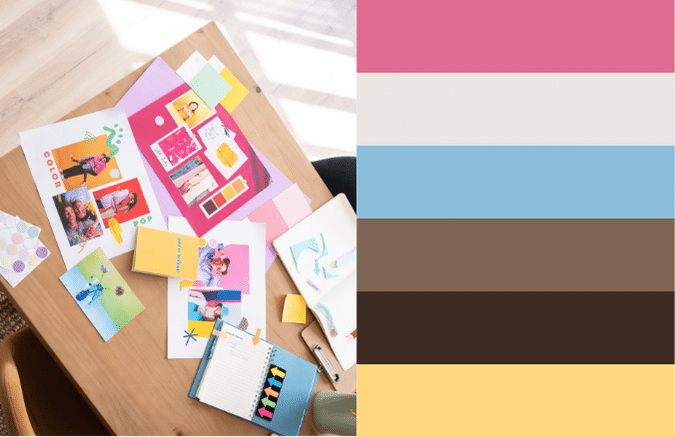
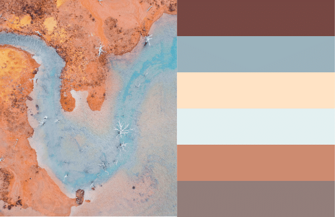
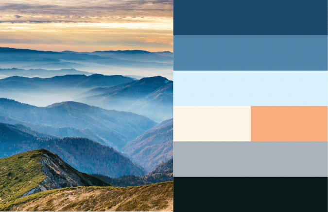
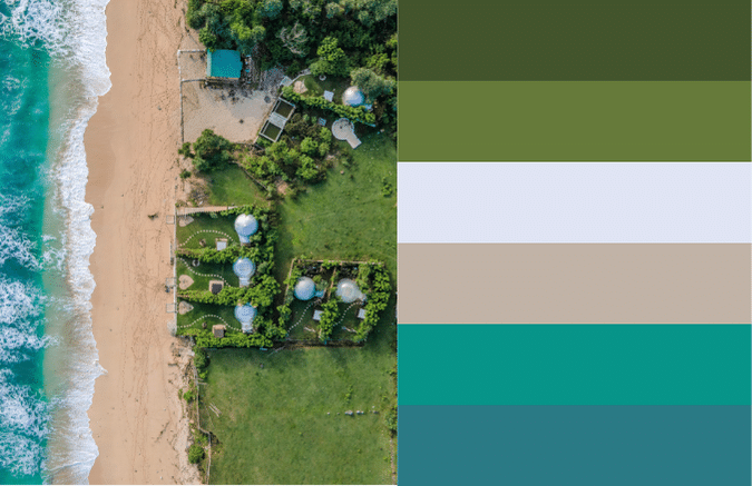
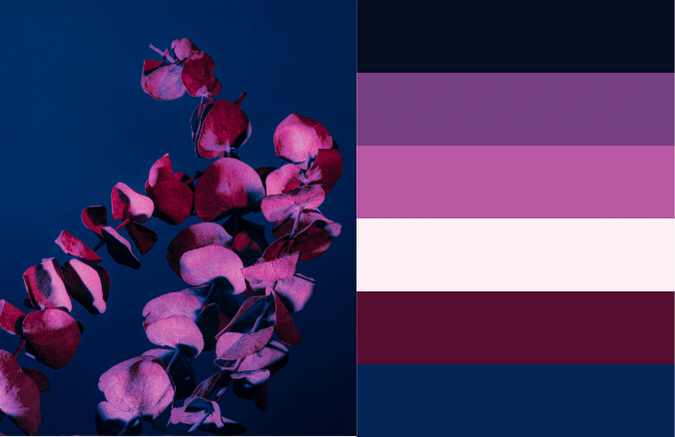
1. Start with a Main Color or Photo
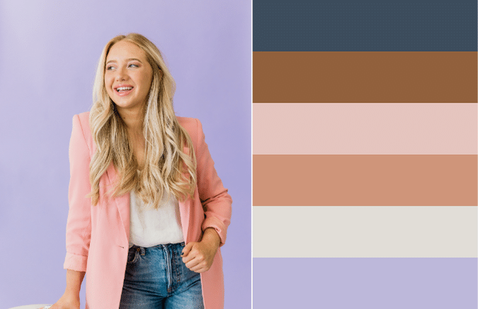
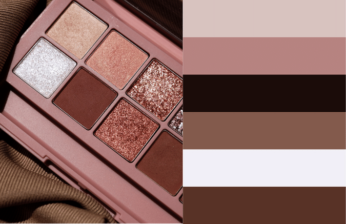
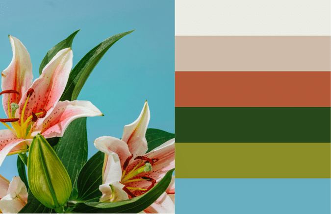
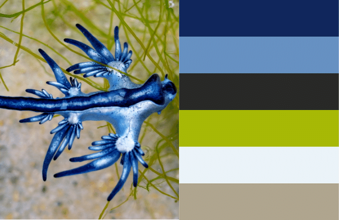
If you’re open to any color, use a program like Canva or a photo library like iStock to search for photos using your core value terms. Then you can start pulling colors from a photo that feels right to you.
You also start with a main color by identifying a color you like or a few that align with your values. And use your core value terms plus the color you want as your main color to search for photos in Canva or iStock.
2. Pull colors you like from the photo.
As you’re building your palette, plan for:
- A main dark color for your text*
- Colors to create visual hierarchy for your headings
- An accent color to call attention to key information
- A light color for your background*
*If you want to use “dark mode” style design where the background of all your materials is dark and the text is light, then choose a light color for your main text and a dark color for your background.
3. Adjust the colors until they feel right and work for you.
Adjust the colors you pull from the photo to create variance and contrast. They don’t have to be exactly the same color, they need to feel right.
Test colors on top of each other for legibility to determine if your palette is going to give you functional design choices. Make sure to test for ADA compliance for your color combos. We use a free Google Chrome extension, WCAG Color contrast checker for this.
4. Document the color code for your colors so you can easily find them when you need them.
If you’re in Canva, you’ll need to pull the hex code for your colors. This is technically to use the colors for web, but you can use those hex codes to set up colors for print as well and convert them to CMYK before sending off your document to the printer. You can always use a Google Chrome extension like Eye Dropper to pull hex codes from images.
Other resources we use often when playing with color palettes:
- https://color.adobe.com/create/color-wheel
- https://www.design-seeds.com/
- https://www.sherwin-williams.com/visualizer#/
Now, go craft your palette!
Hopefully you’re feeling ready to navigate selecting a good logo color and the best combinations for your brand. You know about all the stuff in the mix—like how different cultures see colors, what your audience likes, and the nuts and bolts of design. Use color psychology and theory to your advantage to create a visual that clicks with you and your audience. Because choosing colors isn’t just about making things look pretty; it’s a savvy move that can shape how people see your brand, help you connect with your audience, and make your brand stand out in all the right ways.
Who Manifested This Madness?

This fabulous human, that's who.
Monica Maye Pitts
Monica is the creative force and founder of MayeCreate. She has a Bachelor of Science in Agriculture with an emphasis in Economics, Education and Plant Science from the University of Missouri. Monica possesses a rare combination of design savvy and technological know-how. Her clients know this quite well. Her passion for making friends and helping businesses grow gives her the skills she needs to make sure that each client, or friend, gets the attention and service he or she deserves.


