Commercial Construction Website Trends for 2022
February 4, 2022

CONSUME CREATIVELY
This content is available in:
AUDIO
TEXT
Construction website trends are following many of the same trends in other industries with their own special flair. Understanding trends in design allows my team to help clients make strategic design decisions to make sure we’re promoting their business the best and most sustainable way on the web. Using too many trends makes a site seem overwhelming. But not using any can make it seem old even if its brand new.
I don’t expect clients to keep up on the trends – that’s like expecting every remodel client to be their own interior designer. So I like to do a deep dive and review websites every year and share what I find. Both for creative inspiration and to see what new things we might advise our clients to try this year.
How did I gather this data?
Well to be real, I googled “Commercial Construction Websites” and then I clicked on every article reviewing websites and reviewed them as I found them; good, bad and ugly — 55 in all. The construction companies are from all over the US and range from small to large. They don’t all do exactly the same thing, as I’m sure you would expect because Commercial construction is a pretty big industry definition, filled with everything from specialists to general contractors.
Here’s what I found…
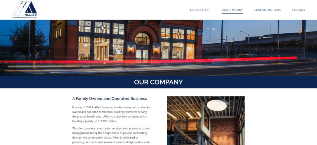
Pretty much the same navigation on EVERY site.
Navigational creativity is lacking at the moment. Simple buttons and a left-aligned logo no more than 1.5 inches tall… Is that enough of a trend for you? Lack of creativity isn’t all bad though. Almost all the sites followed the normal pattern for navigation, which will make their visitors feel at ease getting from place to place.
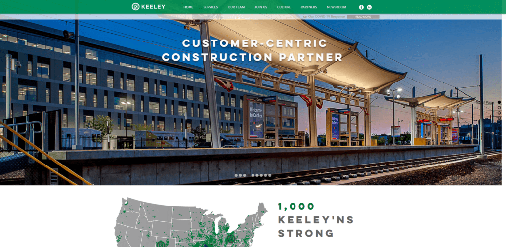 Typical Nav Bar with Color
 Typical White Nav Bar
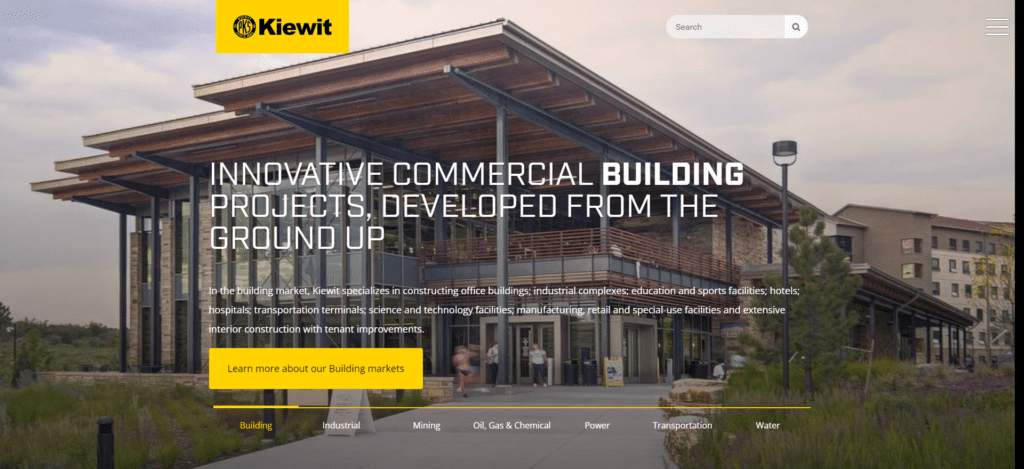 Mobile Menu Style
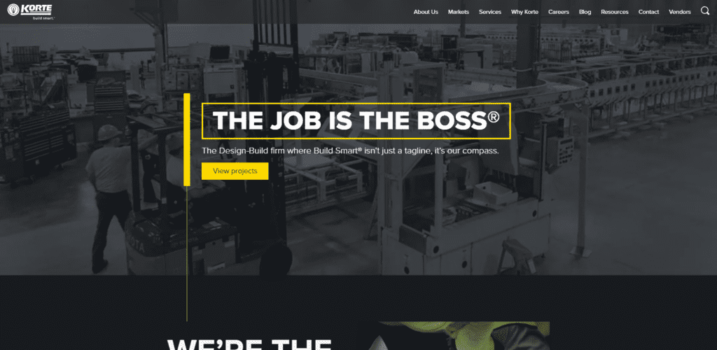 Typical Dark Nav Bar
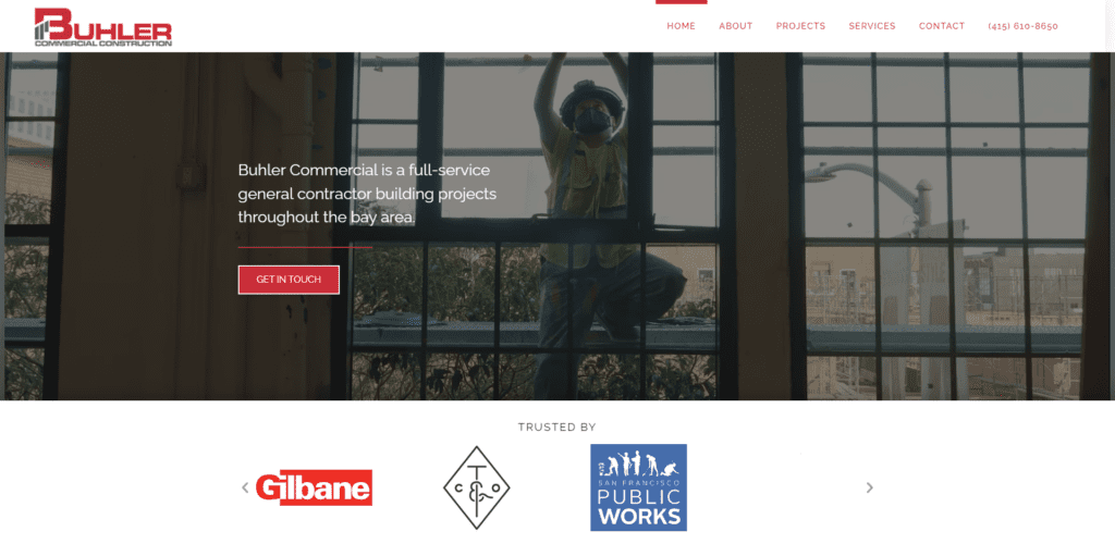 Typical White Nav Bar
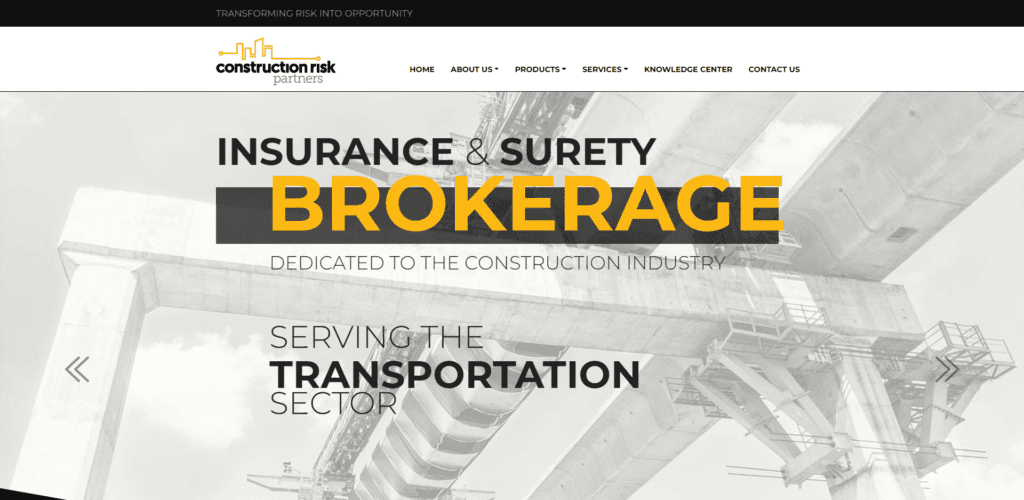 Typical White Nav Bar
 Typical White Nav Bar
 Typical White Nav Bar
Key Points
- Most navigation (62%) is between 2 and 3 inches tall.
- Footers closer to 4 inches tall on average and 75% have a dark background with light text.
- Navigation links are most frequently on a light colored bar at the top of the page (62%).
- Not a lot of flair going on, usually links are just simple text links. When you hover over them the text changes color.
- Pretty much every logo is between 1-2 inches tall and 1-2 inches wide and resides in the upper left corner. Like 90%.
- Sticky nav, that’s our technical term for navigation that stays put at the top of the screen even when you scroll, is pretty popular. 67% of sites are rockin’ it.
- The majority of websites (56%) have dropdown menus in their navigation.
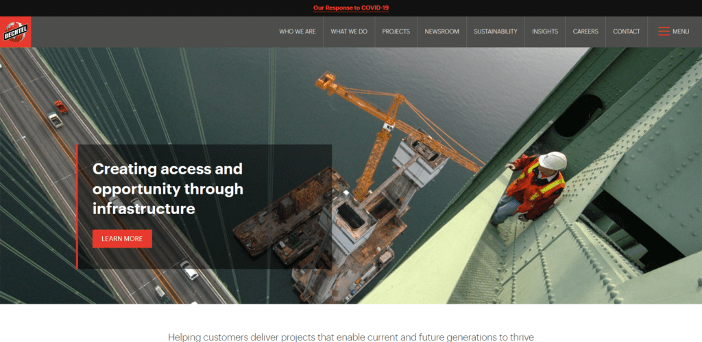
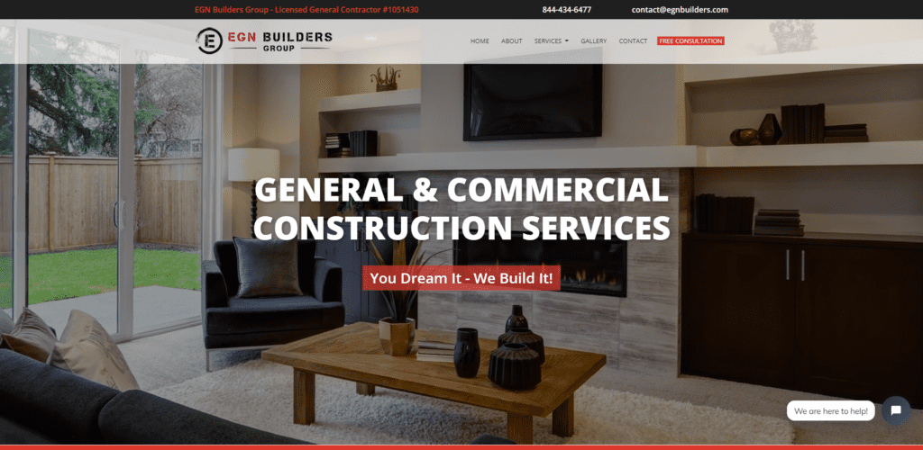
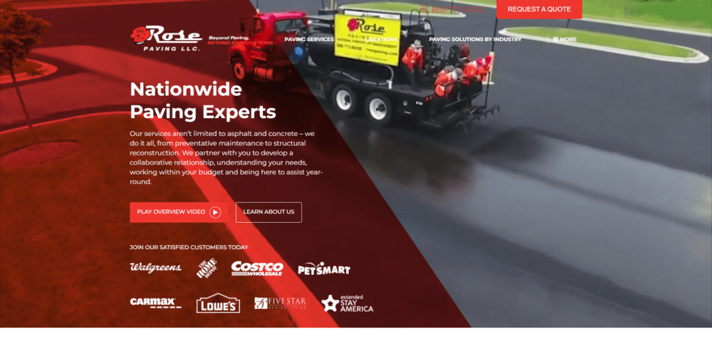
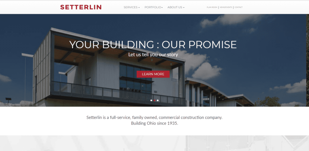
Big Ol’ Hero Images with Text on Top
Big hero images are on trend, I mean they have been for a while but they’re getting bigger. (A hero image is just a fancy way to say big pictures at the top of the home page).
 Mid Page Hero Image
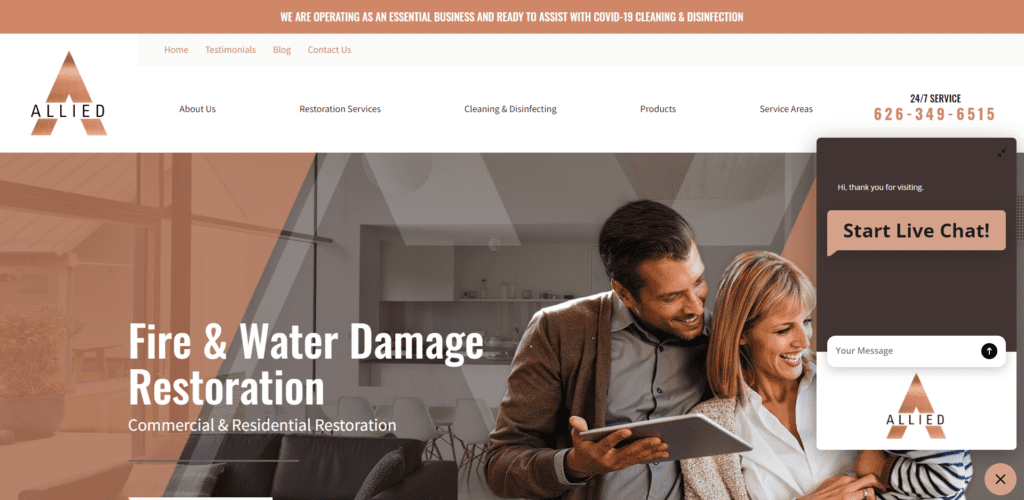 3/4 Page Hero Image
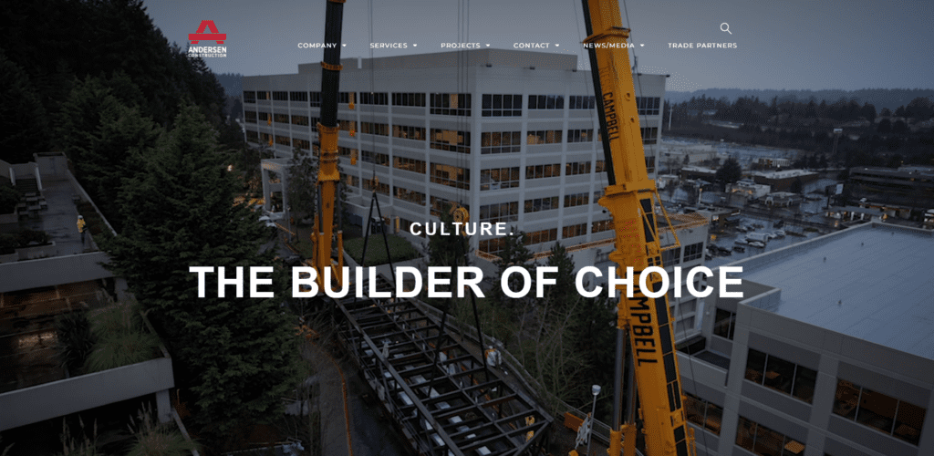 Entire Screen Hero Image
 3/4 Page Hero Image
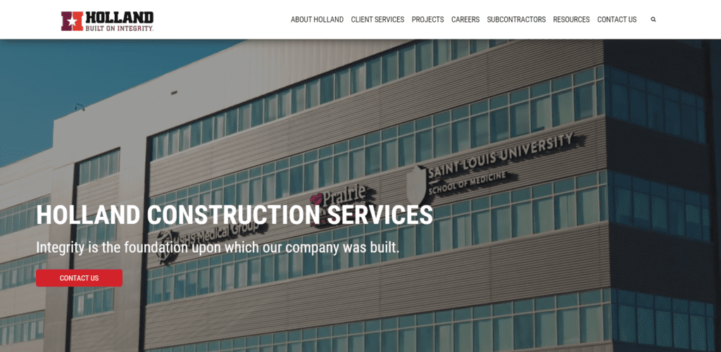 Entire Screen Hero Image
 3/4 Page Hero Image
 Entire Page Hero Image
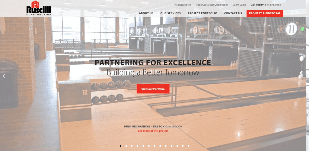
Key Points
- Most sites have at least 75% of their home page screen, if not the entire screen dedicated to imagery.
- Over 75% of the sites we reviewed had words over the top of those big old images.
- Close to 50% have a video for their hero image.
- Of those videos over half had drone footage and/or featured workers.
- Half of the home page videos appear to be created professionally.
💪PRO TIP
Big images are awesome but slow load times are not. Do a load speed test on your site to make sure all your images are loading quickly, especially on mobile.
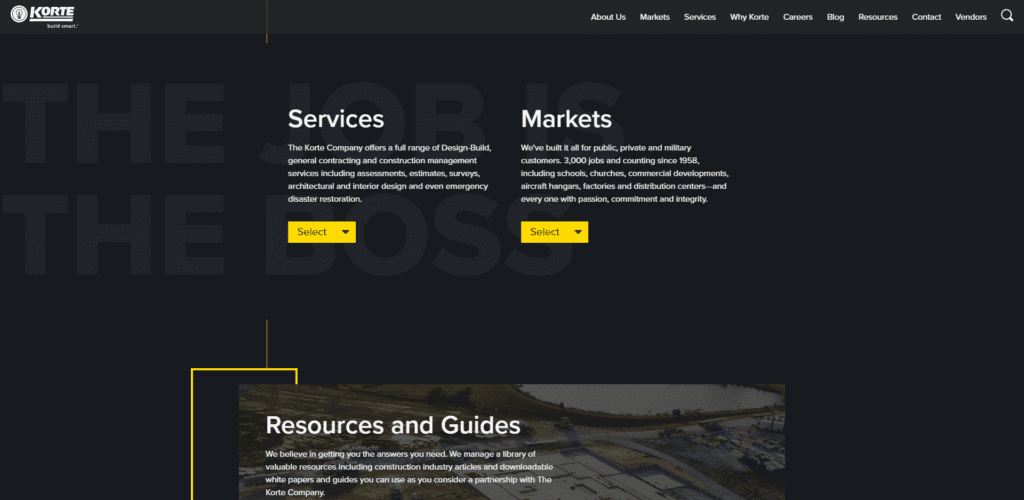
Boxy Call Outs, Big Text & Icons Add Interest
Most sites are well designed without a ton of fluff, minimalist designs are pretty common, but there are still some very fancy sites out there both from a design and functionality perspective.
 Bold Header, Box and Button Call Out
 Icons and Button Call Outs
 Lots of Boxy Call Outs
 Icons and Boxy Call Outs
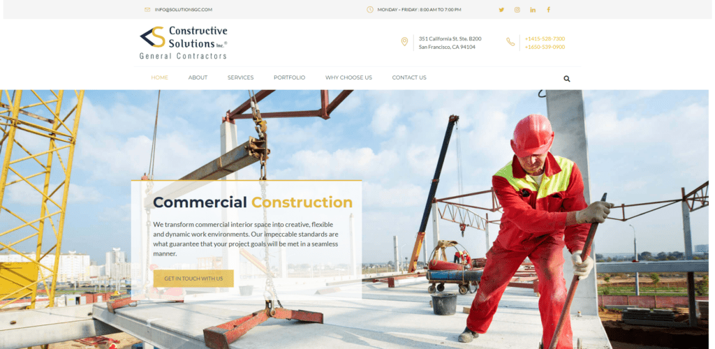 Bold Header, Box and Button Call Out
 Bold Header, Boxy Call Outs
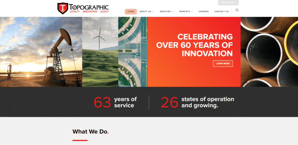 Bold Headers and Boxes
Key Points
- Most sites (65%) used big bold headers to call attention to sections of a page.
- Most fonts tend to be sans serif (meaning without serifs so like Arial).
- Boxes are coming back in style. 45% of the sites we reviewed added boxes around elements to call attention to the content.
- Over half of the sites had icons on one page or another to add interest.
Some fun trends that aren’t super prevalent across the board but I’m noticing more and more often are angled page breaks, loading numbers and using text as a design element. Korte Co. does text as design exceptionally well.
Increased Detail on Interior Pages
Most sites have a rockin home page. And design quality overall is on the rise. Most pages have a header image that takes up between a third and half of the screen.
 Interior page, Half Page Unique Header Image
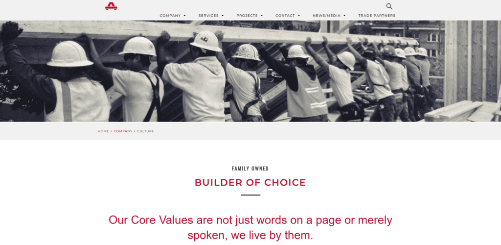 Interior Page, Half Page Unique Header Image
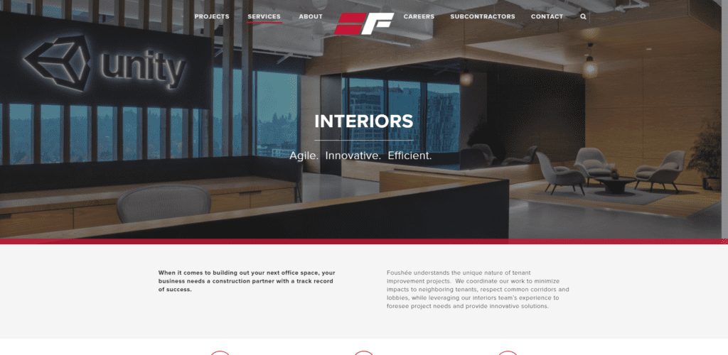 Interior Page, 3/4 Page Unique Header Image
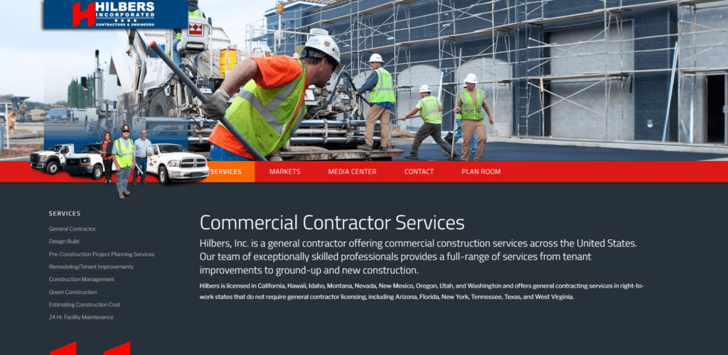 Interior Page, Half Page Unique Header Image
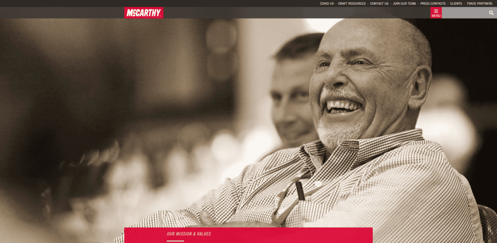 Interior Page, Enitre Screen Unique Header Image
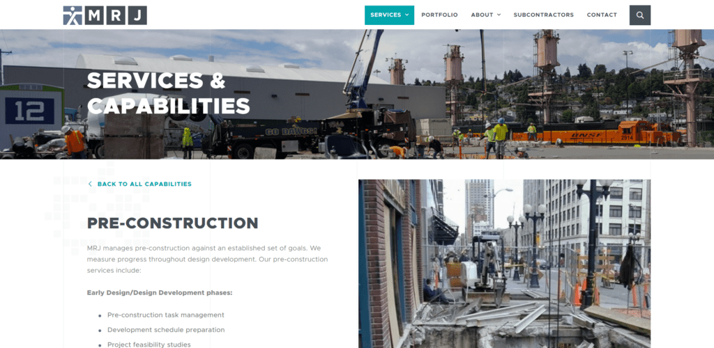 Interior Page, Half Page Unique Header Image
 Inteior Page, Entire Screen Unique Header Image
 Interior Page, Entire Screen Unique Header Image
Over half of sites:
- Use original design elements that are fun, creative and branded.
- Pay attention to their interior pages. Giving the information a design flare that encourages reader to stay on the page and actually READ it.
- Have a unique header image on each page.
- Place page titles overlaying the header images.
What used to be just one page with a bulleted list is evolving into a staple section in construction sites.
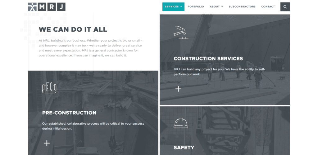 Services Section
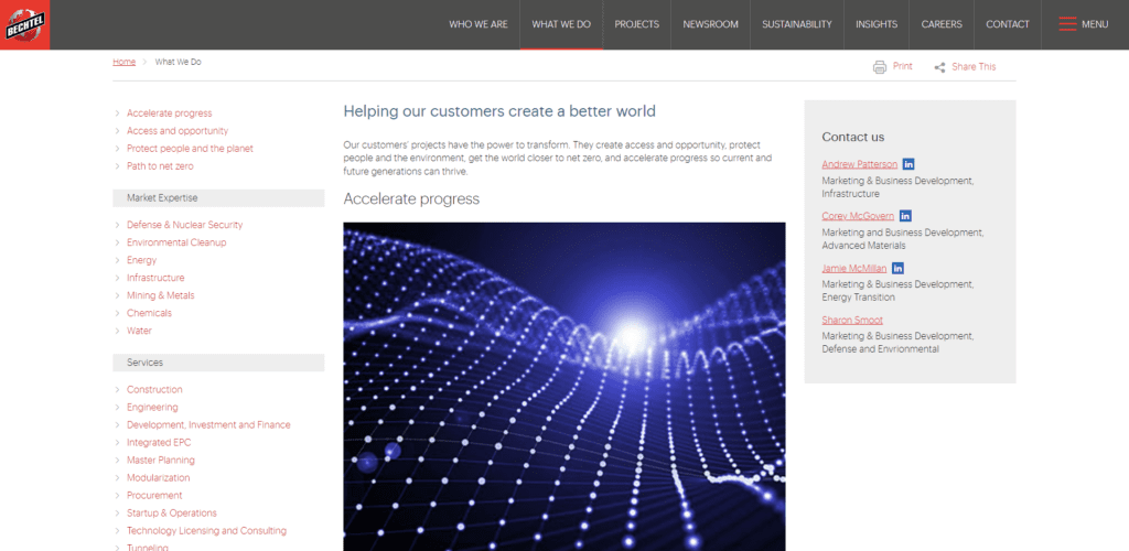 Services Section
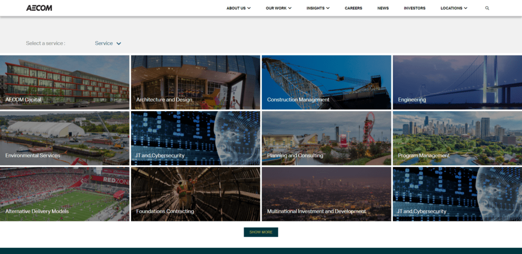 Services Section
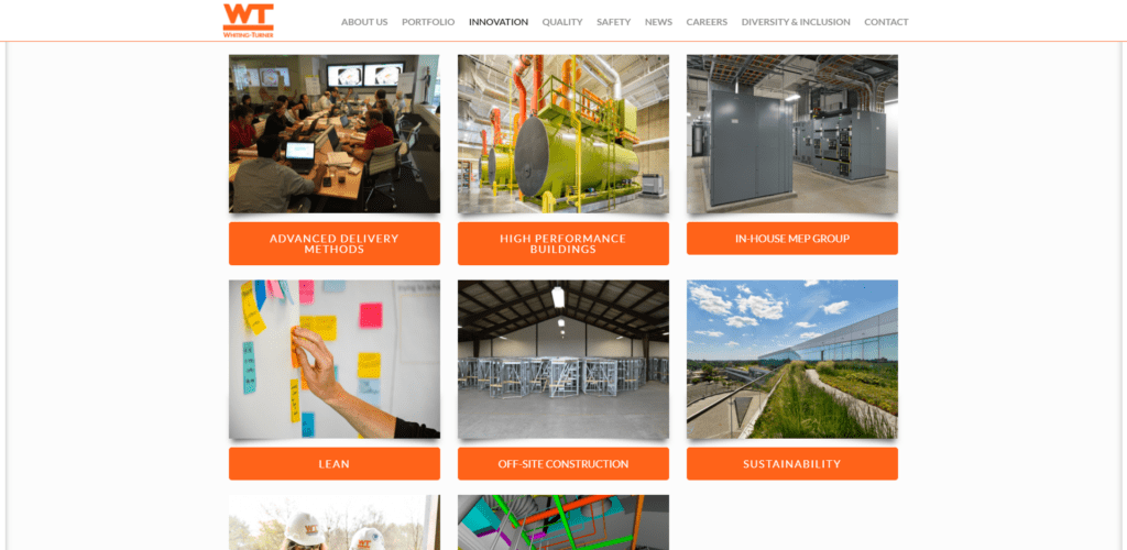 Services Section
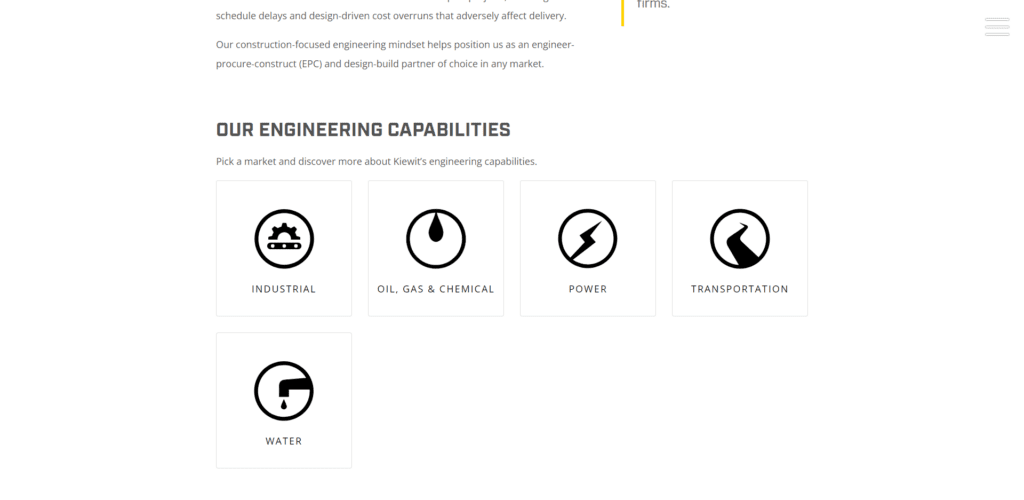 Services Section
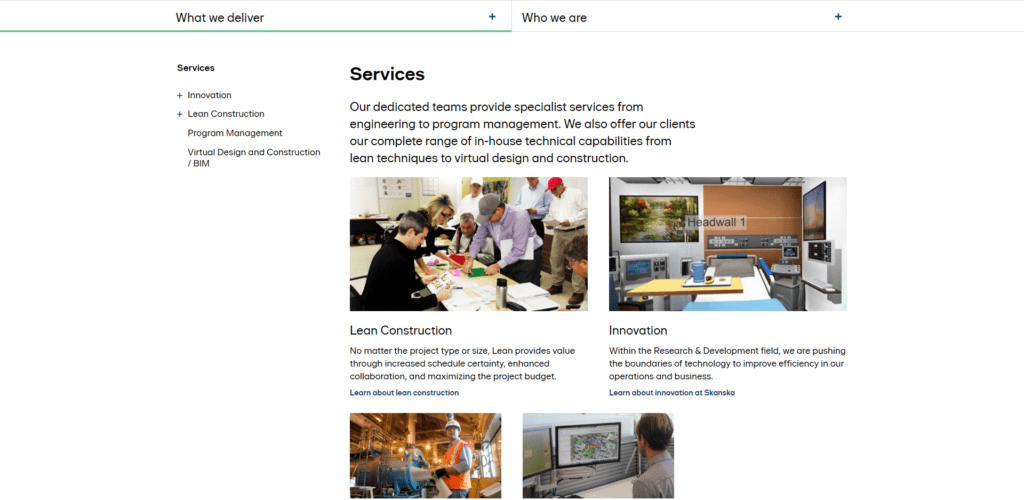 Services Section
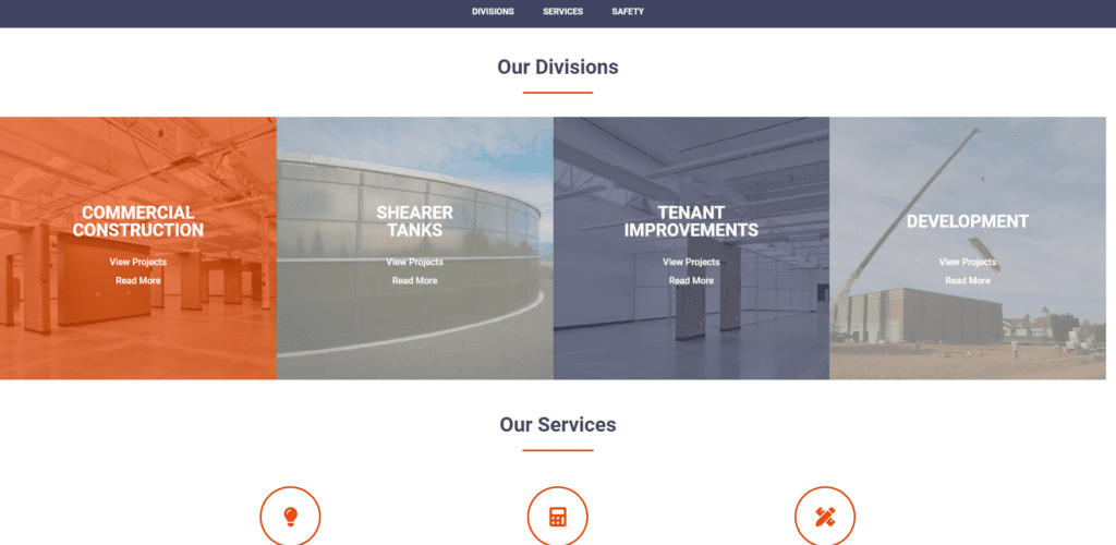 Services Section
Fairly Monochromatic with Pops of Color
EVERY site is using black and grey. Not surprising how many are red. I mean if you’ve ever been to an industry trade show before you’re acutely aware of construction companies’ infatuation with red.
I was surprised there wasn’t more yellow in the sites we reviewed. Many of our clients are heavy highway and those folks have an affinity for yellow. But our sampling was mainly commercial construction builders so maybe that’s the cause.

Key Points
- The majority of construction sites have light backgrounds with dark words over the top. But a fair number (around a third) are rocking dark backgrounds.
- Footers are mostly dark (77%).
- Navigation bars are usually light (60%).
- Fairly monochromatic sites with pops of color are on trend. Sites tend to use grey, black and one more color in their color pallet.
- Large bold headers are all the rage.
- Icons, subtle animations and boxy callouts are on over half sites.
Content (the words) are a toss up.
Some suck and others just plain suck you in and make you want to make friends (like DPR Construction and Alderson Commercial Group those people are either awesome or they have an awesome copywriter). Construction sites aren’t overrun with words. They tend to have more photos than words.
Professional Prolific ORIGINAL Imagery
Companies are investing in professional photography. And damn does it look good. Over 60% of the sites were bursting with awesome photos (that’s what I meant by prolific in the chart below).
It was exciting to see the faces of the company, the workers and the amazing things they build.
I can’t tell you how pumped I am to see the decline in stock imagery as I surveyed sites this year. Less than 30% of the sites had stock photos. If I never see that dork in the suit with the non-descript yellow hard hat holding his architectural drawing at a job site it won’t hurt my feelings.
Social Icons in the Footer
It’s worth mentioning that 80% of the sites reviewed had social media icons in the footer. Every site with social icons had a Facebook page and most had Linkedin. About half had Instagram and Twitter. Very few had a social media feed on their site.
No Blogs
Not many blogs to be found…over 65% of the sites didn’t have blogs. Of those that do blog there isn’t a pattern for how often they post. It’s evenly distributed between weekly, monthly, quarterly and hardly ever updated.
Robust Projects Sections
Almost all the sites I reviewed had at least some kind of projects section. The majority shared a main page with images that allowed people to sort by industry and click to view more information about each project. Smart idea. That helps drive traffic to your site and shows people how successful you are!
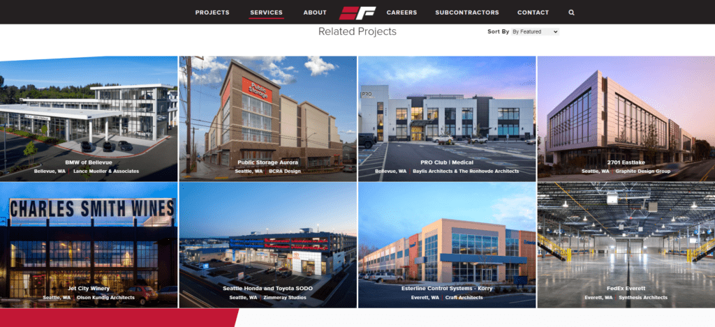 Multi-page Project Section
 Multi-page Project Section
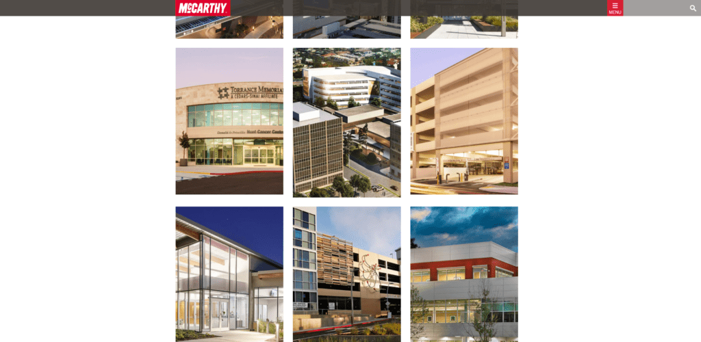 Multi-page Project Section
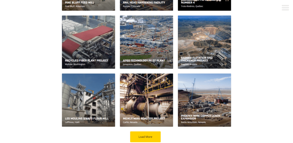 Multi-page Project Section
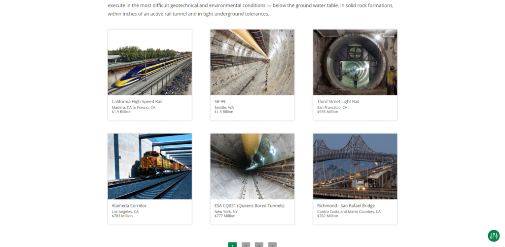 Multi-page Project Section
 Multi-page Project Section
A few key takeaways from our review of projects sections:
- Most projects sections have some ability to sort but only a few allow you to search by keyword.
- Half of home pages showcase projects and link to the projects section.
- About a quarter had some really cool rollover effects in their projects sections.
- Most shared very little written information about each project. Which is a no-no because Google likes words even if humans don’t.
💪PRO TIP
Make sure you put the link to your work in your navigation. And call it something people will instantly understand. Portfolio, Gallery, Projects – any of those work. Visitors want to see those pictures, don’t hide them by nesting the links to all that goodness in some paragraph they probably won’t even read.
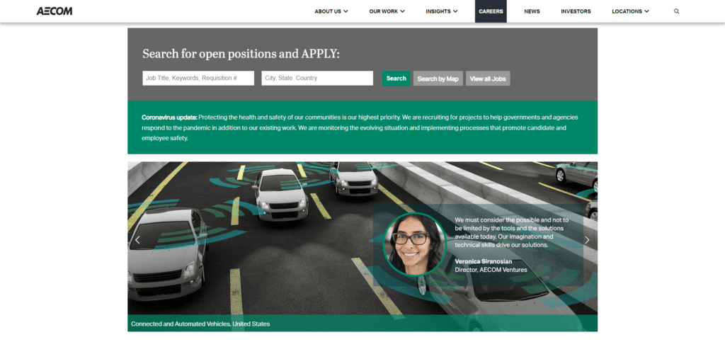
Careers Sections Linked from Main Navigation
Most commercial and heavy highway construction companies have at the very least a careers page linked from their top main site navigation.
 Job Search Feature
 Careers Home Page
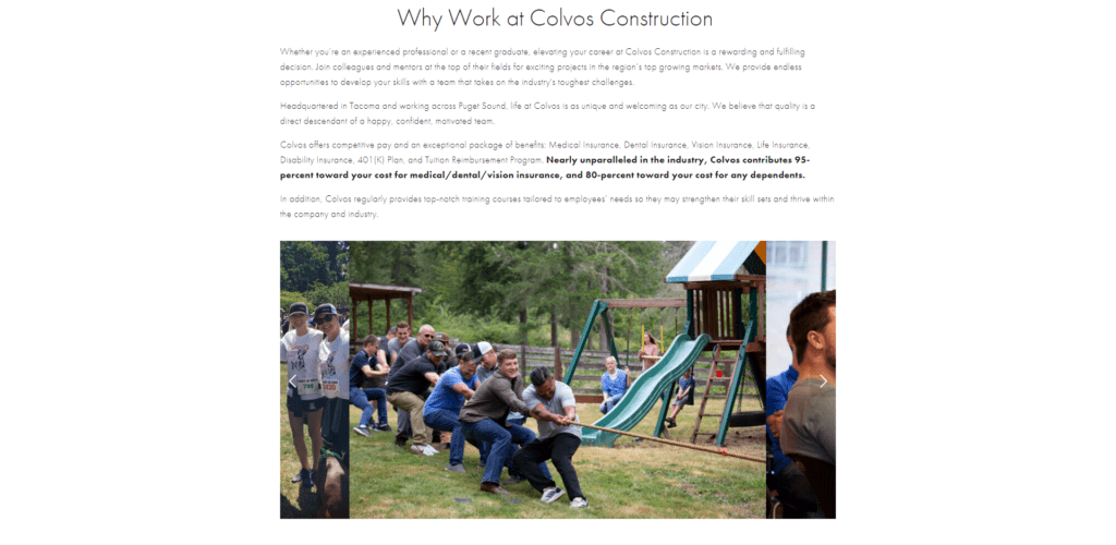 Company Culture
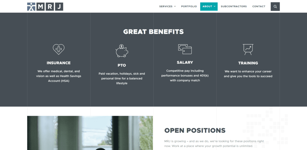 Benefits Section
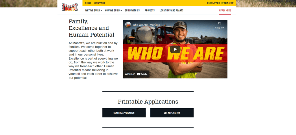 Company Culture
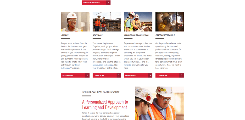 Job Categories
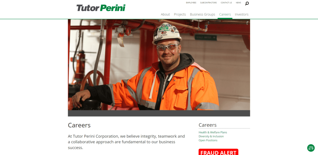 Career Home Page
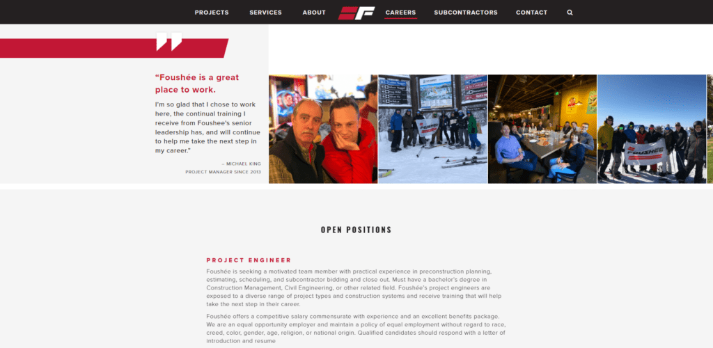 Company Culture
Key Points
- The majority share a paragraph about company culture, show available jobs and the ability to apply online.
- The majority just have one page dedicated to hiring and link out to another system to share job listings and collect online applications like Applicant Stack, Workday or Applicant Pro.
- Smaller companies have the ability to apply online but not much else.
- Larger companies are trending towards a whole careers section of their website dedicated to encouraging potential applicants to join the team.
- Residential companies don’t tend to have a dedicated careers page or section.
💪PRO TIP
It’s surprising to me that only half of the sites we reviewed share their benefits information on the careers page, that kind of seems like a no-brainer. Does your site have it? Better take a look!
SSL Certificates & Tracking But Not Cookie Compliance
I saved this bad boy for last because I figured I was about the only yahoo who cares.
Key Points
- Almost every site we reviewed has as SSL certificate. So that’s a positive.
- Only a few had cookie compliance popups or notifications…so that’s bad.
- Almost 90% had Google Analytics installed. WINNING!
- Around 40% had a search feature on their site.
- Over half use WordPress as their CMS.
💪PRO TIP
If you’re using Google Analytics to track site traffic you’re technically required to have a privacy policy and disclose to users that you are using cookies to track their actions. Figure out if you’re using Google Analytics and then make sure you have a cookie notification on your site that complies with your local privacy regulations and Google’s terms of service.
What trends are most important for your website?
The most important trends for you to review are those of your closest competitors. Their sites will help you understand what’s normal for your area and business type. You want to be as good as them, probably better.
Did your site participate?
Check out the list below to find out. And if it did, it was very nice to meet you! And thank you for participating. I learned something from every site I reviewed. If you want to know what I learned from yours just give me a shout and I’ll give you my notes!

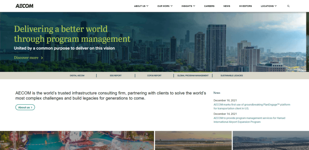
- Aecom
- Allied Restoration
- Allied Construction
- Andersen Construction
- Anderson Commercial Group
- BAF Corporation
- BAM Nuttall
- Bechtel
- Buhler Commercial Construction
- Builderscape
- Colvos Construction
- Construction Risk Partners
- Constructive Solutions General Contractors SF
- Constructive Solutions General Contractors
- CRC Incorporated
- DPR Construction
- EGN Builders Group
Who Manifested This Madness?

This fabulous human, that's who.
Monica Maye Pitts
Monica is the creative force and founder of MayeCreate. She has a Bachelor of Science in Agriculture with an emphasis in Economics, Education and Plant Science from the University of Missouri. Monica possesses a rare combination of design savvy and technological know-how. Her clients know this quite well. Her passion for making friends and helping businesses grow gives her the skills she needs to make sure that each client, or friend, gets the attention and service he or she deserves.