
Home Page Design Tips
December 12, 2025

CONSUME CREATIVELY
This content is available in:
AUDIO
TEXT
Think of your home page like a receptionist.
We like to think of websites as employees. Your home page is not a sales person, a deal closer or a product expert. It’s a receptionist. It greets people at the door, explains what you do, and leads them where they need to go. A good receptionist doesn’t dump the entire company manual on visitors the second they walk in. They’re friendly, they’re clear, and they make sure you get to the right place without wandering the halls confused.
Table of Contents

The problem?
Most home pages fall into one of two traps:
Crammed with every service, accolade, and piece of company history. Your business feels like a cluttered mess. Like a receptionist who won’t stop talking long enough for you to explain why you’re there.
Or they’re a barren wasteland of images with a sprinkle of text—a receptionist who ignores you until you stand in front of the desk and clear your throat, and even then won’t help you find what you need.
The result? People leave before they even figure out what you do.
A great home page is simple, scannable, and strategic.
It tells visitors what you do, proves you’re good at it, and makes it ridiculously easy for them to take the next step. That’s it. Everything else is noise.
Here’s how to build a home page that actually works.
Home Page Goals
To have a successful home page, first we have to know what the goals of a home page are:
- Let visitors act fast without thinking.
- Tell visitors what you do immediately.
- Explain why you’re awesome.
- Invite them to the party.
Let visitors act fast without thinking.
Your home page isn’t the spot for long eloquent poetry—it’s basically a slide deck. You want visitors to roll through it like a PowerPoint presentation, grabbing what they need without even touching your navigation (unless they’re ready to dig deeper right away).
- Share only the most important information on your home page
- Don’t overwhelm them with too much content
- Give quick overviews then link to more details elsewhere on your site
Here’s the deal: This “quick-scan” principle applies to your entire home page, not just one section.
This is where AI fails.
If you’re using AI to write your website content and you start with your home page 9 times out of 10 it will give you way too much to start. Before calling it done ask AI and yourself:
- Did I share only the most important information?
- Can people scan this quickly? (This can be a design challenge as well as content.)
- Did I get too specific? Should some of this information be housed on other pages of the site?
If you’re not sure, ask your AI program. We use Claude, and it often admits that the content is too wordy for a home page and suggests other pages on the site where the content would be more appropriate. More on writing content using AI.
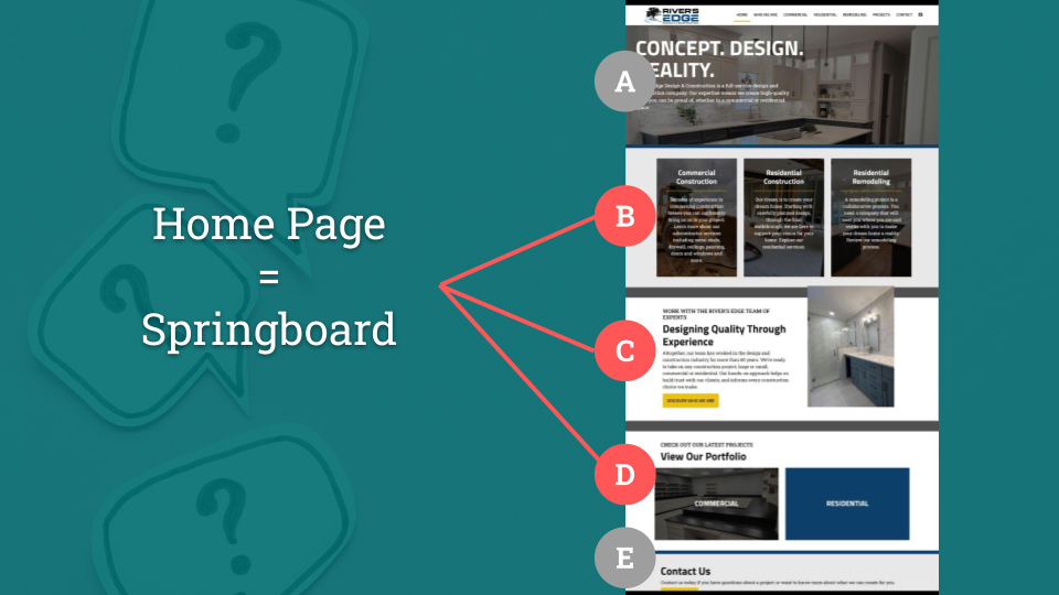
Home Page = Spring Board
If we want visitors to act fast and launch into the site, we first need to take a step back and ask ourselves: “What are visitors looking for?” and “What do you want them to see or do?”
We want them to get what they need quickly, without thinking—and sprinkle in the things you’d like them to take action on.
For example:
- Nonprofit: Visitors might be looking for ways to get involved or sign up for services. You want them to donate or check out your needs list.
- Commercial paving company: Visitors might be looking for your service list, service area, or completed project photos. You want them to see your careers section.
The top of your page should focus on what visitors need, but you can absolutely sneak in where you want them to go next. If it’s not relevant? They’ll ignore it and move on—totally fine. Even better—sometimes what they need and what you want them to do are the same thing.
If you’re not sure what your audience is looking for, look and ask around.
- Ask your sales human or the person who answers the phone or email.
- Talk to people in your audience, it’s a great ice breaker at a networking event!
- Google your company, usually the most visited pages on your site display below your home page on search results.
- You can even look at your competitors’ home pages to get ideas, you’ll likely see a trend between them.
- Heck, you can even describe your audience to ChatGPT and get its opinion!
Tell visitors what you do immediately.
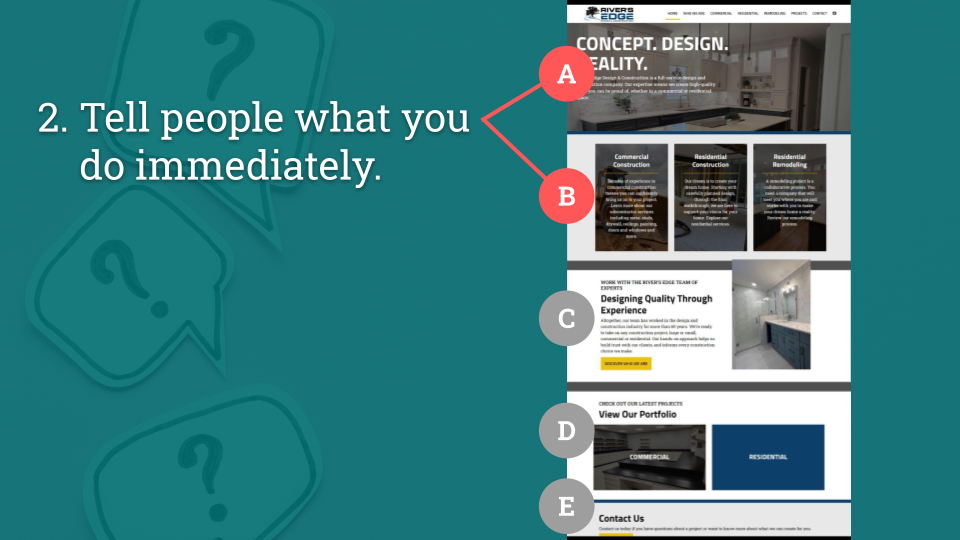
What you do ≠ Welcome to our website.
This is valuable real estate, people should FEEL welcome, you don’t need to tell them. Welcome them by anticipating their needs – tell them what you do so they know if they’re in the right place. Make it clear in nano seconds. This is not the time for poetic stanzas, I’m talking to you vague mission statement holders, no guessing or reading between the lines.
You’ll do this in two main places:
1. Hero Image/Slider/Video “Header” Area
Think of the very top of your page like a billboard. Your logo needs to be big enough to read. If your logo is an acronym, spell out your full name. Then tell people what you do in simple easy-to-understand terms that they can read while driving past at 70mph. This part of your home page is more than just ambience—it’s your first opportunity to give value to your visitors. So give them the best gift EVER: don’t make them think!
2. Services/Product Overview Area
On most homepages there’s a section near the top that shows people your services or product categories—basically a visual overview of what you do. This builds on your header area and gives visitors a quick way to jump to what they actually care about. Use clear labels and imagery, paired with brief descriptions if the labels need backup. Keep it scannable so people can pick their path and go.
- These need to LOOK like you can click on them and not just when you hover over them.
- They need to be big enough to click on mobile but not so huge they take up the whole screen.
- Multiple parts should be clickable – not just a little “learn more button”. Make the image the text AND the button clickable so people can get where they want to go with zero frustration.
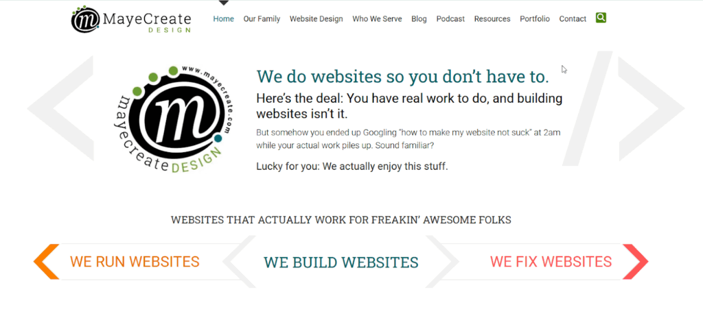
We keep the MayeCreate products and services area simple: “We Run Websites, We Build Websites, We Fix Websites.” Just the things people ask about most—no descriptions needed because the titles say it all.
Explain why you’re awesome.
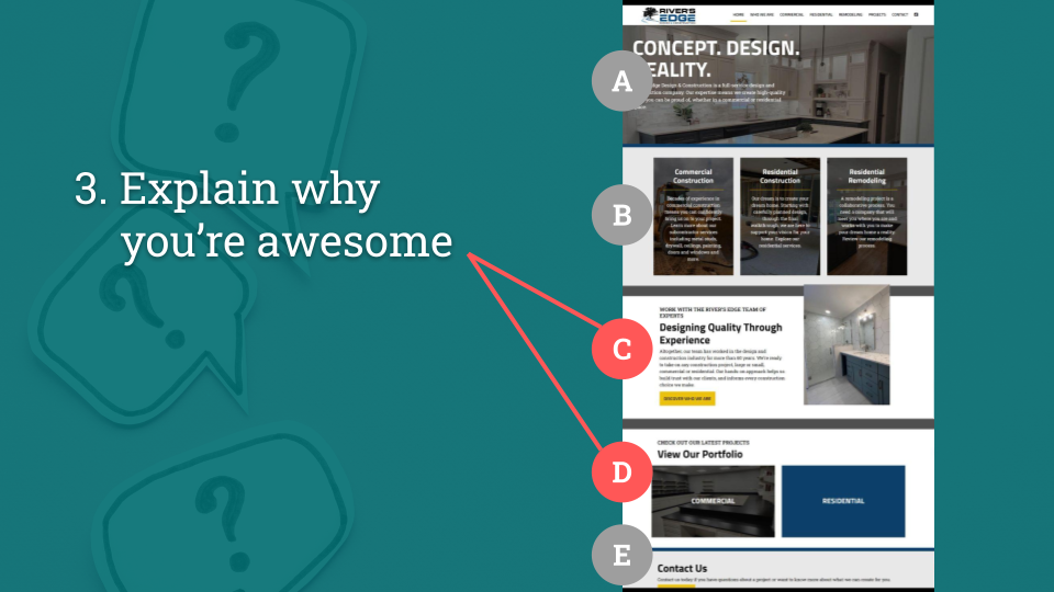
Now that people know what you do, you need to back it up. Don’t just talk the talk—show them you walk the walk. Use the middle of your home page to build credibility and answer the question every visitor is silently asking: “Why should I trust you?”
Think of this as your social proof section—a place to show real results, real people, and real impact. Here are a few ways to do that:
Feature testimonials.
Written or video testimonials both work great. Keep written testimonials on the shorter side, no one is reading 7 paragraphs – it needs to be quick and scannable, remember?
You can pull them from Google or Facebook reviews—there are even plugins that pull Google Reviews automatically, which is brave, cool, and great for building credibility because it shows you’re not making anything up. Those are real words from real people.
Bonus points if you include photos especially with written testimonials! And if your main goal is hiring, feature employee testimonials.
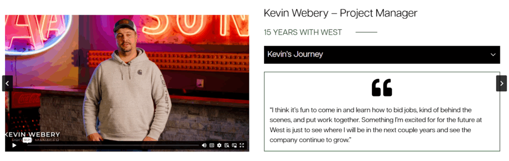
Employee testimonials on the West Contracting home page.
Link to your portfolio.
Show off your work with images that make people say, “I want that.” Your portfolio can be a simple photo gallery or a full-fledged projects section—just make sure it’s easy to find.
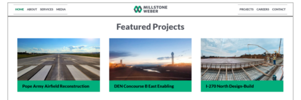
Featured projects on Millstone Weber home page.
Share case studies.
If you solve problems for a living, explain how. Walk people through your marvelous and brilliant process step-by-step so they can see themselves getting the same results.
Roll in numbers that matter.
Years in business, projects completed, clients served, money raised—whatever metrics actually prove you know what you’re doing. Make sure you’re using an ADA complaint block to build this! We use Kadence Blocks, it comes with a whole library including the scrolling number “Count Up” block.
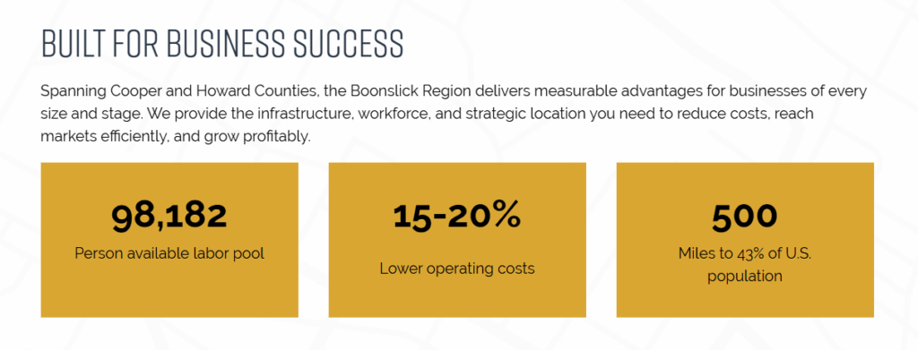
Scrolling data points on the Boonslick Community Development Corporation site show business owners the data they need to know about the region quickly.
Link to resources that solve their problems.
They’ve got a problem and you have the solution, so why not share it? Free helpful content shows you’re smart without being salesy.
Highlight recent community service.
People want to work with real humans who care. Showing your community involvement humanizes your business and proves you’re not just chasing dollars—you actually care about the greater good.
Display logos of clients you work for or organizations you’re a part of.
Make people want to join your “club.” When potential clients see you’ve worked with companies they recognize (even if those companies compete with each other), it makes them want to be part of that roster too.
If you don’t want to share client logos consider showing logos of the organizations you belong to. When visitors spot organizations they’re already part of it’s an instant connection. Like you have a mutual friend.
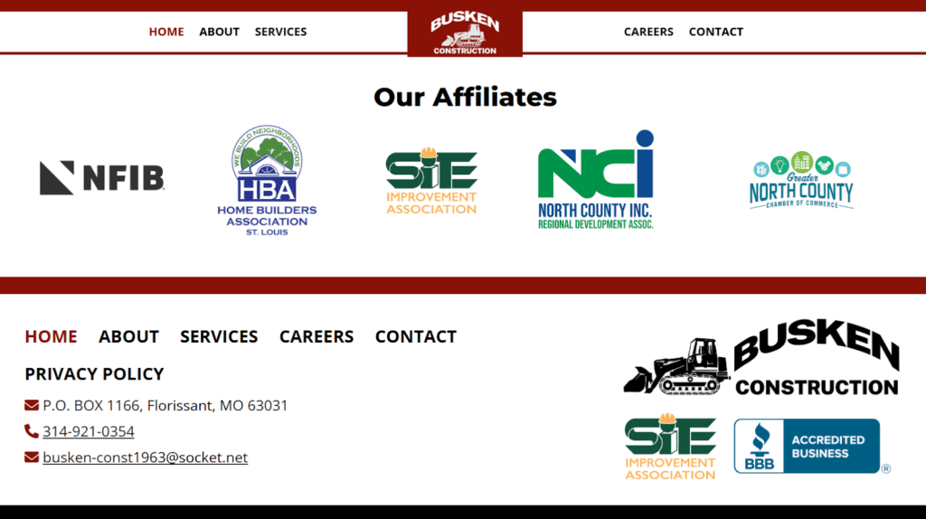
Affiliate organization logos are often showcased just above the footer like on the Busken Construction home page.
Display awards you’ve won.
If you’ve got it, flaunt it. Business awards show you’re respected among your community and peers, make sure website visitors know it.
Show off your awesome employees.
You’re only as good as the people who work for you, so introduce visitors to the great humans who make your business successful. This humanizes your business, shows you respect and appreciate your team, and might even entice visitors to join you..
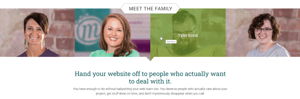
We work with clients all over the world, so we lead with our humans—featuring the team members who’ve been with us for nearly a decade and who clients actually work with.
And if nothing else, pair authentic imagery with powerful language – use real photos that show your work and story paired with words that bring them to life.
DON’T put everything on this list on your home page.
You don’t need to cram every testimonial, award, case study, and employee bio onto one page. Pick the things that best tell your story and show people why you’re awesome—then save the rest for other pages on your site where they’ll actually make an impact. Doing everything is overwhelming, which is the exact opposite of what we’re going for here.
Invite them to the party.
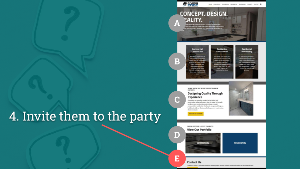
You’ve shown them what you do and why you’re awesome. Now what? Don’t leave them hanging—tell them exactly what to do next.
Ask yourself: What is the next step? What do they need to take action?
Match the CTA to how your business actually works.
Do you want visitors to:
- Call – Make your phone number big, clickable, and visible on mobile
- Visit your store – Show your location, hours, and maybe a map
- Request a quote – Put a contact form front and center
- Schedule an appointment – Link to your booking system
- Sign up for your newsletter – Make the signup form easy to spot
- Donate – Show a big, bold “Donate Now” button
- Apply for a job – Link to your careers page or application portal
Don’t make them hunt for this.
Your primary call to action might even appear multiple times on your home page—at the top, in the middle, and at the bottom. People decide to take action at different points while scrolling, so give them opportunities to say yes wherever they are on the page.
Design Tips
Use space to group items together into scannable patterns.
White space isn’t wasted space—it’s what makes your page readable. Group related items together, add breathing room between sections, and create clear visual hierarchy so people know where to look next. A cluttered home page makes visitors’ brains hurt.
Make sure it has words.
Google and AI can’t read images—they need actual text to understand what you do. Shoot for 400-800 words of text. Write for humans first, but make sure there are enough words on the page for Google (and ChatGPT, Claude, and every other AI out there) to know exactly what you offer and who you serve. AI summaries often favor specific, content-rich pages (like blog posts, guides, or FAQs) rather than homepages. Still, your homepage influences how AI tools interpret your brand and trust your site.
Make sure you SOUND like yourself.
Your home page should match how you actually talk to clients. If you’re a laid-back nonprofit, don’t write like a law firm. Consistency and authenticity builds trust. When people are searching for a service like yours, you need them to remember you. If you look and sound exactly like your competitors you’ll get lost in the shuffle.
Use real images of things you’ve done, your people or yourself.
Stock photos of people in suits shaking hands? Hard pass. Visitors can smell fake imagery from a mile away. Show your actual team, your real work, your physical space. Even a decent smartphone photo of your actual business beats a perfectly lit stock photo of strangers every single time.
Loads quickly.
If your home page takes more than 3 seconds to load, people are already hitting the back button. You HAVE to compress those huge header images, optimize files and videos, and test your page speed on mobile. Learn how to speed up load time on WordPress sites.
ADA Baby.
Your entire site, especially your home page needs to be accessible to everyone—it’s the right thing to do AND it’s the law. That means alt text on images, proper heading structure, color contrast that’s readable, keyboard navigation that works, and captions for any audio video content. When in doubt, run it through an accessibility checker. Learn more about making your website ADA compliant.
A warning about videos.
Home page videos are on trend right now, for a good reason – they look really cool. BUT if not properly formatted, they can also be huge and slow down your site—especially on mobile.
- Format a separate smaller video for mobile.
- Be honest with yourself, if the video doesn’t add the same flair on mobile (and it usually doesn’t), replace it with a static image to boost load time.
- If it auto-plays, your video needs to to be pausable to meet ADA compliance.
- And for the love of all that is holy, don’t make it auto-play with sound.
Make it mobile-friendly.
Over half your visitors are on phones. If your home page looks like garbage on mobile or requires pinching and zooming to read, you’ve lost them. Test it on actual phones, not just by resizing your browser window.
So take a hard look at your current home page.
- Does it pass the billboard test?
- Can someone driving by at 70mph understand what you do?
- Are you showing real proof or just talking about how great you are?
- Is your call to action obvious, or are people hunting for your phone number?
Can’t tell if your home page passes the test? Ask AI. Seriously—paste this article into ChatGPT, give it your website URL, and ask for a review based on the criteria we covered. It’ll give you a surprisingly helpful breakdown of what’s working and what’s not. Then take that feedback, combine it with what you’ve learned here, and build yourself an action plan to get your home page where it needs to be.
If your home page isn’t doing its job, fix it. And if you need help figuring out where to start, you know where to find us.
Who Manifested This Madness?

This fabulous human, that's who.
Monica Maye Pitts
Monica is the creative force and founder of MayeCreate. She has a Bachelor of Science in Agriculture with an emphasis in Economics, Education and Plant Science from the University of Missouri. Monica possesses a rare combination of design savvy and technological know-how. Her clients know this quite well. Her passion for making friends and helping businesses grow gives her the skills she needs to make sure that each client, or friend, gets the attention and service he or she deserves.


