10 Design Trends to Enhance Your New Website
January 28, 2014

CONSUME CREATIVELY
This content is available in:
TEXT
Over the past two years we’ve noticed a transition away from semi-realistic design trends like rounded corners and drop shadows. In addition, as technology progresses, designers now have cutting-edge ways to enhance communication, maintain user engagement, and ultimately make your new website way more awesome. Here are 10 of my favorite trends available to enhance your new website.

1. Menu Animations
Menu animations are an eye catching way to assist readers in navigating your site. They provide them a visual hint of where they are pointing the cursor on the screen.
The site for IMMVAC is a great example of how menu animations work. When you hover your mouse over each of the products in the product listing the menu will create a subtle sliding effect similar to a door opening on an elevator. The animation grabs your attention and lets you know that you have moved the cursor to one of the other products.
[ezcol_1half]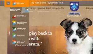 [/ezcol_1half] [ezcol_1half_end]
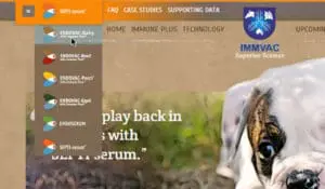 [/ezcol_1half_end]
2. Circles and Organic Shapes
The recent introduction of new coding technologies have provided designers with the ability to break the mold of the standard box shapes that where so prevalent just 2 years ago.
The site for designer Lucia Soto demonstrates this to the extreme. As you scroll through the site. a series of concentric circles expand out from the center of the screen. This creates an interesting effect that draws your reader in and keeps them on your site longer.
[ezcol_1half]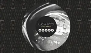 [/ezcol_1half] [ezcol_1half_end]
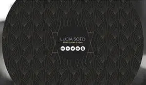 [/ezcol_1half_end]
3. Single Columns of Large Text
Websites with large text and a single column provide some very specific benefits. The first benefit is communication. The large text is easy to read and the single column provides an uncluttered feel. The second benefit is a consistent design across all devices. The large text and single column translate really well to mobile devices.
[ezcol_1half] [/ezcol_1half] [ezcol_1half_end]
 [/ezcol_1half_end]
4. Even Cooler Web Typography
With type foundries providing their commercial quality fonts for use on the web, designers have even more fonts in their arsenal.
The websites for Design Week Portland and Turner Classic Movies are great examples of how you can use amazing typography and still follow the basic search engine optimization rule of not using images for content.
[ezcol_1half]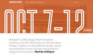 [/ezcol_1half] [ezcol_1half_end]
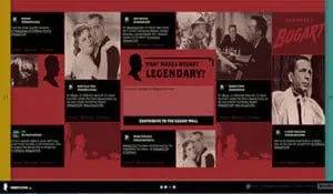 [/ezcol_1half_end]
5. Large Background Images
They say a picture says a thousand words, so why not make those “words” really big and grab the attention and emotions of your clients.
The sites for Def Jam Records and Whitmans new York do a amazing job of grabbing attention and building emotion through pictures.
[ezcol_1half]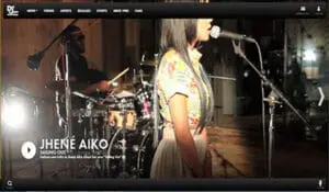 [/ezcol_1half] [ezcol_1half_end]
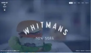 [/ezcol_1half_end]
6. Textured and Subtle Patterned Backgrounds
Another trend that is prevalent currently and will be continuing into 2014 is the use of texture and subtle patterns. They provide a warm, simple and uncluttered trait to the design.
Hollister California’s parchment paper texture and McDonald’s corporation’s subtle patterns of the burlap coffee bags are great examples of this trend.
[ezcol_1half]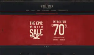 [/ezcol_1half] [ezcol_1half_end]
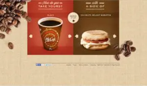 [/ezcol_1half_end]
7.White Space
When white space is mentioned, a lot of people hear the words white and space separately and think of stark which is furthest from the truth.
The best way to describe white space is clean and organized, minimal and not necessarily white. The white space trend is effectively pulled off by letting the viewers eye complete the implied shape that negative space (the space between the elements) creates.
[ezcol_1half] [/ezcol_1half] [ezcol_1half_end]
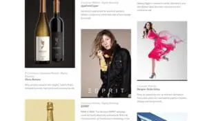 [/ezcol_1half_end]
8. Big Product Shots
If one of your product’s key features is it’s design, a good trend to follow may be a big product shot.
One well know example of this trend is Apple, they were one of the pioneers of this approach and they continue it today. Another good website example featuring large product shots is Tesla motor company.
[ezcol_1half]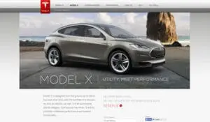 [/ezcol_1half] [ezcol_1half_end]
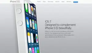 [/ezcol_1half_end]
9. Interactivity and User Buy In
Providing the visitor a way to enjoy their visit to your website gets them to stay longer, read more and even buy your products or utilize your services.
Coca Cola exibits this design trend with there website Ahh.com. The site provides a series of videos and creative games that get the customer to spend some time on their site, successfully keeping the brand in front of the visitor the whole time they are playing the games.
[ezcol_1half]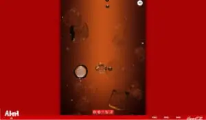 [/ezcol_1half] [ezcol_1half_end]
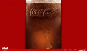 [/ezcol_1half_end]
10. Parralax Scrolling
Parralax scrolling is one design element that still amazes me. The best way to describe this trend is the content of the site and background images scroll at a different speed, creating a three dimensional feel to the site. It can be done in a subtle or over the top way.
The website for the movie “Life Of Pie” is an amazing example of this trend. The screen shots don’t do it justice. You will need to visit the site to get the full effect.
[ezcol_1half]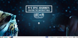 [/ezcol_1half] [ezcol_1half_end]
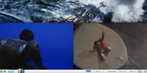 [/ezcol_1half_end]
Conclusion
Which one of these trends peaks your interest? Are there any web design trends not mentioned that catch your eye? As the technology progresses, trends are always in flux. Stay tuned for new trends that will be arriving on a browser screen near you.
Who Manifested This Madness?

This fabulous human, that's who.
Monica Maye Pitts
Monica is the creative force and founder of MayeCreate. She has a Bachelor of Science in Agriculture with an emphasis in Economics, Education and Plant Science from the University of Missouri. Monica possesses a rare combination of design savvy and technological know-how. Her clients know this quite well. Her passion for making friends and helping businesses grow gives her the skills she needs to make sure that each client, or friend, gets the attention and service he or she deserves.