5 Things You Should Put On Your Trade Show Banner
January 21, 2022

CONSUME CREATIVELY
This content is available in:
AUDIO
TEXT
We’re going to trade shows! They’re happening! We are getting in front of each other face to face!
So if you are the person on your team tasked with making sure you have an awesome-looking booth, I’m sure right now, you’re thinking a lot about what your signage will look like for your booth.
And that’s good. Don’t be the person who just gets in and wings it. Because then you forget stuff, which stinks because signage can be costly, and you want to make an amazing first impression. Especially since it’s been so long since you’ve had the opportunity to make face-to-face first impressions. (If you’re not sure how to set up your booth for success you may want to check out our recent post – how to set up an amazing trade show booth.)
So today we’re going to outline just what to put on your signage. I am putting on my art director hat, doing the same thing I would do for any of my designers – make a checklist of what you need to put on your trade show banner. Then I’ll give you the directions you need to make sure you or the person tasked with designing your booth does a great job and has everything they need.
Plan Ahead. Seriously.
Here’s a little nugget of goodness I have earned from the school of hard knocks: If you really want to have an awesome looking banner, you need to start months ahead of time.
And I’m not exaggerating. You need enough time to develop the initial designs, revise them, have them professionally printed and then shipped back to you. This process needs to start two months before you go to your trade show. It doesn’t happen overnight.
The process is worth it though. You want to represent the best version of yourself. That just doesn’t happen if you’re printing your banner on an inkjet and tacking it on a poster board like a junior high science project.
So make sure you start with plenty of time, especially if you’re going to be ordering it from a professional printer over the holidays. It feels like there should be plenty of time between November 1 and December 31, but what I find, my friend, is there’s just not. It just disappears then shipping gets backed up and the next thing you know you’re using last year’s banner for the first show of the year.
Start early. That way, you can have something awesome you’re super proud of to put up and display.
Don’t Show People Your Belly Button.
The way you plan to display your banner will dictate how you design it. Not every trade show is the same, so throughout the year there will be different parameters for setting up your booth, depending on what show you are at.
Think through the different shows you’re going to go to this year.
- How big is your booth?
- What are the spatial constraints?
- How tall are the ceilings?
- What will the booths around look like?
All of these elements weigh into how you will design your booth and your banner.
Consider how you’ll use your banner.
It might be a backdrop while you’re speaking. It could be set up on a table in a hallway. Or as a statement piece in your 12×12 (or even bigger) booth.
What’s the vantage point?
If you’re going to be setting your banner on a table, it will be displayed at a different vantage point than if it’s sitting on the floor. People won’t be looking at it from the same angle. Keep your design elements at eye level for people. If you don’t have a delegated “table height” banner consider creating an adjustable height banner. Maybe one that can be displayed at three feet or six feet.
Obviously you can’t account for all people of all heights…but consider the outcomes. I’m actually a person who can reach the top shelf. I’m just three inches shorter than my husband, but somehow, when I hang a mirror, he can’t see the top of his head in it because I’m hanging in at my eye level. Even if I’m inadvertently robbing my husband of his view of his lovely head of hair, by my shotty mirror hanging techniques I’m still guilty. You could be doing the same thing with your tradeshow signage. Allow people the pleasure of seeing all the important things by placing them at approximate eye level.
Good news though, this is easier to do on a sign than a mirror, I promise. Because people are standing farther back. You want your banner looking people in the eye. So think about where the most important information is hanging out on your banner, and make sure it’s front and center and at eye level.
Trick for designing adjustable height banners.
If you have a six-foot banner, and it’s designed to be looked at when it’s standing on the floor when you prop it up on something taller like a table, then you’re basically looking at its belly button.
A quick fix for that situation is to put the most information starting around 6 inches from the top. Then if you’re going to have to set it on top of a table, you’ll just set it up at three feet, and the most important stuff will be there at eye level. And if it’s displayed at full height the most important information will still be close to eye level – whala no one has to stare at its belly button.
Okay, so what should be on your banner?
1. Big Logo. Eye-Level.
Number one is your logo. It should be big enough that people can read it, see it and recognize it from outside of your booth. It shouldn’t be microscopic. I shouldn’t have to be six inches away from your banner to be able to recognize you.
Big logo around eye level. That is the first thing on your checklist. Big logo. Eye-level.
2. What You Do
Make what you do obvious on your banner.
Now, you could be one of those smart people, and you named your business something extremely obvious, like House Painting, and you’re a house painter. That would be awesome.
For me, though, my company’s name is MayeCreate, and our logo is MayeCreate big and then says design underneath small. We serve a lot of the construction industry, and there are a lot of designers in construction who aren’t web designers. So we have to make it obvious what we do.
You can tell people what you do in a tagline that can work really well. If that’s you, make sure your tagline is legible from outside your booth.
We actually handle it for our company with a bulleted list. Very simple:
- Web design
- Graphic design
- Online marketing
- Consulting
- Identity
Boom, that’s what we do, in a bulleted list, and we make sure it’s big enough for anybody to read from outside our booth, at least a good six to 10 feet away.
So that’s number two, make what you do obvious.

3. Contact Information
Make sure people can see the primary way you want them to contact you. You don’t have to include every way you can be contacted (just leave that fax number on your brochure, a lot of people don’t even have their phone numbers anymore).
Put your web address where people can see it and if you’re an overachiever consider a QR Code too.
Your contact information does not have to be so big you can read it from outside the booth. If people are interested in contacting you, they will come into the booth and then read the information on the banner.
You want the people you meet at the booth to be able to reach you after the event. Make it easy for them, and share your primary contact information.
Those first three things are the non-negotiables for your banner.
The next two things on my design checklist aren’t nearly as cut and dry as the first three. They’re going to be up to your opinion and taste.
4. Company Colors and Fonts
You want to design your booth and banner to match your overall brand. It doesn’t have to match your website exactly, but when people go to your booth and then visit your website, the two should feel the same. People shouldn’t have this weird gut reaction saying, “where am I?” It should be like, “oh, yeah, that’s the right thing.”
Your booth and banner need to match the other stuff you’re going to be giving out. So whether it’s a business card or your website, it should all be like, yeah, I know who you are. Just like any other type of branding, your company colors and fonts should be true throughout your signage.
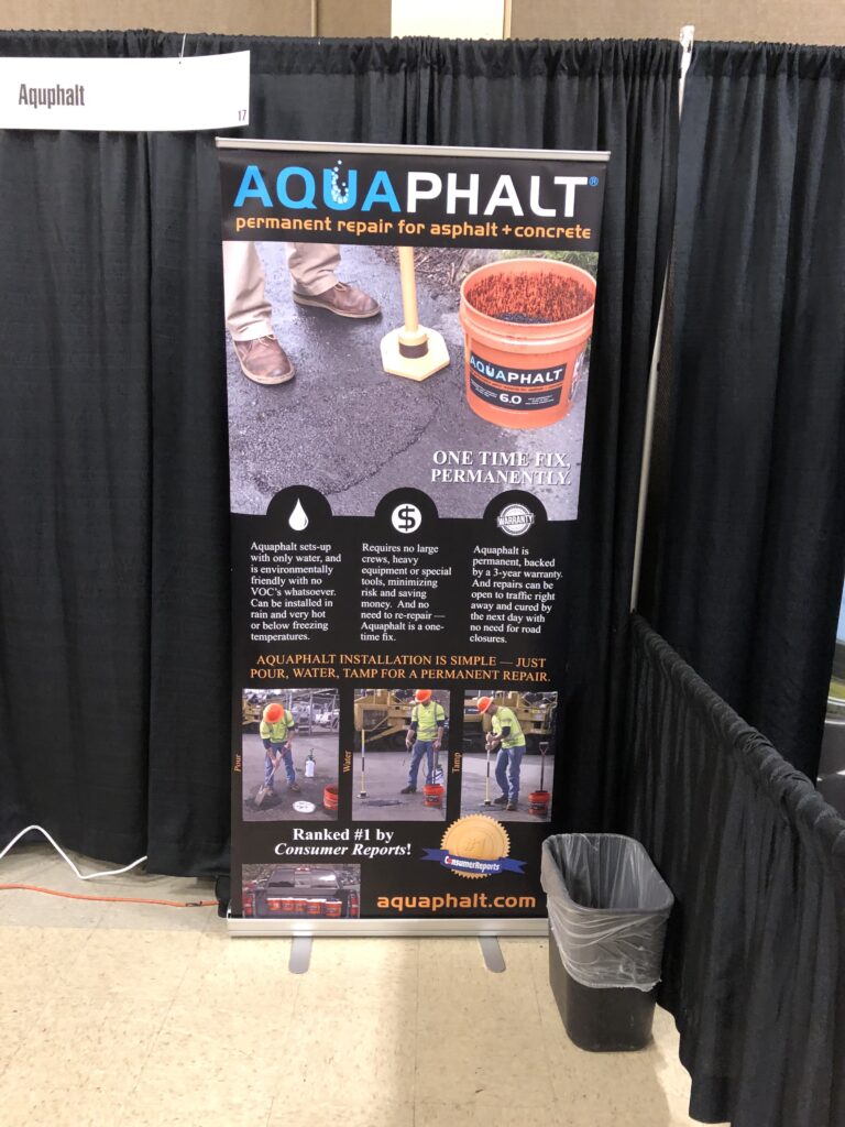
5. Eye-Catching Imagery
Now, this is an extremely gray area because eye-catching can be so many different things. It could be a cool pattern. It could be an amazing photo.
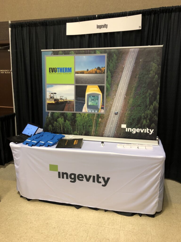
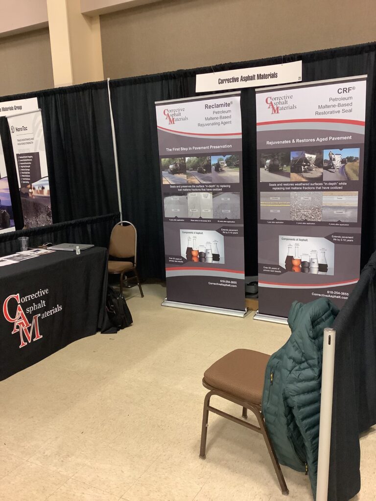
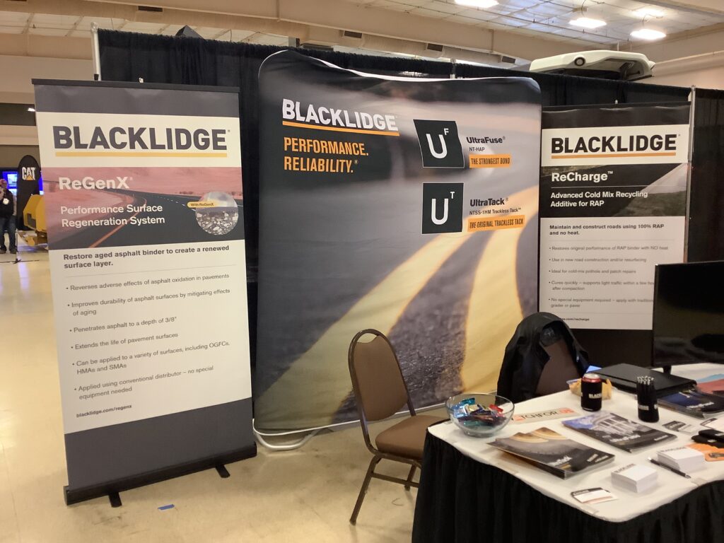
And when I say an amazing photo, notice I did not say 100 small images. This is something I see all the time at trade shows, especially those heavy highway friends. I love y’all. But you have these teeny, tiny pictures of all these different jobs, and it just doesn’t work.
You can have the pictures, but you need to display them differently. All those tiny photos are meant for the portfolio on your website. They’re not made for your trade show banner. On your trade show banner, pick a couple, maybe three amazing projects you’ve done, and showcase them there.
Your trade show banner serves a purpose more like a billboard than a brochure. Don’t cause collisions. Make it easy to consume at a glance. A good billboard is something you can read in seconds, and your trade show banner should be the same way.
You want people to see your booth and draw them in with eye-catching imagery.
Boom. There you have it.
That is my checklist, the five things you should put on your trade show banner, or else.
Remember, before you even design your banner, you’re going to start planning early, and you’re going to think about where you’re going to display it so you’re sure to put the really important things to be around eye level.
Don’t forget:
- Your logo
- What you do
- Your contact information, probably your website or a QR code
- Eye-catching imagery, something nice and big you can consume at a glance
- Your company colors and fonts because everything is pretty matchy matchy or at least goes together.
Who Manifested This Madness?

This fabulous human, that's who.
Monica Maye Pitts
Monica is the creative force and founder of MayeCreate. She has a Bachelor of Science in Agriculture with an emphasis in Economics, Education and Plant Science from the University of Missouri. Monica possesses a rare combination of design savvy and technological know-how. Her clients know this quite well. Her passion for making friends and helping businesses grow gives her the skills she needs to make sure that each client, or friend, gets the attention and service he or she deserves.