Creating ADA Compliant PDFs in Microsoft Word (Without Losing Your Mind)
October 24, 2025
")
CONSUME CREATIVELY
This content is available in:
VIDEO
TEXT
Those PDFs you’ve been posting probably aren’t working for everyone.
Remember when you could just export a PDF from Word and call it a day? Those simpler times are gone, my friend. The government decided (quite some time ago actually) that digital documents need to work for everyone, not just people who can see perfectly and use a mouse with laser precision.
And honestly? It’s kind of ridiculous that we needed a law for this. Making your content work for everyone isn’t just smart business – it’s basic human decency. Why would you accidentally lock people out of your awesome content when you could just… not do that?
Table of Contents
PDFs linked from your website need to work for people who:
- Use screen readers to “hear” your content
- Navigate with keyboards instead of mice
- Need high contrast to read text
- Rely on document structure to understand your content
And no, your current PDFs probably don’t do all of that. Sorry.
The good news? Microsoft Word actually has some pretty decent built-in tools to help you create accessible PDFs. You just need to know how to use them (and then double-check your work in Adobe Acrobat Pro).
Need help with Google Docs instead? Check out our Google Docs + Grackle workflow guide. Want to understand what makes a PDF accessible in the first place? Our PDF accessibility overview breaks down the requirements without the technical jargon.
What You’ll Need for This Adventure
Required:
- Microsoft Word (any recent version)
- Adobe Acrobat Pro (NOT Acrobat Reader – you need the full Pro version)
Optional but recommended:
- PAC (PDF Accessibility Checker) – free download for final validation
Time investment: About 30-45 minutes for your first PDF, then 10 minutes or less once you get the hang of it.
Phase 1: Set Up Your Word Document for Success
Use Real Heading Styles (Not Just Big Bold Text)
0:13 Using Heading Tags in Word
This is where most people mess up right out of the gate. Making text bigger and bold is NOT the same as using heading styles.
The wrong way: Selecting text, making it bigger, and clicking bold.
The right way:
- Select your heading text
- Go to Home → Styles
- Choose Heading 1 for main headings, Heading 2 for subheadings, etc.
- Use Normal style for body text
Why this matters: Screen readers use heading structure to navigate documents. Without proper headings, blind users can’t jump to different sections – they have to listen to your entire PDF from start to finish.
Add Alt Text to Images (And Mean It)
1:23 Adding Alt Text to images
Every meaningful image needs alt text. Every single one.
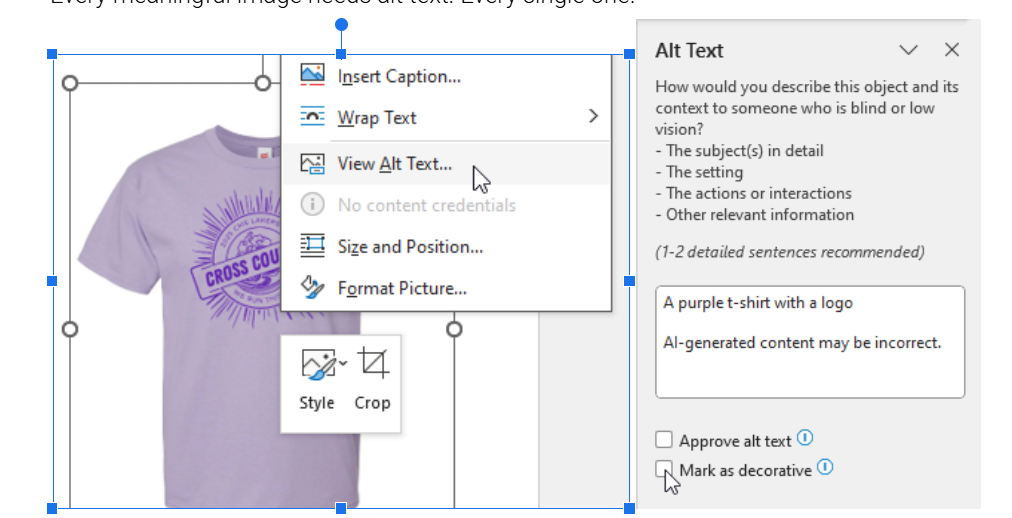
How to add alt text in Word:
- Right-click on any image
- Select “View Alt Text”
- Write a concise description of what the image shows
- For decorative images (borders, flourishes), check “Mark as decorative”
Good alt text examples:
- “Construction crew installing solar panels on residential roof”
- “Bar chart showing 40% increase in donations from 2022 to 2023”
Bad alt text examples:
- “Image1.jpg”
- “Picture of stuff”
- “Click here to see more” (that’s not describing the image)
Make Your Tables Actually Accessible
2:30 Formatting Tables Correctly
If you’re using tables (and not just for layout – please don’t use tables for layout), you need proper headers.
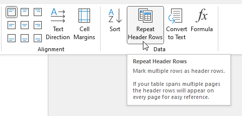
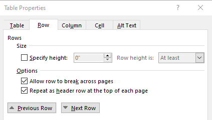
How to set table headers:
- Click anywhere in your header row
- Go to Table Tools → Layout
- Click “Repeat Header Rows”
- Right click in the header row and select “Table Properties”
- Click on the Row tab and select options:

- Keep table structure simple – avoid merged cells and nested tables
| Shirt Size | Quantity | Total |
|---|---|---|
| Small | 2 | $20 |
| Medium | 7 | $70 |
| Large | 3 | $30 |
Lists and Links That Don’t Suck
3:46 Creating proper lists and descriptive links
For lists: Use Word’s actual bullet point and numbering tools (Home → Bullets or Numbering), not just dashes or asterisks.
For links: Use descriptive text that makes sense out of context.
- Good: “Download the annual report (PDF)”
- Bad: “Click here” or “Read more”
Set Your Document Language
5:09 Setting the document language
This tells screen readers how to pronounce your content.
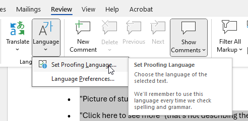
- Select all content (Ctrl+A)
- Go to Review → Language → Set Proofing Language
- Choose your language (probably English)
Fill Out Document Properties
5:38 Filling out document properties
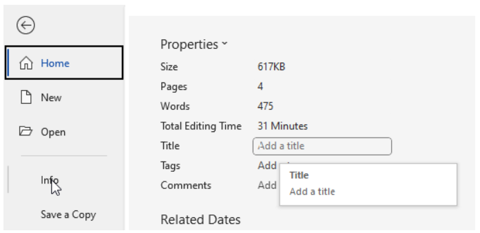
- Go to File → Info → Properties
- Add a meaningful title (this becomes the PDF title)
- Add author if desired
Phase 2: Run Word’s Built-In Accessibility Checker
6:08 Running Word’s Accessibility Checker
Microsoft actually built a pretty decent accessibility checker into Word. Use it.
How to run the check:
- Go to Review → Check Accessibility
- Fix everything it flags as “Errors” (these will definitely break accessibility)
- Consider fixing “Warnings” (these might cause problems)
- “Tips” are suggestions – use your judgment
Common issues it catches:
- Missing alt text
- Poor color contrast
- Missing heading structure
- Tables without headers
Phase 3: Export as a Tagged PDF (This Part is Critical)
7:04 Exporting as an Accessible PDF
Regular PDF export creates a PDF that looks fine but is basically invisible to screen readers. You need a tagged PDF.
The right way to export:
- Go to File → Save As or File → Save As Adobe PDF
- Choose PDF from the format dropdown
- Click “Options…”
- Make sure “Document structure tags for accessibility” is checked (this is the magic checkbox)
- Optionally check “ISO 19005-1 compliant (PDF/A)” if you need embedded fonts
- Click OK and save

If you skip that checkbox, everything you just did was pointless. The PDF will look the same but won’t work with screen readers.
Phase 4: Final Cleanup in Adobe Acrobat Pro
8:05 Checking Accessibility in Adobe Acrobat
Word gets you most of the way there, but Adobe Acrobat Pro handles the final polish.
Run the Full Accessibility Check
- Go to Tools → Prepare for Accessibility (you may need to click “View more”) → Check for accessibility
- Choose the whole document and start checking
- Review the results – expand each section to see specific issues
- If you’re not sure where the error is, right click and choose “Fix”, it should take you to the issue. NOTE: If you fix the issue in the PDF but not in the original Word file you’ll have to fix it again if you export the document again.
- If you can’t find the error location in Adobe consider using PAC to get a more detailed visual report. If the error is in the physical document and not in the meta data PAC will show you the location.
Don’t panic if there are issues – some are quick fixes, others might be false positives.
IF NEEDED: Check and Fix Tags Structure
- Go to View → Show/Hide → Navigation Panes → Tags

Once you have this enabled you’ll be able to toggle on the tags pane using the icon on the far right of your screen.
- Expand the Tags tree to see document structure
- Look for:
- H1, H2, etc. for headings
- P for paragraphs
- L and LI for lists
- Figure for images
- Table, TH, TD for table elements
IF NEEDED: Set Tab Order for Interactive Elements
If your PDF has links or form fields, keyboard users need logical tab order.
- Open Page Thumbnails (left sidebar)

- Right-click any page → Page Properties
- Go to Tab Order tab
- Select “Use Document Structure” (best for accessible PDFs)
Double-Check Reading Order
8:50 Fixing Logical Reading Order
- Go to Tools → Prepare for accessibility (you may need to click “View more”) → Fix reading order
- Use this tool to verify content flows logically

Check Color Contrast for Accessibility
Color contrast makes your text and graphic elements readable for everyone — including people with low vision or color vision deficiencies. The ADA and WCAG guidelines recommend enough contrast between text and background colors so that content is easy to see.
- For Level AA: the contrast ratio must meet at least 4.5:1 for normal text and 3:1 for large text.
- For Level AAA: the contract ratio must meet at least 7:1 for normal text and 4.5:1 for large text.
- All graphics and user interface components (such as form input borders or required field indicators) need a contrast ratio of at least 3:1.
- Links and other informational elements should not be identified by color only. For example, line graphs and links need to be discernable if displayed in black and white only. Links may need to be underlined and line graphs may require varied line styles (dotted, dashed, etc).
Large text is defined as 14 point (typically 18.66px) and bold or larger, or 18 point (typically 24px) or larger.
If you’re using light text on a light background (or dark text on a dark background), double check to ensure your contrast meets the guidelines.
To check color contrast:
- Identify the colors used for your text and background.
- In Microsoft Word, highlight your text, open the “Font Color” dropdown, and select “More Colors” to see the exact RGB or Hex values. Word will flag some colors with low contrast automatically. But if you have any doubt.

- In Microsoft Word, highlight your text, open the “Font Color” dropdown, and select “More Colors” to see the exact RGB or Hex values. Word will flag some colors with low contrast automatically. But if you have any doubt.
- Visit WebAIM’s Color Contrast Checker.
- Enter your text and background colors (you can use the hex codes copied from Word).

- Enter your text and background colors (you can use the hex codes copied from Word).
- Adjust colors until the contrast ratio meets at least 4.5:1 for normal text and 3:1 for large text (Level AA), with higher contrast (7:1 for normal text and 4.5:1 for large text) for enhanced accessibility (Level AAA).
- If the ratio fails, use the sliders on the site to choose a darker or lighter color until it passes in WebAIM. Then copy those values and replace them in Microsoft Word.
Pro Tip: Save the new colors to your color pallet and update any headings or styles using low contrast colors in the Styles settings. By adjusting them in the Styles the new colors will be applied throughout the document all at once and you won’t have to adjust them one-by-one.
Phase 5: Final Validation with PAC (Optional but Recommended)
Walking though the PAC Steps
PAC is a free PDF accessibility checker that provides a second opinion – think of it as your accessibility fact-checker. It’s a Windows desktop utility that tests against WCAG and PDF/UA standards and gives you a detailed report with visual aids that actually make sense. When you download the PAC software it doesn’t install like a normal software though. Here’s how it works:
- Click the download button on the PAC site
- Unzip the folder that downloads
- Open the unzipped folder and click on the PAC application file to launch the program

The best part? No installation required for the basic version – just download and run it. There’s also an installed version for Windows if you’re planning to make this a regular thing and want all the bells and whistles.
Understanding PAC Results
PAC shows you:
- Pass/Fail summary for different accessibility standards
- Detailed results that you can click to see specific issues
- Visual indicators showing exactly where problems are located
How to use PAC:
- Open PAC
- Click Open Document – the accessibility check will automatically run
- To view the results in detail click “Results in detail”
- Toggle to narrow down on any issue
- Click or error items for an indicator of what’s triggering the error
PAC sometimes catches things Acrobat Pro misses, and vice versa. Think of it as getting a second doctor’s opinion.
Don’t panic if there are some issues – PAC is thorough and sometimes flags minor problems that won’t actually break accessibility for users.
Common Error: PDF/UA Identifier
PDF/UA = “PDF/Universal Accessibility,” the ISO standard (ISO 14289) for fully tagged, accessible PDFs. The identifier is just a tiny piece of metadata in the PDF’s catalog dictionary: it tells validators, “This file claims to conform to PDF/UA-1.”
Important: It does not make the file accessible by itself. It’s like checking a box that says, “I promise this file already meets the standard.”
Word doesn’t add this. You can add it in Adobe Acrobat Pro if you need to add it. But not everyone does.
You only add it when:
- Your organization or a specific contract requires the file to formally declare PDF/UA compliance (for example, some EU accessibility procurements, or a government agency that demands “PDF/UA-1 certified” documents).
- You have already verified the PDF truly passes all PDF/UA requirements (e.g., with PAC 2021 showing no fails, manual checks done).
If you’re simply aiming for ADA/WCAG 2.1 AA compliance, U.S. law does not require the PDF/UA identifier. Screen-reader users care that it’s actually accessible, not that the flag is set.
The Reality Check: What “Accessible” Actually Means
A truly accessible PDF should:
- Work with screen readers (main test: can someone navigate it with eyes closed?)
- Be navigable with just a keyboard
- Have proper heading structure for easy jumping between sections
- Include meaningful alt text for images
- Use sufficient color contrast
- Have a logical reading order
The truth: Perfect accessibility is hard to achieve, but basic accessibility isn’t rocket science. Focus on the big stuff (headings, alt text, proper structure) and you’ll help the vast majority of users.
The Bottom Line
Creating accessible PDFs isn’t about checking boxes for compliance – it’s about making sure your content actually works for everyone who needs it.
Yes, it takes a bit more time upfront. But once you get into the routine, it becomes just another part of creating professional documents. And honestly, accessible PDFs tend to be better organized and clearer for everyone.
Ready to make PDFs that actually work for all your users? Start with your most important document and work through this process. Once you’ve done it a few times, it becomes second nature.
Who Manifested This Madness?

This fabulous human, that's who.
Monica Maye Pitts
Monica is the creative force and founder of MayeCreate. She has a Bachelor of Science in Agriculture with an emphasis in Economics, Education and Plant Science from the University of Missouri. Monica possesses a rare combination of design savvy and technological know-how. Her clients know this quite well. Her passion for making friends and helping businesses grow gives her the skills she needs to make sure that each client, or friend, gets the attention and service he or she deserves.
")