Tips for Making a Logo – 6 Key Logo Planning Decisions
April 28, 2023

CONSUME CREATIVELY
This content is available in:
AUDIO
TEXT
Updated 10/26/2023
Making a logo is an important aspect of marketing your company and developing your brand, which is why you need these 6 tips! It’s difficult to develop a brand around no graphics and a logo gives you some graphics to solidify the way that your brand looks.
But sometimes it can seem daunting.
And sometimes it feels like you know what you want, but it’s really hard to express yourself. So you end up going through a billion rounds of revisions with a designer and that costs you a billion dollars. And in the end you wonder if your design can even speak English and you’re still not in love with your logo.
I don’t want that to happen to you, I want you to get an awesome logo.
And I want you to do it in a reasonable amount of time.
Download the Logo Planning GuideYour Logo Decision Guide
Skip the pain and start with a plan.
To do that, we need to get our design details in order and do one of my favorite things: break logo planning down into a bunch of small decisions that you can totally make and feel confident about! 🥳 (Comon’ don’t tell me you’re not at least a teensy bit excited about this…)
You’ll make decisions about:
- Words (name, tagline, etc)
- Areas of emphasis (what do you want to stand out)
- Fonts
- Letter case preference,
- Icons, and…
- Colors
Let’s walk through each one of those things so you know exactly what each decision is, and you can express it to your designer when it comes time to make that awesome logo.
Now, if you’re thinking about designing your logo yourself, or if you’re on a really strict budget, and don’t have a designer, you should really check out the previous episode – The best least expensive way we’ve ever found to get a great logo. I share two really awesome inexpensive ways to get a logo lickity split.
Now let’s start making some decisions and get you in the logo design drivers seat. And once you’re done with these decisions hop on over and read all about the best, most affordable logo design options we’ve found!
Here are the top 6 Tips for Making a Logo:
Logo Tip #1 Words
First, you need to decide what words you want to include in your logo design.
Now on the surface, you’re like, “this is such a lame step, Monica, because duh, I want my business name on my logo.”
But hold up for a second. Because you may not refer to your business as your full business name.
What do you call your business?
If you refer to yourself as an acronym or if you use a shortened name all the time when you answering the phone, or even tell people where you work, then you might not want your entire business name on your logo. And that’s okay.
You don’t have to have your ENTIRE proper business name on your logo.
It’s completely okay to give yourself permission not to put your whole name on your logo. You want a logo, that when people see it, they know it’s you.
If your name consists of five different words, and you always refer to yourself as an acronym, then I would suggest building your logo around that acronym. Then you can use the spot that you’d usually see a tagline on a logo to spell out your entire name below the larger acronym.
I’m going to totally throw my dad under the bus for a second. Dad is the department chair for the Agricultural and Biosystems Engineering Department at North Dakota State University. Yeah, that’s a mouthful, right? And here’s the deal, he has started many, many extension programs throughout his career with the longest names EVER.
Which all ended up being referred to by a pile of clever acronyms. And all the program logos were, you guessed it, ll centered around those acronyms with the long program name underneath
If you’re one of those organizations, then please design your logo around your acronym.
But if you always refer to your company, as your company name, then use that, don’t make up an acronym for your logo.
Are you going to include “LLC, INC, CO or .com”?
Some people like to include their tax status but it’s certainly not required. Lawyers and accountants tend to get excited about this. But you don’t have to unless you want to. Your logo is a marketing piece, not a legal document.
If you’re a completely online company, you might want to put.com at the end of your logo, that’s totally fine.
If you’re a brick and mortar company, it might not make sense to put.com at the end of your logo, even if that is your domain name.
Do you want to include your tagline?
A tagline is by no means mandatory. You do not have to make one up to have a complete logo.
If you have a tagline, you don’t have to have it on every approved logo.
Most companies have different logos for different purposes. You might want a logo with a tagline and one without. Because in some instances, like on a business card, your logo is going to be so small, the tagline may be nearly illegible so you’d want to use the logo without the tagline on the business card. And add the tag line someplace else where on the card where it’s nice and legible.
Is there legal information you need to have on your logo?
If you are in an industry that legally requires certain information to always be associated with your name, make sure to give your designer a heads up.
The goal of all this is to make sure you give the designer everything to start so they can give you a complete representation of your future logo. You don’t want your logo to end up looking like you slapped something on at the end.
Logo Tip #2 Areas if Emphasis
Step number two is to look at that list of words you just made and decide which of those words is the most important, and which one(s) is/are the least important.
You want your designer to place emphasis on the most important words.
To decide what needs to have the emphasis, put yourself in the shoes of a prospective client. What information do they need to know with a quick glance at your logo?
Emphasis decisions are easier for shorter names, and a necessary evil for longer names.
For businesses with short names this is super easy.
For example, our name is MayeCreate Design. We want people to see MayeCreate because that’s the defining name of our company. And design could mean a lot of different things.
For other organizations with much longer names, you need to emphasize a specific part of your name to simplify the design and not make it feel so huge and complicated.
You might ask yourself, if you were to put this logo on a sign, what needs to be most noticeable?
If you have a really long name, and all the text is treated the same, then none of it is noticeable. Especially on signage. It’s all just very small, and it’s not super easy to read.
When you pick an area to emphasize, then that area pops out for people and they see that information first.
Take the Boone County History and Culture Center, for example. When we designed their logo, they decided that history and culture was the most important part of the name. Which made sense, because Boone County and Center felt more like descriptive terms than the purpose of the organization.
So when the logo was designed, we asked the designers to put emphasis on history and culture, and then make Boone County and Center smaller.
Which brings me to our third decision, fonts!
Logo Tip #3 Fonts
All right, so what the heck is a font? You might already know what a font is, but then again you might not. The easiest way to describe a font is the way that the words look.
Some are really simple. Some of them are more round, fat, or skinny. There are all kinds of different fonts out there. And I’m not even going to try to describe them all here. That would not really serve you.
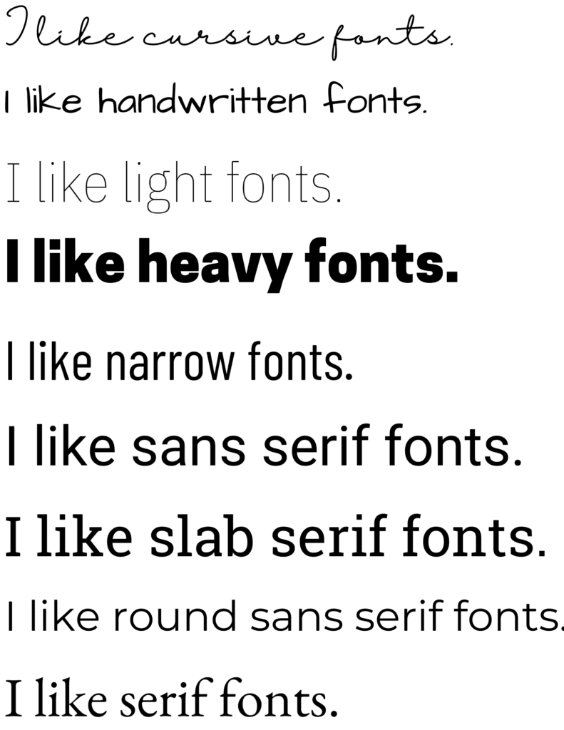
Instead I’ll send you out to a few places to look at fonts and get some inspiration.
Google Fonts, which is awesome, because all the Google Fonts are free, so you don’t have to buy them. There are also free fonts out at daFont.com and fontsquirrel.com (well some are free on fontsquirrel.com but others aren’t so pay attention to that).
As you’re choosing your font, think about how you want your logo to feel. Should it be friendly, conservative, modern, powerful, fun?
If you want it to feel friendly, then you might pick a font that’s a little less traditional and has a fun feeling to it.
But if you want it to be more conservative or traditional, then you’re probably going to pick something that feels kind of like Times New Roman. But for heaven’s sakes do not pick Times New Roman
You know another font you’re not going to pick? Copperplate, just don’t pick it. Okay? Don’t pick it. It’s terrible. Don’t even tell your designer that you want it. Don’t do it. Pick something else. Please, for the love of God, pick something else. Papyrus and Comic Sans are off limits too. No one should ever use those fonts. Like ever. They’re terrible.
I saw them in a gas station the other day and I flipped my lid. My husband thought I’d lost my mind.
He said, “Who even cares about Fonts, Monica?” 😱 Oh no he didn’t.
I digress. Here’s the deal. If you find yourself attracted to those fonts it’s not because you’re dumb. It’s because you see them all the time. And you’re used to them. But if you pick them then your logo is going to look just like everyone else’s. Or like someone who has absolutely no taste and design. And that is NOT what you want. Soo….I think I should probably stop font ranting now.
Okay, I’m taking a deep breath.
You – go pick an awesome font.
Consider where your logo will be used.
When I first designed the MayeCreate logo, it used a handwriting style font in it.When I went to put it on a big sign outside my first office, four years later, I was like, “Oh no! Yyou can’t read that at all!”
And I had to redesign my logo and pick a font that’s legible from a distance.
If you plan on embroidering your logo on a shirt, don’t pick a super skinny font, because it won’t be as easy to see on your shirt. If you HAVE to have a skinny font then do your due diligence and talk to your embroidery professional. They can help you make sure it looks really nice on your apparel.
Last suggestion…pair fancy fonts with plain fonts.
Multiple fancy fonts in one logo design is overwhelming. And really even one fancy font that’s hard to read is too many. You may think it’s super, super pretty, but if you can’t read it, it sucks. It just does not serve its purpose.
This is supposed to be a brand new mark for you. And people should not have to think that hard when they read it. They should be able to read it right away.
Realtors and salons, I’m talking to you. Yes, your logo is supposed to be pretty, but it has to be functional. That’s the deal. So don’t pick the stupid fonts that you can’t read.
Okay, I’m done complaining about fonts, I swear, let’s move on to the next decision that you get to make, which is your letter casing.
Logo Tip #4 Letter Case Preference
What do I mean by letter case?
This is sentence case
The first letter of your name would be capitalized, and none of the other letters after it. They would all be lowercase.
lowercase is just what you think it is…all lowercase
Title Case Looks Like This
The first letter of each word is capitalized.
OR YOU CAN YELL AT PEOPLE IN ALL UPPER CASE
And I have some strong feelings about all uppercase logos. I think they’re for quitters…ok that’ was a little harsh but hear me out. I get it sometimes your logo won’t work any other way. But I feel like it’s a cheap designer trick, something that young designers do, because they can’t figure out how to make upper and lowercase letters work.
Upper and lowercase letters are powerful together.
Here’s the beautiful thing about upper and lowercase letters, my friends, when we learned to read, we learned to recognize the shapes of words. If your logo uses only uppercase letters, then what you’ve done is you’ve essentially created rectangles out of all of your words. They’re not as easy to recognize. Because you’re stripping the word of its true shape.
Stacking rectangles is way easier than stacking circles, triangles and squares…that’s why I call it cheap quitter design. Because with a little elbow grease you could have something waaaay cooler. So I challenge you to create at least make one or two examples with upper and lowercase letters, or at least do part of your logo and upper and lowercase letters. Can you do it? I bet you can. And you know what, if you got to go all uppercase, go all uppercase. At least you gave it whirl.
Logo Tip #5 Icons
Not everybody has an icon in their logo. And not everybody needs one.
Back in the day when I first started designing, it was a major task to make an icon for a logo. You had to create them from scratch. Now, there’s all kinds of icon libraries out there, plus tools like Canva, offering library after library of elements that you can use for the icons in your logo. It is so much easier to find something that’s close to what you want.
If you’re on a really tight budget, try picking something that at least semi exists from an icon library to start with, and then get a designer to help transform it into your icon.
An icon doesn’t have to be a shape or an illustration.
Many logos have letters as icons. Businesses with acronyms for your names, you are a perfect example of someone who might do very, very well with a letter style icon.
Regardless of what style icon you choose:
- Take a good hard look at it and make absolutely sure it doesn’t look like something else.
- Make sure it tells the right story about your company.
- Have other people look at it too.
There’s a three seasons lawn care company in town, and they made a logo that looks like a uterus. I am not even kidding, I can’t see anything else.
To be fair, I have designed logos that I thought were exactly right. Then I send them over to the client. And they’re like, “that looks like boobs.”
Aaaand that’s why we have other people look at our logo icons to make sure that they don’t look like something else to someone else.
Logo Tip #6 Colors
The final decision to make about your logo is the colors.
You might already have brand colors. If you put your brand colors on a logo and hate them, just take a step to the right or the left of those colors until you have something that works for you.
Let’s say your colors are royal blue and red. And you put them on your logo and it just feels too old school. Try taking the royal blue a little bit more towards Navy, or turquoise, you can really adjust the feeling of your logo and not blow up your whole brand by just taking a little step to the right or the left of the colors in your existing color palette.
If you’re brand new, then that’s kind of exciting. You get to pick whatever floats your boat! For inspiration check out designseeds.com.
You can find color inspiration everywhere. I have had people tell me that they want the colors of their logo to be anything from the painting on their wall all the way to their upholstery. Literally bringing me in swatches of fabric to color match.
Consider the emotional responses created by certain colors.
For example, red often evokes a sense of urgency or intense emotion, while green, on the other hand, has a calming and nurturing effect. Blue usually establishes trust, yellow is energetic.
Consider what you want to say with your logo and make sure you’re using colors reflective of the type of energy you want to push out.
Different industries gravitate towards different colors.
We see a lot of repeated colors in different industries. For example, in the banking world, we see mostly green, navy and blue. Move over into construction, you’re going to see a lot of red and some yellow, especially when you get into heavy highway construction.
Last piece of advice…
Limit your design decision makers.
Too many design decision makers makes for too many opinions. Accommodating all options makes it hard to make a decision.
The logo you create today won’t be the one you use forever, and that’s OK. Remember while your logo is an important part of your brand, it’s just one part of the big wheel that makes up your brand. And if you don’t have one, and you need to get one, then pick something you feel great about, make a decision and move forward with it.
Armed with these 6 logo making tips in this podcast/blog post guide, I know that you’re going to have all of your decisions made so that you can very confidently enter into an awesome logo design for your organization.
Who Manifested This Madness?

This fabulous human, that's who.
Monica Maye Pitts
Monica is the creative force and founder of MayeCreate. She has a Bachelor of Science in Agriculture with an emphasis in Economics, Education and Plant Science from the University of Missouri. Monica possesses a rare combination of design savvy and technological know-how. Her clients know this quite well. Her passion for making friends and helping businesses grow gives her the skills she needs to make sure that each client, or friend, gets the attention and service he or she deserves.