What Not To Do on Your Website: 5 Key Things to Avoid
March 29, 2014
CONSUME CREATIVELY
This content is available in:
TEXT
Websites should be efficient, easy to navigate and visually pleasing. Websites should make you feel feel “Ahh…” instead of “Agh!” My career in the graphic/web design world has drastically changed the way I view websites. I’ve come to easily discern things I like about websites, as well as things that are just plain annoying. If a website has a glitch in their functionality there’s a high chance its visitors are going to bounce, and I’ll be one of them.
Avoiding These 5 Things Could Help Lower Your Bounce Rate
Bounce rate represents the percentage of visitors who enter the site and “bounce” (leave the site) rather than continue viewing other pages within the same site. The lower your bounce rate the better.
What’s going to keep you in a website? That depends on the viewer but the things things that make them “bounce” are usually pretty easy to spot. The following are my personal favorite examples of what causes me to leave a website immediately, if not sooner.
1: Required Contact Form Prior to Entry
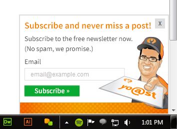
Yoast has the right idea with keeping their “Sign up!” box in a less obtrusive spot: the bottom right corner of the site.
Quite frankly, if a website utilizes this feature, I usually bounce immediately. I understand a website needs to get traffic, needs to get contacts and leads…but this doesn’t make me a lead. It makes me leave.
There are couple exceptions, though. If you insist on gathering contact information before even offering your visitor anything, consider using these methods:
- Have an option for your visitor to opt out, an “X” button
- Have the little pop-up window appear in some unobtrusive manner; Yoast, one of our awesome WordPress plugin people, has the right idea.
Although it’s one of my pet peeves, I can see the value of the required entry form. Many online flash sale sites use the ploy successfully to gain contacts and keep people coming back day after day to buy their products. However useful it is though, I still don’t like it.
2: Aural Accompaniments
Any sort of auto-play feature on a website, especially one with sound, is a nuisance in my opinion.
Imagine you share an office with a coworker and they’re on a business call. You click on a website, forgetting your speakers are on, and all of a sudden the room is filled with heavy, screaming, loud music. Even if that is your taste in music, you’re leaving that website ASAP.
Just play it safe and avoid audio additions. Rely on your fantastic visual design to grab a visitor’s attention. Plus if it’s not properly integrated the audio file will slow down the graphic load time on the site and if integrated correctly it’s the last thing to load. Leaving viewers unsuspectingly scrambling for the stop button after it’s finally ready to play or leaving the page before the file is done loading thus missing the ambiance all together.
3: Excruciatingly Slow Load Times
We all live fast-paced lives (most likely), or we’re just a bit spoiled by super fast internet, either way who wants to sit for 5 minutes waiting for their Pinterest, Google search or Facebook page to load? No one. Which is why those pages load so quickly!
When building your website, adding content and whatnot, consider the time it takes for your page to load. If you weigh down your page with giant images, unnecessary media or fancy Flash animations your website is going to be dramatically slower. With all the impatience in the world, help your visitors out and offer them an efficient website optimized for speed which will in turn lower your bounce rate.
4: Treasure Hunts: Hidden Navigation and Contact Information

This navigation may look cool, but it’s hidden from the start. When hovering, not clicking, over the X it disappears and reappears when hovering over the logo beneath. It becomes quite spastic.
When a person first visits your website you want their experience to be smooth, easy and pleasant. Typically, a visitor knows what they’re looking for on your website, so help them out by avoiding a treasure hunt. Clearly guide your audience in the direction they need to go.
Accurately labeled navigation helps your viewer to get where they’re going without a second thought. They take one look and think, “Ah! There’s the contact information!” …because the tab is called Contact. And, for the love of Pete, please put business hours and a phone number on the Contact page (if not also on the home page). The About Us page is for the staff members, history or description of your business, not contact information.
Honestly, if I can’t find a business’ phone number, at least, on the homepage I’m bouncing and just doing a Google search for it.
5: Text That Looks Like a Link But Isn’t
Once again, guiding your visitor easily around your webpage should be one of your main goals. If something is a link, format it to look like a link. If it’s not a link, don’t format it to look like a link. Simple, right? Case and point: I bet you just tried to click on “webpage,” didn’t you? I’m sneaky, aren’t I?
This overall idea seems pretty self-explanatory, however I’ve looked at many websites that have text, usually bulleted lists, formatted to look like a link. Some have even gone as far as to use that default link blue.
Alas, I am not a link.
It’s a good idea to design your links with a definitive style so people will know to click on them. All other text should be styled as headers or body text. It’s perfectly fine to call attention to text within your website but keep it simple.
Just follow this rule of thumb: if you can’t click it a go somewhere, don’t make it look like you can click it.
The Moral of My Story
Websites should provide awesome, enjoyable, visually pleasing and easy experiences. If you currently have a website visit it and look around like you’re seeing it for the first time. Did you find any frustrating or confusing aspects? If you do chances are your visitors will, as well. Take the time to change things up, simplify and clarify. Your visitors (including myself) will thank you.
(And in case you’d like more no-nos: The World’s Worse Website Ever!)
Who Manifested This Madness?

This fabulous human, that's who.
Monica Maye Pitts
Monica is the creative force and founder of MayeCreate. She has a Bachelor of Science in Agriculture with an emphasis in Economics, Education and Plant Science from the University of Missouri. Monica possesses a rare combination of design savvy and technological know-how. Her clients know this quite well. Her passion for making friends and helping businesses grow gives her the skills she needs to make sure that each client, or friend, gets the attention and service he or she deserves.


