
Every website is different.
Or at least it should be…
There are three things that make or break any construction website:
- Well built out services section
- Robust projects section
- Targeted careers section
You need all three.
A successful construction website should have all three, but each site will share the information differently because every company is different. As you go through this workbook, use the activities to outline those parts of your site, as well as the other pages of your website with your company’s story in mind. This is a guide to discover the right information for your website. It can and should be different from others.
Outlining your pages.
Write down all the pages you want.
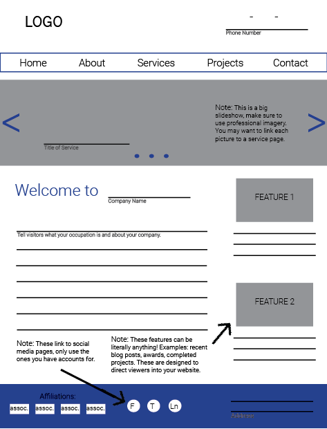
And if you’re a visual person, make a simple site map.
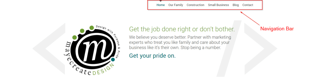
The top row of the chart should include the words you would want to see in the main navigation bar on your website. In a bulleted list the items furthest to the left would be found on the navigation bar. The illustration below directly translates to the main navigation you’ll find on the MayeCreate website.
Pay attention to the location of the homepage in the layout of the navigation. Some people make the mistake of thinking that the homepage of their website should be at the top of the chart. The ideal way to outline your site is to include the homepage along the top of the chart with the other main navigational buttons. Having “Home” in the main navigation, and on each page, allows your visitors to easily return home or navigate to any of the other pages within the site from each page, regardless of which page they are currently viewing.
Subpages, or the selection of pages that drop down from your main navigation, can be listed below their parent page. They are shown to visitors in a drop down menu or are linked to from their parent pages.
Most construction websites have some combination of these pages:
- Home
- About
- Services
- Service 1
- Service 2
- Service 3
- Service 4
- Projects
- Projects Single
- Staff/Team
- Staff Single
- Careers
- Job Application
- Job Listing Single
- Safety
- Privacy Policy
- Contact

Simple Site Map Example
You can use Microsoft Word or PowerPoint to make graphics to show the hierarchy of your page. The one above was made in PowerPoint.
Above is an example of a simple site map example made in PowerPoint. The pages listed on the main navigation of this site would be the items listed on the left (Home down to Contact). The items on the far right are sub pages that might be in drop down menus or linked from the pages they are nested under in the site map.
This is an example of a website with a main services page that serves as an overview for all of the company’s services and links to individual pages for each service.
Fancy Site Map Example
Sometimes when making a site map it helps to make a little sketch of what each page may look like. This can add more structure to the intangible and remind you what you thought you wanted on each page when you begin building the site.

Deciding what you want on your pages.
Pay attention to detail on interior pages.
In so many industries, the interior pages of a site are treated like the forgotten leftovers of last night’s dinner; home pages are action-packed main courses and the subsequent pages are languishing in tupperware at the back of the fridge. But here’s the deal, the internal pages of a website also display in Google search results, and they serve as topic-specific landing pages to welcome visitors to your site and learn about the services you offer.
The construction industry deserves a huge high five for trending towards page equality. I’m finding pages filled with images and eye-pleasing formatting designed to pull visitors down the page and encourage them to take action before leaving the site. Some pages pull visitors into the project section of the site, others offer downloadable content, and most encourage people to apply for jobs.
Go page by page and make a quick list of your content.
Now, you’ll go page by page and decide what will be on each of them. Usually just a super short bulleted list will do. This will help when you’re trying to write content for the pages later on down the road. Make sure you document what types of functionality will be on each page as well. Are there blog posts on a page? Or a photo gallery? Note each of those items so you don’t forget when developing content for your pages. You’ll use this outline as a guide as you build and plan your site. It’s like your blue print.
Not sure what you want on your pages? Read on!
In this section we’ll go through the most common pages found in construction websites and address each one individually, outlining suggestions for both content and functionality. As you read make a list of what you’d like to put on the pages of your site.
Quick list examples:
Home
- Big slideshow of images
- Introduction to who we are
- Links to our services with pictures
- Links to a few projects
History
- A timeline of our company history with pictures
- Our core values and mission statement
Contact
- Phone number
- Email address
- Map of our location
- Photo of the front of our main office
What should be on your HOME page?
Every website has a Home page.
Even if it’s just a one-page site (which I strongly advise against), that one page is “Home” to all content featured therein. But what makes a good Home page for a construction company?
Construction company home pages are action-packed, using a barrage of eye candy including: color, photos, icons, subtle animation, and video. The combination establishes an ambience and a feeling of wow for visitors at first glance.
Home page imagery makes a statement.
A high-quality image slideshow featuring photos from your latest and greatest projects is always a win. Drone footage is all the rage right now — looks super slick. Drone footage varies dramatically from site to site. Some is filmed at night or in time lapse (which is particularly dramatic), some during the day, others are color treated black and white or treated with a color overlay. Really, any and all implementation of drone footage is impressive and does a great job of introducing viewers to a company.
If a construction website isn’t sporting drone footage, it’s probably touting a gigantic image welcoming visitors to the home page. Large imagery can also set the tone for the rest of the page. While the home page trend is to have larger imagery, the majority of the secondary pages (about, contact, etc) usually have shortened header images. Regardless of size, the industry is trending towards quality photography to start off each page of the website.
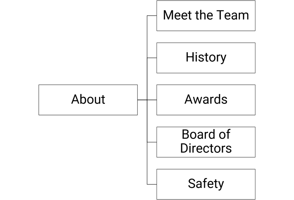
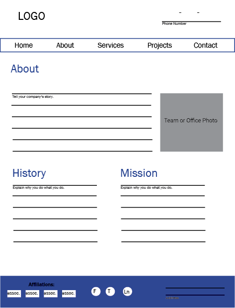
What goes on the ABOUT page?
Your about page is all about culture and bonding and rapport.
The About page/section exists to give you credibility as a company, to show people you exist, that you’re capable and trustworthy. While this section isn’t typically the most visited area of a website, you’ll want to devote special attention to it, especially if you’re recruiting new hires or selling a high-dollar product.
If you’re a small company that’s just getting started, one page would probably suffice. If you’re a huge company with years of experience, you could have a whole section, in which case your values, mission, and vision would be on your main About page, and each other facet of what your company is about would become its own page (i.e. History, Team, etc.).
The site outline for a large about section might look like this:
What do you need on your TEAM page?
Show off your people.
A lot of construction companies want to highlight their leadership and team members — those who plan to feature just a few members carve some space for them on the About page. Companies with a lot of employees to feature will have a separate page or section accessible from the main navigation. If you’re going for the separate Team page, let’s just say it’s mandatory to share team member names and titles at the very least or else… what’s the point? Any other information you decide to include is at your discretion.
Will you share contact info for everyone?
Maybe you just need to provide it for your Sales Team or Project Managers, but not for your CEO. Sometimes when contact information varies from person to person the page can look messy and uneven. In those cases we often create a link for users to expand to view contact information or click to a second page for more information about a team member.
What about team member photos?
This certainly isn’t mandatory, however including pictures of team members is a real positive for certain types of companies, like those that provide residential services (i.e. plumbers, electricians, HVAC techs). Customers can achieve peace of mind by referencing the website and seeing exactly who’ll soon be at their front door. That feeling of certainty and safety can go along way.
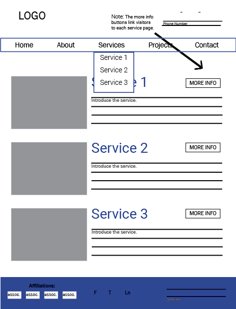
What goes on the SERVICES page?
A well-built construction website has a Services section with each individual service on its own page.
Having a separate page for each of your services boosts your chances of ranking for keywords and phrases your prospects are using to search for what you do on Google.
People may not call your services the same thing you do on your website so the correct pages might not show in search results. That’s why you have a page for each of your services. For example, Let’s say you’re a landscaper. Yes, you do landscaping. What about tree trimming or mowing services? Do you do both residential and commercial work? Plow snow? If you just have one page on your site with a bulleted list of your services there’s no way you’ll show up for all of those things. Maybe landscaping, but everyone’s searching for all those other services too.
- On each page, use original content to describe your service, and do your best to use around 500 to 800 words (it’s just good SEO practice).
- People love seeing real people doing real things, so include original imagery of your team working on related projects.
- Don’t forget your contact information, especially if you have specific contacts for each service you provide.
- And last but not least, provide links to projects you’ve completed for this service within your robust project section to further build credibility.
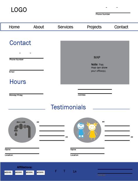
What do you need on the CONTACT page?
Anything people might need to contact you.
I’m honestly not sure what the point of having a website is if you don’t have your contact info on it, and we certainly can’t always bet on visitors figuring it out for themselves. Best practice is to include a link in your main navigation.
Including a map of your location(s), an email form, and any important contact information helps you look even more legit.
Do you need an email form?
People ask all the time if they really need a contact form, and it can depend. Email forms are great for prompting visitors to give information you may not have gotten from them otherwise, so if there’s a specific type of information you want from your prospects (ex. service type or project start date), including a contact form helps ensure you’ll get it.
Whatever you do — form or no form — definitely include a contact email address in a blazingly obvious place on your website so visitors do have a way of reaching you electronically.
Consider the reasons why people contact your company.
- If they often call in for sales and that line is different from your direct line then include a sales number and email.
- If they’re calling in for receivables, make sure to include information about bill pay.
- Some companies also list their HR contact information, along with a link to the careers section of their website.
Planning your CAREERS section.
Beef up your website’s hiring section.
Your website isn’t only for attracting business prospects, it’s an excellent tool for recruiting qualified hires. It’s 2019… people go online to shop for everything, so it’s important to be there when they’re looking for awesome places to work, like your company.
Give potential hires a clear route to your hiring section. Consider what they would want to see once they get there — woo them on your website the way you would in person. Tell them a story, talk about your values and your team. Share testimonials and pictures of your workforce. Make them want to work for you, and not just because you pay well and offer great benefits.
When someone searches for your company, the first thing they’ll typically see is your website. That’s good, it gives you control over their first impression of you. Make your website a good one.
Hiring is the reason most construction companies re-design their websites.
One of the biggest challenges faced by my clients in the paving industry is actually not the inability to find amazing things to build — they build amazing things everyday. Most of my clients have a hard time finding the right people to help them build the awesome things they build.
Most paving websites are built to sell services, not woo potential hires. They need to be able to easily see themselves working for you, so consider ways you can use your website to show potential hires how great it is to work for your company.
You can achieve this in many ways: you can use photos of your employees and post about how you support your community, train your staff, and focus on safety. But the easiest way to get the point across in a very straightforward way is adding a targeted career section to your website.
Dedicate a page to each type of person you hire.
Speak so applicants will listen.
When speaking about your company and available job opportunities, speak in words everyone understands. Be clear about the job responsibilities. No one likes to be spoken down to, and potential job applicants are no exception.
Your company may be hiring everyone from operators to management.
Question: do operators and management have the same qualifications? Do they have the same concerns?
Nope, they don’t. Each will evaluate your company through their own lens.
A targeted career section speaking to the individual concerns of each type of position for which you’re hiring helps set your company apart from others. By addressing their concerns directly, you can potentially attract more qualified applicants who may already have a job but are dissatisfied with their employer.
Chart a clear career path for applicants and let them know about the ample opportunities to progress through the ranks of your company.
Let them know how long it might take to advance or how much experience a person usually has at each benchmark.
Show them how they can take responsibility and ownership over the jobs they will do.
Showcase your benefits, training techniques and safety programs, tailoring each to the job type.
Provide testimonials from current employees.
Face objections head on. This lets people know you anticipate their concerns and are dedicated to create the best working environment for your employees.
Don’t make it all about the money.
Good businesses aren’t just in business to make money, and a good employee doesn’t just come to work for the paycheck.
To solve this, speak openly and passionately about what makes your company great — share your values. That’s hard for people in construction. When I ask people in interviews, “What makes your company great?” Everyone says, “We do good work at a good price.” While that answer is fine for government work, it does little to build credibility with job applicants. Share the journey that makes your company what it is today. Show how you value your employees and their input. Tell people you do business the right way because it’s what you believe in and it’s the right thing to do.
Show your flexibility.
45% of Millennials will choose workplace flexibility over pay.
That is almost half of Millennials who would choose flexibility over pay — and 89% prefer to choose when and where they work versus being placed in a nine-to-five job. That’s a great statistic, but let’s face it: not every business is suited for that level of flexibility.
Imagine managing a construction project where all employees are allowed to come and go at will or select the tasks and locations of where they want to work each day. You can’t just have employees working from coffee shops or park benches, they have to be on site. So from the start, the construction industry can’t meet that expectation. That doesn’t mean it should be ignored. Approach that objection with your eyes open and understand it may be an issue.
- Can you provide employees with enough flexibility to keep them from feeling undervalued and stuck punching the clock at a meaningless nine-to-five job?
- Could you offer rotating start times? Or more time off from December 23rd through January 3?
- Would it be possible for you to close the office over Fourth-of-July week or on some of the days students are scheduled off from public school?
- When public schools announce a late start due to inclement weather, can you commit to allowing employees with children to arrive after they drop their kids off at school?
These things create the feeling of flexibility but still give you some level of predictability for your job and workforce.
Highlight community involvement.
The volunteering, fundraising, workforce initiatives, safety trainings, sustainability practices — you do them, don’t sweep them under the rug.
Those are your opportunities for the all-important humble brag. Inform the public about your corporate social responsibility. So much of the way businesses promote themselves online and in print is centered around the services they offer. I challenge you to examine why you perform those services and tell people about the awesome stuff you do on a project-by-project basis. Praise your employees for the good work they do. Explain your initiatives. And do all those things where applicants can see it – on your website and on social media.
Here’s some good news.
People searching for a construction job in your area are likely using many of the same search terms to find your website as potential customers. So if your site displays well in Google, you’re covered — they’ll get to the site. The person hunting for a service is looking for a bulleted list of credentials, service areas, possiblypast projects like the one they’re planning to build.
Here’s the bad news.
The information they care about is different — they read between the lines. The web visitor looking for a job is trying to imagine what it would be like to work for your company. They’re concerned with how you take care of your employees and community, judging your photos to see if you look like a cool place to work and reviewing your projects to see if they’re exciting, different or a job they’d be proud of.
Make it easy to apply online.
This is so important, I’m going to say it again just in case you missed it: make it easy to apply online.
This is not just for your applicants. If you’re not streamlining the application process for HR, you’re not doing it right. Ask yourself, is it easy, is it convenient? If not, hiring prospects will go somewhere it is. Your hiring process is a reflection of who you are as a company. Treat it with respect.
Put your application online (in other words, make it easy and convenient).
By “apply online,” I don’t mean allowing people to download a PDF application to print and fill out. For some of my clients, the only way anyone can apply for a job at their company is by driving out and filling out an application in person. That’s not easy, it’s not convenient, and that ship has sailed. Intaking handwritten applications and forcing HR to type them into their HR software is not an online system. It’s a hot mess sucking up man hours and costing you money. Your online application needs to be something applicants can — you guessed it — fill out and submit online.
I’m not saying you should avoid meeting potential hires face-to-face, but do consider this: who has time to come out during your business hours and complete that application? Someone who doesn’t have a job. And a person employed in construction or even with the state can’t just take two hours off in the middle of the day to drive out to the middle of nowhere to complete a job application. By enforcing outdated processes, you close a door of opportunity to allow a qualified applicant to apply for a job with your company.
Ultimately, you want more than just unemployed individuals to apply for your open positions. You want the people who already know how to work and have good values and work habits in place.
Streamline the application intake process for HR.
Don’t make things harder for HR. You need them for processing more applications, right? So do everything you can to make their lives easier and more streamlined. This starts with collecting legible applications and providing a way to keep them organized. Utilizing an email form or another online route makes the application easy to read and allows the information to be saved in a database. Then, when it’s time to recruit, you can sort applicant contact information and qualifications to market future positions.
Make your application an email form, not a PDF.
Stop forcing applicants to download a PDF and try filling in the blanks. If you’ve ever tried to do that on a mobile phone, you know how incredibly painful it is. And after all that torture in completing it, good luck saving it and emailing it back. And as for printing and hand-delivering them? That’s a bit of a postal service approach I could have sworn was only reserved for Amazon packages and certified letters… I digress.
Make your application into an email form allowing applicants to fill in the blanks. Then, when they submit the form, the submission can be emailed straight to the correct person in HR. If you can’t do this on your website, or if you intake too many applications for this, consider using a third-party service to collect and manage resumes and applications.
Make sure it works on a cell phone.
People don’t just have computers sitting around their houses anymore. I run an advertising agency. I work on a computer all day, every day, and I do not have a desktop computer or a printer at my house.
It’s so easy to think all potential job applicants would have one, or that would they would even have a laptop? Many of them don’t — what they do have is a smartphone. According to Pew Research Center, 6 in 10 US adults use their phones as their primary source of news, and 96% get news online. Additionally:
Adults Age 18-29
- 29% live in a home with a desktop or laptop computer.
- 51% live in a home with three or more smartphones.
- 28% do not have broadband at home but have smartphones.
Adults Age 30-49
- 27% live in a home with a desktop or laptop computer.
- 39% live in a home with three or more smartphones.
- 24% do not have broadband at home but have smartphones.
From 2016 to 2017, website visits from desktop computers declined from 43% to 37%.
What’s crazy about that statistic is it doesn’t mean less people visited websites from desktop computers — thanks to my managing and tracking of hundreds of Google Analytics, I can assure you desktop visitors are remaining consistent. Traffic overall is increasing, and that increase is from mobile visitors. I include all of this data to emphasize even more the importance of allowing people to easily apply for open positions using their mobile phones.
Planning your PROJECTS section.
Portfolios, Projects, Experience, Capabilities, Completed Work…
Whatever you call your projects section, it’s arguably a must-have feature on construction websites because it helps you leverage your awesomeness and reach new people by proudly putting your work on display for the world to see.
The layout however, is strikingly similar: a grid of impressive imagery sortable by industry, type and/or location. This investment in functionality once again speaks of the industry’s value to offer potential clients a positive first impression by taking the time to anticipate how visitors want to use the information on the site and providing them a way to easily access it.

While there are different types of online construction portfolios, feel free to just start with a page of photos and very (very) brief project overview — give them only what they need to evaluate whether or not they’d like to learn more about the project without overwhelming them with words — information like project name, location and type.
Why have a projects section at all?
Why not just show a gallery of images or a bulleted list of completed projects? Why do you have to make a page for each new project? Well first off, because sometimes, friend, life just ain’t as simple as we’d like it to be, no matter how much we wish things were different. Am I right? And secondly, because regularly adding projects to your site offers the same opportunity as building out a page for each of your services — each page you create on your website is like another door offering visitors entry. (Same goes for blogging, too!)
As you regularly add content to your site, Google uses that content to better understand what you do. And as people are searching for what you do, Google will be more likely to share your website than others. It will also be able to more specifically match your new content to more search terms, which means more website visitors for you that may potentially contact you to buy your services. Also, potential hires will visit your projects section to learn about they types of projects you take on to consider if they’d like to become a member of your team.
You need a robust projects section.
By robust I mean…
What type of projects section do you need?
How do your visitors need to see your work?
How you layout your portfolio is not so much about seeing how many ways it can be done. It’s more about crafting it for how potential clients decide whether or not they want to work with you. Ask yourself: What do visitors need to know you’re qualified to meet their needs?
List the service types you plan to include in your portfolio. And outline how prospects evaluate your services and what they need to see at a glance to evaluate if they want to learn more about a project.
If people seem more interested in what you have in the works or your most recent projects, consider laying your projects out by date with your most recent projects at the top.
If people are concerned by the areas of the United States you have worked in consider first displaying your projects as points on a map that they can click on to learn more.
If prospects are most interested in the kinds of services you can provide, stick with a layout that displays your projects sorted by the type of work you do, or at least allow them to sort your work by category. Sort of like a shopping cart, you don’t want to look at pants when you need new shoes. Same goes here. Prospects may not want to look at your experience with excavation when all they need is demolition.
People who want to build or remodel their home often need to see pretty pictures. They don’t care how many bathrooms a house has in it. They just care that the bathrooms are beautiful. Not surprisingly, home builders and remodelers often go with a minimalist portfolio structure, featuring projects as standalone images in a simple photo gallery, typically categorized by the services they provide.
Businesses who are considering hiring an architect or engineer may be evaluating based on industry specific experience or project sizes similar to their own. To meet that need an architect might list projects on a main portfolio page with an image and important project highlights like location, client name and project type. Then link to individual project pages with additional information contractors can use to decide if their needs can be met by the company.
Allow visitors to sort your projects.
Give your visitors control.
Incorporating sorting capabilities into your structure not only gives you better control over what visitors will see and how they navigate through your projects, but it also lets visitors find projects that truly interests them more easily.
Some prospects put more emphasis on the size of projects you’re capable of handling. Others may be primarily concerned with the kinds of industries you provide services for while the rest might be only care if you do pretty work..
Here are some examples of ways you can sort your projects:
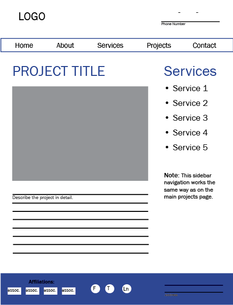
Each project should have its own details page.
What information will you feature on each project details page?
These pages can show prospects on a project-by-project basis why they should work with you without a ton of unbelievable marketing jargon. This page may include images of each project from start to finish if you can. And if you’re feeling really ambitious, gather a testimonial from the client for which you performed the project.
Back to the question we asked earlier: What do visitors need to know you’re qualified to meet their needs?
Now balance that with the level of interest your prospects and clients have in the information you have to offer. Then, get real with yourself, and determine if you have the patience or the staffing to create the type of content you’re considering for these pages. A continually updated simple portfolio will impress your prospects more than a completed projects section that hasn’t been updated since 1998. That’s just about the same as telling them you went out of business. Probably not the message you’re trying to get across.
If you’re selling to high-tech executives, you might forego wordy descriptions and put more emphasis on imagery. While if you’re selling to engineers you may want to include more details.
Here are a few items commonly included on Projects Details pages:
Don’t forget a privacy policy page.
Pretty much every website needs one.
Privacy policies are meant to provide transparency about how websites use visitor data.
We’re all used to seeing privacy policies on e-commerce sites, but now pretty much every website is expected to have one. If you have and email form or accept employment applications online you are collecting peoples personal information and Google is ademate you tell them your rules of engagement.
Privacy policies not only improve trust with your viewers — if you collect personal information from your website visitors using an email form or track user behavior with a system like Google Analytics, you are legally required to have a privacy policy.
You can manufacture your privacy policy in many ways.
You could attempt to craft it yourself, pay for an online service, or hire a lawyer to write one for you. Your privacy policy is meant to inform visitors about how you collect information, how it’s used, and if it’s protected, traded, or not. It doesn’t just talk about their personal information, it also talks about usage of cookies, if you plan to contact them through your marketing, and how to contact you with questions. As the privacy laws change, and they are definitely in flux right now, your privacy policy needs to adjust as well. For this reason, we generally utilize an online service to build and host privacy policies for our sites and those of our clients.
You don’t necessarily have to require people to read your privacy policy before they submit an email on your site; you do have to make it available to them. And simply posting one can build trust and rapport for little to no investment on your end. Link to your privacy policy from the footer of your website and consider linking to it below each email form on your site as well.
Making pictures a priority.
A picture is worth 1,000 words.
Which is likely the number of times you’ve heard that phrase. You want your website to wow visitors. Not scare them away.
Construction websites have decreased their use of icons and retired the glowing white stock photo people in favor of photos of their own crew. Can I just say, “Thank goodness!” and I hope other industries find it inspiring and follow suit.
Using authentic imagery more effectively brands your company. It creates human interest on your pages and guards against getting lost in the shuffle of glowing stock-photo-riddled sites. But most importantly, using real photos of your employees illustrates how you value the human beings who work for your company. I have no doubt this trend is a direct result of the effort to recruit new hires online. It’s easier to see yourself working for a company when you see the faces of real people at their tasks.
So you have a professional photographer on staff, right? No?
Yeah, let’s be real here, you probably have a foreman shooting pictures with his iPhone. If your construction company is one of the photography starved masses we have to get real and figure out how we can still make your website look awesome without a pro shooting every photo you need for your site. Let’s talk about ways to make your life easier and create a website designed to flatter the images you actually have access to and can create easily.
Get quality images without being a pro.
Construction photography crash course.
Image Orientation
Vertical or horizontal, that is the question. Consider what needs to be in your picture and the type of work you’re shooting when picking the orientation for your images. What in the picture do you want viewers to focus on, and which orientation best captures that focus?
Using a combo of horizontal and vertical images on your projects page doesn’t usually play nice with photo galleries and slideshows. It can lead to the images feeling disorganized. In most cases it also makes the vertical images seem really small in comparison to their horizontal counterparts, so we typically recommend using one or the other.
Plan for what you can handle.
Processes get the job done right.
Consistency with your photos is key to creating a professional look for your portfolio, so consider your workload and the level of commitment needed to collect images when establishing a plan for your website. We suggest assigning it to a key individual for each job site, like your foreman or another person who might just have a good eye for photography. Also, try working it into your existing processes. Just like everything else in your industry processes are key to making sure the job gets done right. Here are a few pointers:
Add photography to the punch sheet you use on final walkthroughs. This will remind you the photos need to be taken.
Consider drafting a photo taking punch list. Remind the photographer: horizontal or vertical, up close or far away, clean up the job site first, etc. so he or she gets the photos right the first time everytime.
Decide who will add photos to your site and how the photos will be delivered to that individual. Could be via email or just drop the camera off at their desk.
Don’t forget to track!
You won’t know if your website sucks if you’re not tracking it.
Two tracking services that are completely free and offered by Google are: Google Analytics and Google Search Console.
Go forth and plan your website!
Your website will be an original.
Hopefully with the help of this e-book you can move forward with confidence and plan our just the right website for your construction company.
Don’t forget above all other things it should have:
- Well built out services section
- Robust projects section
- Targeted careers section

Meet the author.
Monica Pitts
I’m Monica Pitts, the Chief Creative Officer of MayeCreate Design. I’m a matchmaker of form and function. Founded in 2005, MayeCreate focuses on web design and online marketing. I live in Columbia, MO with my husband Mike, two kiddos Ellis and Aveleen and our two pups Roxie and Quimby. I am an audio book junkie, aerialist, yogi, runner, crafter who loves traveling and playing in the dirt.
