Best Asphalt & Paving Website Designs
June 11, 2016

CONSUME CREATIVELY
This content is available in:
TEXT
The asphalt and paving websites listed below are the best designed because of their unique qualities and interesting visual elements. Each of these websites have a characteristic that makes them stand out individually.
1. The Maryland Asphalt Association, Inc.

Maryland Asphalt Association, Inc. is an association dedicated to the leadership, development and advancement of Hot Mix Asphalt. They’re committed to ensuring that Hot Mix Asphalt paving is the most cost-effective, high quality paving available.
Original photos, color overlay, integrated Google Docs and easy to use members map make this site a winner.
What makes this asphalt and paving site stand out:
- Original photos in the home page slideshow make this site appealing and authentic.
- Transparent color overlay allows for lots of photos space on the page and adds interest to the top navigation.
- The asphalt index integrates a Google Doc so it’s easy to update each month and still show a great graph of the pricing data. The expandable and contractible yearly pricing breakdown is a great way to share the reference.
- Plant locations are easy to search by distance and address.
2. Fix Asphalt

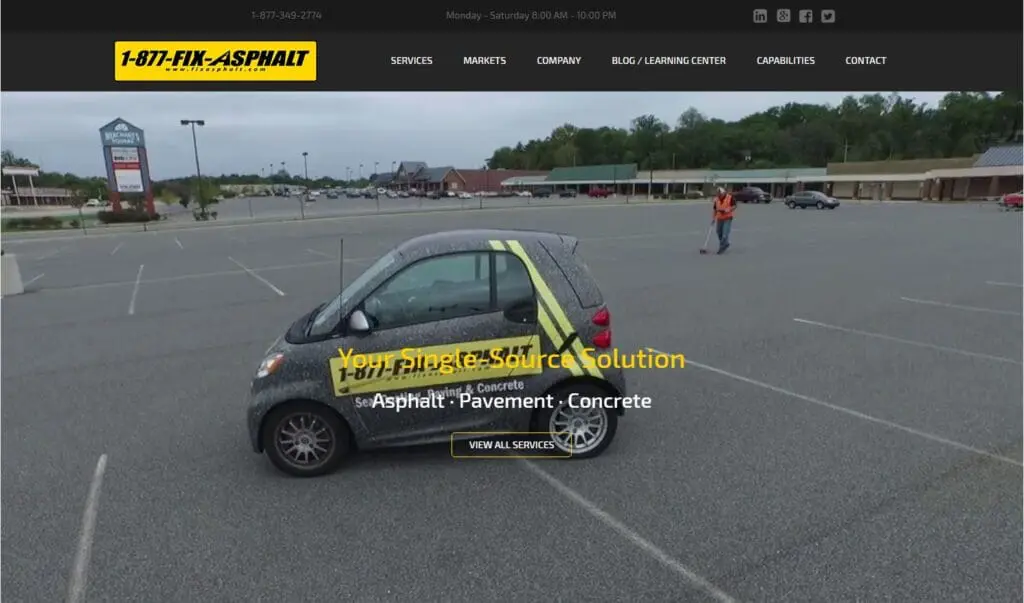
Fix Asphalt provides professional asphalt, concrete services and pavement management programs to commercial and industrial property managers in the northeast. They do things a little differently as a niche business. Their business model is specifically tailored to focus exclusively on customer service and building long term relationships.
Home page video background and bold yellow modernize this site.
What makes this website stand out:
- The consistent bold color of yellow is another visual element that stands out. As you scroll down the homepage or click through the pages of the website, yellow is there, whether that be via the font, picture, or graphic bar.
- The initial background video pans and adds interest without being overwhelming. It sets off the modern feel for the site.
- A long scrolling modern style home page does a good job introducing visitors to Fix Asphalt.
- An animated video easily explains what they do.
- The blog answers many commonly asked questions and undoubtedly helps Fix Asphalt rank well in Google.
Wish List:
The one thing missing from the Fix Asphalt website is a portfolio page. There are no pictures of finished products or the names of businesses from said finished projects. Portfolios are important because it can be a decision factor for potential customers who visit their website. Also, the interior of the site feels a bit cramped and dated in comparison to the well designed home page and blog.
3. Blacktop Service Company

Blacktop Service Company is a specialized asphalt construction company based in Humboldt, Iowa. Founded on family values, the company is synonymous with trust and dependability. Operationally, they strive to produce the highest quality products, seek to exceed customer expectations and are dedicated to providing a quality work environment for their employees.
Complimentary color pallet and consistent icons give this site eye appeal.
What makes this asphalt and paving site stand out:
- The yellow bars on the navigation mirror the yellow lines on a road. The characteristic makes the company stand out from the crowd of similar designs.
- A complimentary color pallet of yellow orange and dark blue are upbeat and easy to read with high contrast over the asphalt textured background.
- Larger text is easy to read.
- Icons representing each service are consistent throughout the site. Starting on the home page and continuing on to the services and locations pages.
4. M&J Asphalt Paving Company, Inc.

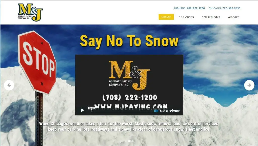
M&J Asphalt Paving Company, Inc. has more than 35 years of experience delivering high-quality asphalt paving work that doesn’t bust budgets. A family-owned, self-performing company, M&J Asphalt and Paving Company, Inc. specializes in the work that has to be done right the first time – the shopping centers, office parks, hospitals, restaurants and manufacturing facilities that demand reliability from their vendors.
Animated transitions, video and consistent design elements set this site apart.
What makes this website stand out:
- Professional videos accompany each of the slides on the homepage slider. This goes above and beyond the industry standard of one video at most!
- Modern, horizontal scrolling style is consistent throughout all the pages of the site. It’s more pronounced on the home page but still carries through to the interior.
- Well developed projects gallery.
- Animated transitions ease visitors into each part of the site.
- The photographs are tinted and faded, which add a nice stylized design touch.
- The text is large and easy to read.
Wish List:
While cool in some instances I think they do go overboard with the transitions. For example the drop down menu isn’t displayed instantly, you have to wait for it to fade in which can lead to visitors abandoning the site.
5. Missouri Asphalt Pavement Association

Missouri Asphalt Pavement Association is proud to represent the asphalt industry in Missouri. Founded in 1990, the company has grown to serve asphalt producers and non-producers, oil suppliers, contractors, and parties with a commitment to the quality production of asphalt.
Colorful with great contrast and cool asphalt facts draw visitors in.
What makes this asphalt and paving site stand out:
- Pops of color bring life to the overall darker color scheme. The deep purples in the site offset the bright accents used for the titles and buttons throughout. This balance almost resembles a road sign at night, only it looks awesome and not blinding.
- The purple curve running along the header and footer of the website gives it a different feel from the others. It is not a design element you see very often, mainly because it is difficult to pull off correctly.
- Asphalt facts scattered throughout the site add interest and act as an educational design element.
- The site search feature helps members find information easily.
- The events calendar widget makes events easy to find in both a list style on the events page and calendar layout as well.
- Interactive members map, sortable by category, is interactive is easy to use.
6. Rose Paving

When they started out in 1974, Rose Paving LLC. understood that preventative pavement maintenance was serious business. Now, more than ever, proper upkeep of facilities is a critical business requirement.Their services are not limited to asphalt and concrete – they do it all, including structural reconstruction. They partner with their customers to develop a collaborative relationship, understanding the needs, working within the budget and being there to assist year-round.
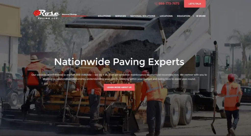
Red and black is hard to pull off, this site makes it classy.
What makes this website stand out:
- High contrasting red on black buttons call visitors to action.
- The original photos have a color overlay that stylizes the site and makes it easier to read text placed over the images yet leaves the images feeling colorful and fun.
- Rose Paving offers a downloadable resource from the home page, which can help generate leads for the company.
- Pages are easy to read and consistently designed. They did a nice job of bolding important content to keep your eyes moving through the larger sections of text. This also makes sure visitors don’t miss an important piece of information buried in a paragraph.
- The more menu on the far right of the navigation is a clever way of sharing additional pages in the site. Though since it’s not a traditional solution not all users may be aware to click on the More link to find links to the additional pages.
- Bread crumb menus keep visitors aware of where they are within the site.
What does your asphalt website need to keep up with your competition?
Take a look at our 5 Asphalt Paving Website Must Haves and Asphalt and Paving Website Trends to see how your website measures up.
Who Manifested This Madness?

This fabulous human, that's who.
Monica Maye Pitts
Monica is the creative force and founder of MayeCreate. She has a Bachelor of Science in Agriculture with an emphasis in Economics, Education and Plant Science from the University of Missouri. Monica possesses a rare combination of design savvy and technological know-how. Her clients know this quite well. Her passion for making friends and helping businesses grow gives her the skills she needs to make sure that each client, or friend, gets the attention and service he or she deserves.


