5 Tips for Incorporating Donate Buttons on Your Website
November 26, 2024

CONSUME CREATIVELY
This content is available in:
TEXT
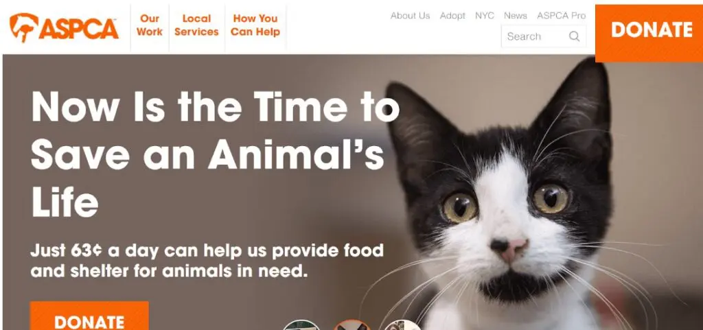
Take a look at the ASPCA’s website homepage. What’s the first thing you notice on this page besides the adorable kitten? Probably the large orange “DONATE” buttons in the top right and bottom left corners!
If your nonprofit is refreshing or redesigning its website, figuring out how and where to incorporate donate buttons is essential for connecting visitors to giving opportunities. Use these four tips to optimize your site’s donation button.
1. Feature the button in a prominent position.
User testing shows that calls to action (CTAs), like donate buttons, placed above the fold outperform those placed below by 304%. For a website, “above the fold” describes the content that is visible without scrolling when you first land on a page.
It’s also essential to place your donate button on high-value pages that 1) see a lot of organic traffic and 2) represent valuable conversion opportunities in the donor funnel.
For example, Bloomerang’s guide to nonprofit donation pages recommends placing a donate button in the following spots:
- The top right corner of your homepage within the top-level menu
- Blog posts
- About page
- Event pages
These pages represent potential conversion opportunities in the donor funnel because visitors are more likely to feel passionate about your mission after visiting them. For instance, a supporter might feel motivated to donate after reading an emotional blog post about a family that received support from your nonprofit’s disaster relief services.
Explore your website’s analytics to determine which pages receive the most traffic. Then, strategically place donate buttons above the fold on those pages to keep them top-of-mind for visitors.
2. Use fundraising software to embed the button.
Make sure your fundraising software allows you to create a donate button that leads supporters to a donation page embedded into your website (not a form hosted on a third-party site). This integration helps increase trust in your donation process, reassuring donors that their gifts will go directly to your organization.
Plus, when you integrate your donate button into your fundraising process, you can gather donor information and seamlessly transfer it to your CRM. Track key details, such as donors’ contact information, donation amount, and programs they like to support. Use this information to follow up with donors after they give, thanking them for their donations and spotlighting additional ways they can get involved with your organization.
3. Get creative with the button’s look.
Your website’s content management system (CMS) might offer a few default or standard options for how your website’s buttons look. We recommend getting creative and trying different custom options to see what works best for your site’s overall design.
Use these strategies to find the right button style for your site:
Try different colors.
Test combinations of your brand’s colors to see which ones are most visually appealing or eye-catching.
Include an icon.
Consider including an icon relevant to your nonprofit’s mission on the button. For example, the Leukemia & Lymphoma Society’s donate button has a droplet icon, representing the organization’s mission to find cures for blood cancers.

Ensure the button looks good with other prominent icons, like your logo.
The button shouldn’t clash with your logo or dominate the page unnaturally. Ensure your top-level menu and header have a balanced look.
Run A/B tests for different options to see which variations your audience responds best to. You can use heatmaps to evaluate how visitors interact with your website elements, particularly your donate button. Heatmaps are visual representations of the user experience that identify areas of your website that users are drawn to the most.
Evaluate which button variations attract the most clicks from your audience. Change one element at a time, such as the colors or font styles, to identify which adjustments make the biggest difference.
4. Ensure buttons are accessible.
Creating an accessible donation process, from your donate buttons to your giving form and receipt, ensures your giving opportunities are open to anyone who wants to support your mission.
By following accessibility regulations like the Web Content Accessibility Guidelines (WCAG), you can create a user-friendly donor journey that inspires more giving.
Keep these essential accessibility considerations in mind when designing your donate buttons:
Color contrast
The WCAG recommends a color contrast of at least 4.5:1 for standard text or 3:1 for large text. Check the color contrast of your buttons using WebAim’s free contrast checker.
Proper font sizing and spacing
The WCAG doesn’t note a specific font size for buttons, but you should ensure that the text is large and readable on both laptop and mobile screens.
Touch targets
Touch or tap targets are website elements designed for the user to directly interact with, like buttons or links. Space your buttons out appropriately from other elements on the page so that users don’t accidentally tap the wrong element. They should also be large enough that users won’t miss them when they try to tap them. Appropriate tap-target sizing is especially important for designing your site’s mobile look, as users will need to be able to tap elements easily with their fingers or a stylus.
Keyboard navigation
Visitors should be able to navigate your entire website using a keyboard, including your donation buttons.
Manually test your website’s donation process, starting with your donate button, to note areas of poor accessibility. Use the WCAG as a guide to help adjust your site and make it more accessible over time.
For more accessibility tips check out our ADA Compliance for Websites Quick Guide.
5. Incorporate microinteractions.
Microinteractions are subtle design elements that enhance the user experience. You can incorporate a microinteraction into your donate button design by having the button change in a unique or surprising way when users hover over it.
Explore a few ways nonprofits and other organizations incorporate microinteractions by having their donate buttons:
Pop off the screen, like the Covenant House donate button.
This donate button features a dove icon that pops off the screen when users hover over the button.
Change colors, like the CARE donate button.
CARE’s button changes from white text with an orange background to black text with a lighter orange background.
Play a short animation, like the McMaster University Tours and Admissions buttons.
When users hover over these CTAs, they change from static images to moving GIFs.
Outline the perimeter, like the Girls Who Code donate button.
When visitors hover over this button, a black outline animation is triggered, helping it pop off the screen.
Explore Kanopi’s roundup of the best nonprofit websites to see more examples of how nonprofits get creative with their CTA button designs and microinteractions. If you have a particularly imaginative or ambitious idea, work with a web developer as needed to implement the design effectively. A web development expert can help create a visually pleasing button that doesn’t slow down your site’s performance.
Of course, your donate button is just the beginning of the giving process. To secure donations from supporters, your giving form must also be optimized, with a user-friendly interface, multiple giving options, and a compelling reason to give.
However, website visitors won’t be able to find your giving form without prominent CTAs, including well-designed, strategically placed donation buttons. Use these tips to design a donation button that provides a positive first impression of your giving process.
Who Manifested This Madness?

This fabulous human, that's who.
Monica Maye Pitts
Monica is the creative force and founder of MayeCreate. She has a Bachelor of Science in Agriculture with an emphasis in Economics, Education and Plant Science from the University of Missouri. Monica possesses a rare combination of design savvy and technological know-how. Her clients know this quite well. Her passion for making friends and helping businesses grow gives her the skills she needs to make sure that each client, or friend, gets the attention and service he or she deserves.