
5 Great Website Designs for Commercial Construction and What Makes Them Awesome
February 7, 2014

CONSUME CREATIVELY
This content is available in:
TEXT
Updated: October 19, 2020
My Grading System for Great Commercial Construction Websites
In case you haven’t noticed by now, I adore talking about websites, from design to planning, optimizing to tracking. All of it. Years of experience in the industry have given me the ability to say they’re what I know best.
We design a lot of construction websites here at MayeCreate, and when we take clients through our web design process, we put together a list of inspirational sites. This helps our clients envision what they have in mind for their sites, and it also gives me the opportunity to stay abreast of the high quality construction websites out there right now. (Not sure what makes a good construction website? Check out our podcast/article on the topic.)
I took my passion for all things websites and combined it with my love of rubrics and created this rating system for some of the websites we come across as designers. In this post, I stack 5 great commercial construction websites up against this rubric to see who’s really got it goin’ on and who could use just a little more love.
| Category | 1 | 2 | 3 | 4 | 5 |
|---|---|---|---|---|---|
| Projects | Projects section exists but is not populated. | Projects section is populated but it’s just a photo gallery or is not sortable. | Projects section is sortable but little information is shared per project. | Projects section is sortable and populated with information for each project. | Projects section meets criteria for 4 and is creatively & attractively displayed. |
| Services | The Services page exists but is just a bulleted list. | All services are listed and described on one page,or are listed on separate pages but described in less than 200 words. | Each service has its own page and around 200 words of content, but do not have added functionality. | Services each have their own page, link to related projects, and share who to contact for more information. | Services meet criteria for 4 and are creatively and attractively displayed. |
| Employment | An employment or careers page exists. | Benefits are listed and a PDF application or contact information are present. | Company culture and benefits are described. Visitors can apply online or available jobs are listed. | Each position has a landing page with benefits, company culture & FAQs. Visitors can apply online or available jobs are listed. | Available jobs are listed and all criteria for 4 are met, plus content is attractively and creatively displayed. |
| Ease of Use | Navigation exists OR navigation is mobile on desktop display. | Mobile menu is reserved for mobile traffic. Dropdown menus enable people to easily jump to pages within a section. | All of 2, plus interactive site content is logical to use. Links feel like links, buttons like buttons. Information is logically organized. | All items from 2 & 3, plus key items from other sections of the site are used to supplement information throughout. | Everything from 2, 3 & 4, plus elements are displayed attractively with creativity. |
| Creativity & Content | Site looks like someone forgot about all the pages, except for the home page. | Some pages are well designed, but not all. Site is composed well, but looks like most other sites. | Looks like a website someone cares about on the home page and some other pages. Effort was put into branding the site. | This is a site someone cares about and each page has thoughtful layout and design. It reflects the company’s branding. | Looks like someone put some serious time and thought into making this site. It doesn’t look like every other site out there. |
| Load Time | Site loads slowly and has low scores on GTMetrix. | Site loads in average load time but has low scores on GTMetrix. | Home page loads slower but other pages load quickly had average scores on GTMetrix. | Site loads quickly and has average scores on GTMetrix. | Site is fully optimized, loads quickly and has good scores on GTMetrix. |
Korteco
Highlights
- I love the rollover effect on the projects pages and services page – so cool!
- Good job adding the location to each of the projects, could have more information about each project to entice clicking but really the companies they work for are so big that they do sort of speak for themselves.
- Good job with solution-based marketing callout on the individual project pages. They offer a “Hiring a manufacturing and distribution center builder” download. I do wish they had a gallery of photos, not just big ones in the header so I could see an overview of photos to pick the one I want or at least an indicator of how many there are. Right now it’s like a surprise every time you click. The rest of the projects page though is pretty sparse.
- Individual services pages are pretty simple, they could link them to related projects to keep people moving through the site. They did do a good job with offering the downloadable resource.
- You can tell they’ve invested a lot of thought and energy into this section of their site. The offer multiple places to click and view job openings, have a video, share photos of their employees in action, a social media feed, even have employee reviews.
- Everything is easy to locate but they need to do a better job of linking to related information from one part of the site to another. For example they could have featured projects and case studies on related services pages etc.
- I love the design, it’s not super easy to code this style of site either, I haven’t seen another like it!
- Site is well optimized, haven’t seen many as thoroughly done!
GTMetrics Score
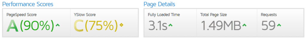
Score
FINAL SCORE: 24.5/30
82%
Projects
Services
Employment
Ease of Use
Content & Creativity
Load Time
Straub Construction
https://www.straubconstruction.com
Highlights
- The photos on this site knock it out of the park. They’re real, authentic and professionally done. 5 stars.
- However those lovely images could be compressed a bit more to speed up load time.
- If you want to see what an awesome about page looks like go here…
- I would have put Careers on the main navigation, there’s plenty of room up there, no reason to nest it.
- Careers landing page needs some love to direct people to apply online. I’d turn those teeny links under the big picture into buttons overlaying the big photo or under it.
- Services pages (under what we build) are quite brief, need more words on these pages if they want them to rank.
- Projects pages are lovely. Nice display, tons of images even contact info. Could tell more of the story in words for SEO purposes but the images do a great job of telling a story to visitors that do get there. Would be nice to add related projects to each page to keep visitors panning through the projects. There’s some hidden navigation that allows you to do it but I didn’t find it right away.
GTMetrics Score
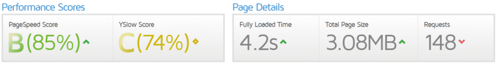
Score
FINAL SCORE: 23/30
77%
Projects
Services
Employment
Ease of Use
Content & Creativity
Load Time
Weitz Commercial & Industrial General Contracting
Highlights
- This site uses text as a design element and though it doesn’t always use a ton of photos, manages to stay creative throughout with illustrations and animations.
- It does a pretty good job of converting rollover behaviors to expandable collapsible content on mobile devices, though there are a few weird spots with background images messing things up.
- The site is consistently and creatively formatted throughout, a great example of a commercial construction site.
- I wonder why they didn’t use any dropdown menus? They are needed in the Expertise section at the very least.
- Great single projects pages – the at a glance details section is awesome to keep information organized. Though there’s not a way to get to more projects other than going back to the previous page.
- The main careers page is well organized, though it seems they could have added more pages for job types instead of just a short bit for student employees. And I feel like it would be good to open job openings pages in a new tab since they go to a new site.
- The home page isn’t super slow loading but it’s not fast either, videos are so awesome but they tend to slow down load time. The GTmetrix scores are dismal though…even on the interior pages, so there are certainly improvements that could be made. To start they have a few really big images that could be resized and all images could be compressed, one on the home page is 4.8M!
GTMetrics Score
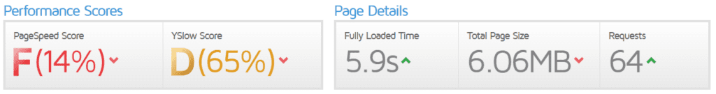
Score
FINAL SCORE: 23.5/30
78%
Projects
Services
Employment
Ease of Use
Content & Creativity
Load Time
McCarthy Building Companies
Highlights
- There are so many things to love on this site, stylized imagery and fun bold colors really make their brand pop.
- I’m not a fan of the mobile style menu to share additional content on desktop navigation, it seems like with a bit of organization the content could be housed in a normal desktop style navigation.
- Dang I love these services pages, they sell the service, show featured projects and news. Ahhh, it’s a user interface dream.
- Yes projects pages! Yes, Yes, Yes. These folks are writing the book on a great projects section.
- This careers section has it all. Pages speaking to each type of person they’re hoping to hire, stats, and my favorite part, a featured employee with a career path. High five! McCarthy thought of everything!
- Home page load time is not awesome. It’s not terrible, though the GTMetrix scores aren’t anything to write home about. Interior pages are better but really all page sizes are too large. That’s really the fault of big images, with some image resizing they could speed this site up a ton.
GTMetrics Score

Score
FINAL SCORE: 26/30
87%
Projects
Services
Employment
Ease of Use
Content & Creativity
Load Time
Hensel Phelps
Highlights
- The creativity in this site is more subtle in rollover behaviors and clean lines. The minimalistic yet clearly interactive buttons and links are really fun. You know they’re links but then you rollover them and they tell you what they do! Only thing I think this site needs more of is photos of people.
- Projects section is good, sortable, lots of photos. It translates well to mobile.
- Services pages are pretty good, could link to featured projects and would benefit from a bit more formatting. It feels like the icons are just kind of an afterthought. But I do appreciate the secondary navigation and breadcrumbs to help me through the section’s information.
- The Careers section is very well made. Including landing pages for each type of employee they seek to hire and career paths. Not as beautiful as McCarthy but the information is all there for the viewer and that’s the important part.
- This site is loading like a dinosaur, 19.5 seconds on the home page 235 requests…this bad boy needs some optimization in a big way. The biggest problem is the huge home page video, it takes 16 seconds to load by itself and there are a number of large images slowing things down as well. The secondary pages do load faster but big images are still bogging them down.
GTMetrics Score
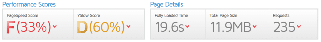
Score
FINAL SCORE: 25/30
83%
Projects
Services
Employment
Ease of Use
Content & Creativity
Load Time
What Do You Think?
Tell us what you think about these sites, and we’d love to have you submit your own site for review!
Who Manifested This Madness?

This fabulous human, that's who.
Monica Maye Pitts
Monica is the creative force and founder of MayeCreate. She has a Bachelor of Science in Agriculture with an emphasis in Economics, Education and Plant Science from the University of Missouri. Monica possesses a rare combination of design savvy and technological know-how. Her clients know this quite well. Her passion for making friends and helping businesses grow gives her the skills she needs to make sure that each client, or friend, gets the attention and service he or she deserves.


